bm33
bm33
About
- Username
- bm33
- Joined
- Visits
- 13,155
- Last Active
Comments
-
Seems to happen on any indoor map.
-
I don't find it scary. At most I'll get startled by a Mikey appearing from around a corner.
-
Interactions you need to be lined up just right to perform them. I had a totem I normally would be able to cleanse from side but I kept starting/canceling cleanse until I moved directly in front. Had a survivor cancel a heal and turn slightly, normally I could return to healing but I had to walk around them to find right spot to start healing them again.
There's a bug similar to the bug where killers couldn't pick up downed survivor at gens, now it's at exit gates.
The event offerings are randomly not rewarding bonus BP earned in a match. Can complete all 5 gens - maybe you'll get points from all 5, maybe only a couple, or maybe none at all.
-
@Rescultir said:
https://forum.deadbydaylight.com/en/discussion/comment/1939349#Comment_1939349
Yes, but they have those other blood point gains icons that also don't matter because you don't see the total amount of bps you have until the game ends and those icons represented the old rank system to keep track of how much score you got. So I say we replace those, you say rank doesn't matter but it will because they made that MMR, and they're bringing it back in the future. Even if you think they're not important, the devs still think it is despite all the negative feedback about it.
@Rescultir said:
https://forum.deadbydaylight.com/en/discussion/comment/1939349#Comment_1939349
People seem to forget that the devs are bringing back MMR despite all the negative feedback about it so it will force you to pip or keep playing with potato teammates. The icons on the top right of the screen in-game is the old scoring system to show you what you needed and how much you needed to pip. So if they replace that it'll be more useful than the current icons that are there since it doesn't provide any useful information while playing the match.
I don't get why you quoted me twice just to basically repeat yourself.
I'm not sitting through ads and watching 20 minutes of some random content creator's video and waiting for him to talk about what you think is related to the emblems. Find the written DBD dev statement instead because I'm guessing the dude is just reading one of those.
The new MMR is not attached to the ranking system with the emblems, in fact in the last Q&A stream they said they will not be telling us what exactly they are using to calculate the new MMR because they don't want players to change their play to increase/decrease their hidden MMR rating.
In the January dev update they said Ranks (which are tied to the emblems) would no longer be used for match making once MMR is introduced. They will only matter for BP rewards you will get at rank reset.
The BP scoring events are not tied to the emblems in a way to let you know what your emblem score is. You can max out BP in categories which you would see from the BP scoring BUT not get an iridescent emblem because the scoring for emblems is not the same as BP scores. I've gotten all iridescent emblems and not max out scoring in the categories - Unbroken is one you can get an iridescent emblem and only have 5k out if 8k points. I've also gotten perfect score of 32k but not had all iridescent emblems - Unbroken again if you're hooked once you won't get higher than gold but you can still get the max 8k BP.
As far as BP scoring events staying/being removed from the HUD I would be fine with them being removed so there is less popping up on my screen during a match. It could be helpful to remove them because there's plenty of players that see they max out in altruism and stop even attempting to save players from the hook because they won't get any more points in that category. The only time the BP scoring events are possibly needed during a match is when there's an event like the current one we have now. Currently in game you see the event scoring pop up, if you played event offering it'll show the increased bonus BP.
Between BP scoring events and emblem status I would choose BP scoring events every time because they're more useful than a soon to be old rank system that will only matter once a month.
-
I had a match today where I spawned facing Freddy. It was a short match for me.
-
New UI gives me eye strain that leads to headaches after a few matches. Bugs during Twins were frustrating but atleast I wasn't in physical pain.
-
Soon rank won't matter at all except for some extra BP at reset so adding in emblems would just be unnecessary clutter.
-
Think Game map may be disabled too. I played a few matches today and didn't get it once even though it should have higher pick rate right now.
-
I like that they made all gens and hooks event gens/hooks.
I wish that the items/offerings appeared waaaaay more in bloodwebs and chests. Only getting 1 maybe 2 per bloodweb is wicked lame.
-
I wish they'd increase spawns on bloodwebs and in chests. Firecrackers are my favorite item, help me a ton with blinding challenges. They could for the time replace all the single category BP offerings with event items and offerings.
-
I really hope they increase the spawn rates. I'd like to load up on firecrackers since they are my favorite item.
-
They really need to increase the items/offerings on the bloodwebs. They can take the place of all the single category offerings that fill the bloodweb.
-
I saw Mandy say on another post they are aware of this bug so hopefully will be fixed fast than the gen bug.
-
I already commented a longer piece here on page 1 about the UI and animations but have couple additional things to add.
For UI: the bar for when an item is used up should be more clear that it is empty. Currently an empty item looks like it has charges.
For animation: please bring back the ability to spin while in the dying state. This was extremely helpful to communicate to teammates while in dying state. I also used it as a way to thank killers that gave me the hatch as last survivor.
-
This makes me sad. Whenever a killer was nice and gave me the hatch I'd spin to say thank you. 😔
-
@TragicSolitude said:
I didn't really care about the new movements until I discovered that I can't spin in the dying state anymore.
Now I care. I care a lot. Spinning is fun, and being able to do a quick shake to warn away teammates was super helpful.
The spin is gone? I used to spin as thank you to killers that gave me the hatch. 😔
-
@_HN_ said:
Overall I like almost everything there, but I have a couple of problem with it still.
The first being the choice of character that will get skins.
Not only a good chunk of them were already present in the pervious rift (like Billie and Legion) but the stuff they got look frankly... worst than the previous stuff.
The free killer skins are ... okay I guess, but not only they are just retextures with some particle effects, but they are way more visible than the standard skin thus making them harder to use.
Did Claudette REALLY need TWO sets in a single rift? Cmon now.
Dwight also has 2 sets. They could've instead done 2 other characters and had them all get 1 set.
-
I'm so tired of Dwight and Claudette skins being in the rifts, especially when there's characters that could use more cosmetics like Zarina.
-
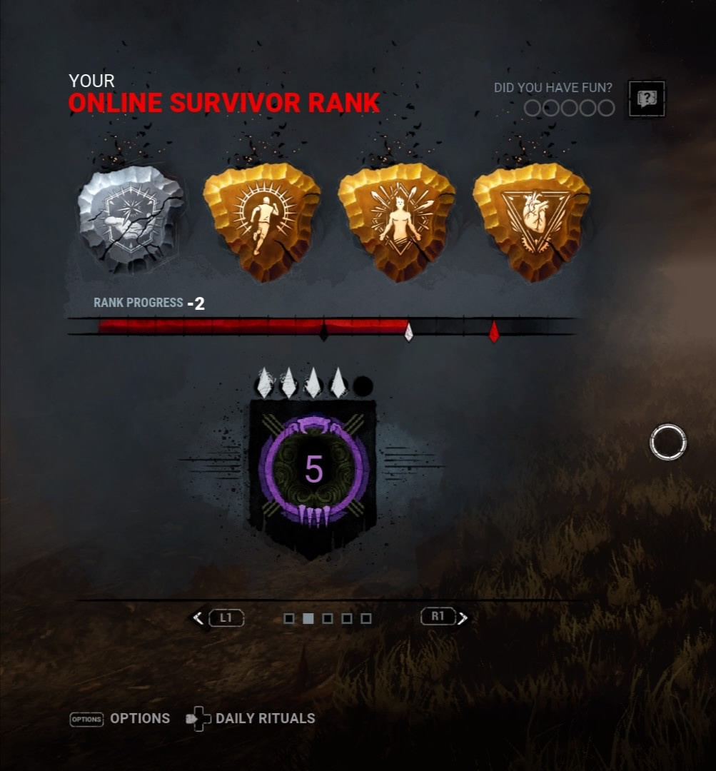
@bm33 said:
Also broken on ps4. Was left to die on first hook in one match and then tunneled the next match. While it says +2 on both I did actually lose a pip each time.
https://us.v-cdn.net/6030815/uploads/PRA3MRBMEBCM/20210210-170441-jpg.jpg
https://us.v-cdn.net/6030815/uploads/UVDJ4ZHNOCCU/20210210-171354-jpg.jpg
So when it said +2 on pips when I should've had -1 I did received -1. I just had a match where I should've pipped +1, it said -2 and I went down -2. 😒
-
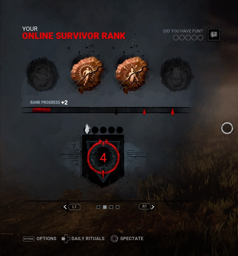
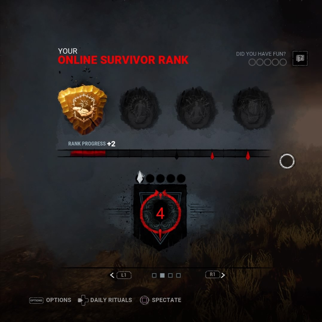
Also broken on ps4. Was left to die on first hook in one match and then tunneled the next match. While it says +2 on both I did actually lose a pip each time.
-
If you complete the rift you get back your auric cells you used to open the premium track. I would recommend waiting until you're close to the end before buying the premium rift that way if you don't come close to completing it you don't lose out on auric cells.
-
https://forum.deadbydaylight.com/en/kb/articles/137-forum-rules
-
@LapisInfernalis said:
Here is what I made after a few hours.
https://us.v-cdn.net/6030815/uploads/JM6RLNFTW040/ui.png
Just for you information: The archive challenge progression only pops up, if you completed it.
What do you think?
This is what they should go with. Put this as example in the pinned post.
-
@dezzmont said:
This new UI fiasco is honestly very interesting to the point that I plan to use it as an exemplar of 'Graphic Designer UI' for interface design courses.
Basically, its very visually flashy in a way that screams "I am a flashy UI," which is why you see this sort of thing a lot in fiction. Think how Ironman's helmet shots tend to have screens all over the place, it doesn't exist because that would be convenient for Tony Stark, it exists to tell you, the viewer, "Ironman is taking in a lot of information!'"
In real life however, good UI design is intended to be invisible and compact until you need it, at which point you can quickly see it and absorb the information from it. It takes up as much space as it needs to in order to be readable. Sometimes you want your UI to quickly update players so you have elements jutting into the 'main area' but usually this is done through color. This isn't really an 'opinion' or 'beauty is in the eyes of the beholder' thing: UI design has been a science for like 60 years at this point with ######### like Bell Labs or the US Airforce doing rigorous scientific experiments with both user fatigue and information retention/absorption, because as it turns out when we were making airplanes having stuff be quickly readable was important, and when we were making early phones misdials sucked. So we got really good at it real quick.
Lets take an example your likely looking at right now if your on windows, a very basic bit of UI you interact with so much you might forget its UI: The Taskbar! The taskbar is located very centrally on your screen SOMEWHERE, but you can choose where it is! Its most likely at the bottom, but some of you renegades like it at the sides or top. Doesn't matter, its ONLY in one place. It doesn't wrap around, because the point of the taskbar is to let you quickly glance down to see if any of your icons are lit up to say they need your attention, and to see what you have open. Icons are, on most screens, about the size of a fingernail these days, and most graphic designers for apps understand how to make a readable icon: Non-realistic stylized imagery usually with 3-4 colors and geometric shapes: You don't get any photos, you get a dark blue gradient circle with a white line going through it at that breaks at an angle for the steam logo, or an orange square with a semicircle in the center for your PDF reader. So I can mostly tell what I have open through shape and color. Less relevant information, like if a pinned thing is open or not, are smaller bits of information that are still visible but take up less space. For example, I can access my volume any time from my toolbar, which is a much smaller section of the screen because its rare I need to mess with sound settings compared to switching windows on apps I am using. It de-emphasizes redundant information too: I probably am aware I am connected to the internet in this day and age so that icon barely takes up any space and uses color more than its shape to denote a problem. There is a reason no one talks about windows 8: Centralized UIs that focus on readable iconography based on color and abstract shapes do so much better even microsoft couldn't force this one on anyone.
DBD does almost the opposite of good practice in every way. A good example is the perks and items: A LOT of screen real-estate is taken up by unimportant information like your own perks, which you shouldn't really need reminding about too often. Its also the information located at the least busy and most clearly read part of your screen in DBD: The bottom. There is a reason a LOT of UI designs focus action at the top or bottom rather than the sides, it intrudes on the 'focus' of your screen way less. Having ironman style ######### popping out from the corners of your eyes is a cool scifi visual but there is a reason basically no one does that and why popups from the 1990's were annoying as hell things no one liked for appearing there. It isn't bad the perks are there (especially as it is a cooldown timer) but its so weird they are dramatically larger than the information used to track gamestate that contains info you can ONLY get through the UI. Items fare little better. I get the item should be larger than its addons, but its SO much larger despite the item being visible on your character, when the addons aren't. And the fact that both items and perks are so much more vibrant, centralized, and in a more valuable part of the screen real estate than gamestate tracking is weird.
It also does stuff like using detailed photo (or CG, in this case) graphics that are harder to read than simple iconography, it de-emphasizes critical information like your borrowed time/deep wound timers, and it doesn't give you enough face to focus on important things like your peripheral vision in a game where seeing stuff in the corner of your screen is kinda HUGELY important. And in a videogame having UI low is also good because it makes it less likely its going to be floating over a rapidly changing background while your moving: sure it won't always be over a featureless ground but you get less jarring change that way. A lot of the information is conveyed through more muted colors which fit the game's aethestetic more in some ways but are a readability nightmare, and stuff like a circular bloodsplatter that can fade into muddy backgrounds is a lot less useful than a more stylized visible shape based alteration.
And then there is the basic stuff, like the items and perks not being correctly aligned. Its like... such a badly designed UI that if it wasn't real I would say it looks like an unrealistic textbook example. I get I care about this way more than other people because like... its my career and most people won't think of it this in depth, but the reason people tend to do things the same way in terms of usability design like UI is because those ways tend to not be ass for your consumer. People are talking about getting motion sick and that could certainly be true (Having some of the more immediately critical information in the top left where your likely going to get a lot of transitions over complicated backgrounds like tree branches, roofs, ruins, ect is going to definitely make some people woozy) it is far more likely the overly busy UI is just over-stimulating people. The average person doesn't have nuanced language to express why this UI sucks, but they know it sucks, and it stinks in a way that doesn't just make the product worse, but makes it physically unpleasant. If your UI is so bad that it is physically upsetting to use, people aren't going to use it.
And, 100%, people would complain about this UI if it was perfect. ANY time you make a change to your interface its going to piss people off: Reddit UI change, Google chrome, whatever, you actually DO need to let people sit with it because the reaction will ALWAYS be negative at first. But holy crap this is so bad that, again, I literally plan to print this out as a handout for how not to do a UI.
Just open any interface design textbook they are different than graphic design ones pleaaaaaaaaaase this is NOT a place you flex creativity. You flex creativity in stuff like the perk icons, which are beautiful and iconic, not in where stuff is on your screen.
If you haven't already please put this in the pinned UI post in the feedback section for the devs to see.
-
I stopped buying skins/DLC over the summer because with my platform (ps4) it feels like my money isn't going towards making it a better experience. Apparently to improve my experience I need to upgrade to a PS5 to have the game run without FPS drops so I need my money to go towards that instead of towards DBD.
-
I had a Teammate cancel a heal and move slightly but it was enough that I had to move around and get into right position to start healing again.
-
I thought it felt like it was zoomed in on my survivor but I thought maybe it just felt like that because of the new HUD taking up so much of the screen.
-
@OBX said:
Please put this in the pinned post the mod has made regarding this dumpster fire 🔥 HUD. You put to words very well what the vast majority of us are thinking
This. Hopefully if you put this there the devs will read it.
-
UI
After several matches I do not like the new HUD. I would've played more but due to eye strain causing headaches I had to turn off the game. While additional information like hook states and character portraits are nice additions the overall execution of the HUD is bad.
The information being spread out is inefficient for gathering quick data on what is happening in the match. Maybe it's easier for handheld devices like mobile or switch but on console when you are a distance away from your TV it is not helpful. Before the most important information was in the bottom corner of the screen, you could glance at it quickly to get multiple types of information - teammates, gens, item. Your item/addons were a good size where as now they are comically big compared to rest of UI that is, in my opinion, more important for information. The information being spread out also makes the screen cluttered and removes the any immersive feelings from the game.
Scoring events start at the top corner of the screen, again it is not good placement for something that is quickly popping on the screen. Before when scoring event popped up they were in a good location for your eyes to quickly see what happened. If multiple scoring events happen they also can quickly take up a portion of the now limited screen space.
The red on red for exhaustion or madness state is terrible. You have to really focus to see where it is, again this should be easy to quickly glance at for information.
It causes eye strain/head aches. I could only play several matches before I felt a head ache start to come on. The new HUD has your eyes constantly trying to focus in multiple directions at once, this causes your eyes to strain when you try to focus on other areas. When the HUD was neatly at the bottom the set up did not constantly cause your eyes to try focusing in multiple directions at once. While playing survivor I would actually look away from the screen any time I was doing an interaction to avoid the eye strain I had when trying to focus on skill checks or progress bar but my eyes kept involuntarily being pulled in multiple directions due to the HUD.
The new HUD blocks FOV. Character portraits block FOV on one side while multiple scoring updates can block the other side. If you adjust the HUD to be smaller to have larger FOV this will cause further eye strain trying to read the smaller icons/writing.
New HUD does not give information on teammates as well as the old one. On the old HUD it was much easier to tell if a teammate was being healed off the ground, being carried to a hook, or how much time they have left on second hook. While I appreciate knowing hook states and what character each player is playing the lack of information I previously received is very disappointing, especially as a solo player.
Please adjust the HUD to be primarily at the bottom of the screen rather than spread out as I think that will help with the eye strain/headaches it is currently causing. Adjust the exhaustion/madness status to one that is easier to quickly read. Also please make it easier to tell when another survivor is being healed from ground, being carried to hook, and how much time they have left on a hook as this information is very important in solo q.
ANIMATION
The walking, running, sneaking feel awkward - they don't feel as smooth as they did before. Running it looks and feels like when someone is doing a jog that's just a little bit faster than a walk, like you aren't actually moving that much faster. If injured it looks like my character keeps doing mini lunges like they are trying to do Dead Hard but can't fully do it. Crouching doesn't feel like I'm as hidden as I was before, I feel like I am much easier to see.
I'm not sure if it's the new animations but hits consistently look way off. Maybe the hit boxes changed due to the new animations but every time I was hit it looked like a bad hit with how far away I was from the killer.
***Edit: Since I've seen others mention platform/play time I'm on PS4 and not sure hours but whatever Devotion 10 Level 50 is.
-
They put out the patch just before rift and event starts. The increase player numbers from those hopping on for atleast the event will let them say "patch is fine because look at the player numbers after its release." 😂
-
@OniWantsYourMacaroni said:
I'm more of a killer main and have about 6000 hours in this game and never had a problem whatsoever.
The new HUD however already caused me eyes strains and headaches after playing a few games.My problem is that my eyes also try to focus on the information of the HUD on the sides and corners even if i try to focus on the middle.
This. I play both sides but today I only played few matches of survivor. I had to look away while doing interactions because if I tried focusing on skill checks/progress the stuff all over the screen is trying to pull my focus in multiple directions at once causing eye strain followed by headaches. If I decreased the size of the HUD it increased eye strain. I only played a few survivor matches before shutting the game off because a headache was forming from the eye strain, I didn't even bother trying to play killer.
It's one thing to move your eyes around to check surroundings voluntarily, it's another when your eyes are being pulled involuntarily in multiple directions.
-
@[Deleted User] said:
https://forum.deadbydaylight.com/en/discussion/comment/1931093#Comment_1931093
The player count leading up to and after the new update:
https://us.v-cdn.net/6030815/uploads/4PR8CVZ7YSQO/image.png
a few thousand people disagree apparently.
I wish the other platforms had this. Be interesting to see console player before and after.
-
I think new animations screwed up the hit boxes because hits are consistently off.
-
Had this in my games as well.
-
Hit boxes definitely feel off this patch, it doesn't even look like killer's weapon is connecting with my character with how far back they are.
-
@WeenieDog said:
https://forum.deadbydaylight.com/en/discussion/comment/1296738#Comment_1296738
There are two sound queues for huntress hatchets. One where she takes a deep breath and readies a hatchet. The other is like a "shing" noise when the hatchet has been max charged.
Those sounds are just that she's readying up a hatchet, I mean for there to be a sound that you'll be hit by the hatchet like with Deathslinger there's a sound as long as long as you're in an area he can hit you with a shot.
-
This. It's so much better being neatly placed at bottom rather than all over the screen. It's old placement was more efficient, easier on the eyes, and did not block any FOV.
-
@OniWantsYourMacaroni said:
https://forum.deadbydaylight.com/en/discussion/comment/1930642#Comment_1930642
It's actually ridiculous,isn't it?
They almost NEVER cared about us console players,but now they are using us as a scapegoat to force such a horrible update?
Absoletely lost the very tiny respect i had left for them.
It feels like the real reason for console not having ptb is so they can push out releases like this and use console as scapegoat.
-
It's funny that console players most times are ignored or forgotten but now that the UI is so hated it's "oh, we gotta wait and hear what console says." Us consoles are only an excuse for devs to push out bad changes, not like we needed pc players to have even more complaints about console.
-
@Freki said:
so we can't let them know it causes PHYSICAL discomfort and pain that could after long periods of exposure cause eye issues, including loss of sight or worsening of sight? i'm sorry you think that they should not hear that.
This. Guess I should be grateful I get headaches after a handful of matches and need to stop playing. Finally physical discomfort to push me and others away from the game. 😂
-
Be nice if they'd do a hot fix and put the old UI back, atleast until they use the feedback on new UI to make it one that players want to use.
-
Running/walking/sneaking just feels awkward. The run reminds me of someone doing a jog that's just above a fast walk. When injured felt like my character kept doing mini lunge like they do for Dead Hard. Hits feel off, alot of hits where killer is pretty far back.
-
This HUD is actually worse to play with than the pics/videos I watched on my phone. Maybe if you are on a handheld device like mobile or switch it's better but as a console player sitting away from the TV this is terrible.
Having everything neatly at the bottom was way more efficient for getting information and didn't cause eye strain/headaches. I've actually stopped looking at the screen when I'm doing totems, chests, gens heals, etc. because the eye strain caused by everything all over the screen. No way I'll be playing long sessions like I did before, I can feel headache coming on after several rounds.
The new HUD also blocks FOV. If I make it smaller it worsens the eye strain but having it bigger blocks more of the screen.
The new red on red for madness/ exhaustion is so difficult to see. Old one only took a glance, this one need to stare at it to get the information you need.
-
EGC is just to give the game an end because there used to be wicked long hatch stand offs and the survivors could hold game hostage after doing all gens and opening the door but not leave until they felt like it. It's already very killer favored, it does not need offerings to favor the killer even more because survivors teabag in exit for 4 minutes.
If survivors are hanging out in the exit either chase them out or use the time to go around the map destroying pallets you may have missed or find the hatch to close for extra BP.
-
Such a bummer they're just pushing ahead with that new UI. The old one fit with the game and was nicely organized on the bottom. Really wish they held back the new UI and made adjustments based on the feedback they already received.
-
I've had 2 uncleansable on one of the Coldwind maps because there were 2 machines on the map. I have a feeling they're waiting until the Coldwind rework to fix the totem bug.
-
In the game itself I don't see it as a necessary thing to add. I just want voice actors for the rift lore videos instead of the "ohhh ahhh grrr wah wah" that's in them now.
-
Only problem with Ghostface is how wonky his reveal mechanic is. I've stood behind him with 0 blocking my LOS while he stalks a teammate and I couldn't reveal him but then later I'll be behind a rock where only a corner of my screen is showing and I'll hear that I started revealing him when he walked by.
-
I like this proposed change, it makes OoO way more useful for solo q. I haven't touch OoO since I did the Laurie Adept achievement, this change would have me consider rotating it into the perks I use.