Alice_pbg
Alice_pbg
About
- Username
- Alice_pbg
- Joined
- Visits
- 5,607
- Last Active
Comments
-
@stikyard said:
I am playing other games.
The point is, I come to DBD for a gaming experience I haven't found anywhere else. I've invested hundreds of hours and money. I would usually play 5+ matches a day. Now I play one and, log off because it's not fun.
My son is enjoying it though and, earning me some big BP's, lol!
sounds like you're burned out of the game. it happens with everyone.
take a week off or so.
it will do wonders
-
I would be perfectly fine if they decided to delay the release for a month to spend said extra month fixing bugs.
-
take an obsession perk, or risk not having an obsession in the game. that is all.
same with killers
don't take an obsession perk, or always assume DS.
-
I rarely see it too.
people just call seeing the killer twice tunneling
-
"Had a few teammates before lead the killer right to me to lose him and then he downs me and hooks me"
how do you know it was on purpose? it's way more likely they simply were running towards the next loop and you were there.
on topic, I almost never suicide on hook. and when I do, it's to give someone hatch.
and if they make no effort towards saving me, I stay on hook as long as possible.
to me, playing the current match > going to the lobby and queueing to the next one
-
@Clevite said:
https://forum.deadbydaylight.com/en/discussion/comment/1943466#Comment_1943466
Agree, but that is if the tunneled one can loop. If they go down fast, and you are not in a swf, well you may be lucky to finish a gen or two.
Especially with some of the fast unsafe no BT hook rescues done in solo q.
yeah...sadly, not everyone climbs the ranks by learning to run from the killer.
or learning to wait for the killer to go away before unhooking.
or to at least take a hit for the unhooked.
-
@Phasmamain said:
https://forum.deadbydaylight.com/en/discussion/comment/1939854#Comment_1939854
The least they could do imo is make recoloured purple skins like what plague got awhile ago. Those are a bit better
she got purple stuff? damn...missed that... shame... she has like... NO cosmetics, that are good.
-
k.
-
@RiskyKara said:
https://forum.deadbydaylight.com/en/discussion/comment/1943521#Comment_1943521
For me it was "I can't get this combo consistently what is going on?"
"Oh it's a 2 frame combo... how is this a BNB?!"
Then I finally can do it like 10 times in a row, go online. Can't do it to save my life. Screw it I'm a living pinwheel.
I remembe once I was at an event, and there was gonna have a free entry MK...X... I think... maybe 11... tournament.
and I went... "Yeah. sounds fun"
there was like, 10 people total...around that.
I had played mk9 a bunch, but never in a "let's actually learn this game" way. and this was a sequel.
so I picked my phone and googled "combo scorpion mkx" and tried to memorize the first thing that appeared. I never managed to use it 😂
-
I rather have Nemesis. more iconic, will bring more people.
and Jill valentine.
even if Leon and Claire are my personal favorites, not having Jill or Chris would be wrong.
also, I feel like I'm the only RE fan that doesn't care at all about mr.X :p
-
@RiskyKara said:
Honestly anyone even at the lowest tier of competitive Street Fighter has to respect the frame data. That's like the first thing anyone who tries to git gud learns.
I get your analogy though. As someone who is garbage at Street Fighter but tries anyways I felt the need to say that.
2nd thing...maybe 3rd.
first is A combo. a single combo that they will always try to repeat (I know it, because I do it 😂)
the other might be a full 2nd combo with ultimates or supers. or just a secondary end to the first combo.
and then yeah. frame data. 😁
-
@Clevite said:
https://forum.deadbydaylight.com/en/discussion/comment/1942850#Comment_1942850
It's an okay perk, but unless it's EGC with open doors. A killer just resumes tunneling you after 5 seconds.
correct.
but the killer wastes valuable time. time that your team should be using to fix gens.
tunneling only works if you do it fast. if you waste too long on a single survivor, everyone else will be out in 5 min.
-
I used it once after the change. (mostly because I'm still catching up on tome 4 and had a devour hope thing to do...taking a break does that)
It activated and I mori'ed one person.
the other 2 that were still alive instantly quitted 😂
-
@Somna said:
It's always funny seeing people try to do a flashlight save on Billy, when it turns out later he was trying for Adept.
literally 3 people against me... that was a fun adept to get... XD
-
@Volfgang57 said:
https://forum.deadbydaylight.com/en/discussion/comment/1943096#Comment_1943096
Mettle of Man when it's active just straight up ignores a hit that would put you in a dying state
only if you're injured... I think
-
2 killers is op.
they can both be m1 killers with no power. op.
-
i kept the event item twice now, but used the gates. gonna try hatch next time to see
-
@Ghoste said:
Also the devs seem to value seeing blood very highly, hence why they throw the hemorrhage status effect on so many add-ons lol.
blood is good and all. but being silent>>>>>>>>>>>>>>>>>>> not dropping blood.
we can all agree hemorrhage is the worst effect ever right?
-
@JPA said:
https://forum.deadbydaylight.com/en/discussion/comment/1940585#Comment_1940585
Maybe if the aura lasted 4 seconds and it has a cooldown or something, would bring it more in line with the power level of a perk like Alert
yeah. that would make it work
-
way too good.
all survivors use this = everyone always knows where the killer is
-
thanks.
yours gave me an idea...
-
happened in the school aswell.
-
why shadowborn?
as billy, ruin will work wonders for you. tinkerer is good too, but they hear the chainsaw, so it isn't perfect.
but yeah, holding the game hostage. report them and open the ticket.
it's not your responsability to bring whispers and iron maiden to deal with these kind of players
-
auto door open is waaaaaaaaaay too good
-
I feel like this should be on the feedback part of the forum
-
bad idea for a perk.
also..."wise"?
-
so far... I only played there once as trapper.
and as trapper, I just trapped stuff. so I didn't notice anything too bad... 🤷♀️
-
first time I heard of it.
it's normal for me.
the one issue I had was not being able to collect the glyph in one match.
-
I feel like this comment will get lost here. but here is what I want from the new UI
- Killer hook counter. just give us the same as the survivors, killer who wanna tunnel, will tunnel anyway
- If not. make it so it fills with a different color when someone doesn't get saved in time and spends another hook state on the hook
- let us control the sizes of the UI and things like skill checks separate.
-
don't know... performance feels the same...
but skillchecks seem smoother (ps4)
-
@Skaels said:
https://forum.deadbydaylight.com/en/discussion/comment/1937866#Comment_1937866
https://us.v-cdn.net/6030815/uploads/SF0IP23CIWYK/dbdmeme2.jpg
I think this is what Weck needs
people really like strawmans I see.
@NuclearBurrito said:
https://forum.deadbydaylight.com/en/discussion/comment/1936428#Comment_1936428
All cats are animals
Pigs are animals
Therefore pigs are cats
---
Horror games use minimalistic HUDs
Donkey Kong uses a minimalistic HUD
Therefore Donkey Kong is a horror game
---
See the flaw in the logic? He said horror games use minimalistic HUDs, not that minimalistic HUDs are only used by horror games.
indeed. but when you look at the full sentence
Oh and about you wanting an explanation for DBD being a horror game. I figured it was obvious. Most horror games utilizie a minimalistic hud to increase immersion.
the minimalist hud is literally the only qualifyer they gave for the game to be horror.
@pixelfixed said:
wrek objectively doesn't know what hes talking about, @Mr_Slick546.
in all of his example games the hud info isn't imperative to actions.
in dbd the hud info is mandatory. it's the most important part of the game. i'm pretty sure these people that are liking it are the ones who don't know what they're doing and therefore hardly look at it to begin with. it literally breaks the game without a constant & fast internalization of the match info.
"it just looks butt ugly and breaks basic graphic design principles." it's quite the opposite...unless he's referring to the new one.
you really think the information on the hud isn't imperative to a fighting game or cod? have you played games?
@DebunkedMonsters said:
I see Weck mention subjectivity of UIs but I'd like to remind people that while a UI can be subjective it's also relative.
You have to consider that DBD isn't a first person shooter or adventure game. It's meant to be a fast paced, high stakes game of cat and mouse.
For adventure games like Mario Odyssey and Breath of the Wild it's fine having things spread apart because you're not on any particular time crunch. Additionally by opening your inventory time pauses and you can see the state of your health which consumes the majority of your UI in the first place.
For first person shooters it's a little more relatable. The problem is that in these games, cover matters more and firefights typically don't last long. In Dead By Daylight the chase is the firefight and as a survivor you want that to last longer not shorter, cover almost has no meaning in this game. If it did there would be fewer P3 Claudettes.
Finally for fighter games the information is simple and clean. There's a health bar and in the end you can see it very clearly from the corner of your eye. Dead By Daylight doesn't have one thing that you can glance at. If you compare the fast reactions of Mortal Kombat and it's ilk you have to also note that again, there's less going on. The game's mechanics are simpler and the UI reflects that.
Dead By Daylight is not an Adventure/FPS/Fighter game. It demands attention to detail and relies very much on audio as well. A UI must reflect it's game's mechanics accurately and this new UI does not do that. Focus is essential and at higher ranks the more attention is necessary. You don't have the time to play ring around the rosie with the various elements. Having things spread out in corners works but it is relative to the game that is being played. A UI can be subjective but it also must be relative or it will become objective.
if only more people worded their opinions like this.
like...I disagree. but you have more than "nah".
like you said, chases are usually short. and only 2 of 5 players are involved in it at any given point (mostly).
there is a lot of downtime on DBD. you have the time to camly look everywhere.
really,
You don't have the time to play ring around the rosie with the various elements.
hard disagree on this
Blood is supplied to the entire brain by 2 pairs of arteries: the internal carotid arteries and vertebral arteries.
-
The maximum amount of air your lungs can hold is about 6 liters
-
@Skaels said:
https://forum.deadbydaylight.com/en/discussion/comment/1935769#Comment_1935769
If the FGC has an unbreakable rule about health bars, even though there is no correct way to do it. How is that different from DBD having a preferred layout as per the community? Why break something that was working fine? That's my point, I don't have time to sit here and debate you on every minute detail. The 6k posts in the pinned topic, the 100+ threads made, the backlash on twitter, steam and discord speaks for itself.
https://us.v-cdn.net/6030815/uploads/LUJBZ8Z7J16G/dbdlol.png
edit:
Oh and about you wanting an explanation for DBD being a horror game. I figured it was obvious. Most horror games utilizie a minimalistic hud to increase immersion.
To go back to your post with pics of FPS games. In hardcore mode, the HUD is mostly removed to increase difficulty but also immersion.
name me one fighting game that doesn't use the horizontal bars at the top that decrease towards the center of the screen. obviously, one made after street fighter 2. can you get even 1 from the last 20 years?
it's an unwritten rule, and no one dares mess with it. again...unless you're called smash bros... or is a platform fighter in general...
this backlash happens literally every update... the game would still be stuck on 1.0 if they listened to every backlash.
what even is this graphic? people review bombing the game or something? because this isn't the first time. people are dicks like that.
Oh and about you wanting an explanation for DBD being a horror game.
please, point out exactly where I said that.
is donkey kong country a horror game? it's hud is minimalistic... and that literally the only criteria you gave to something being a horror game...
-
@Reinami said:
https://forum.deadbydaylight.com/en/discussion/comment/1935769#Comment_1935769
BARRRRRRRRS are long and easy to see.
the mitochondria is the powerhouse of the cell
-
waiting until the killer leaves
-
jesus... at least wait to see what they plan on changing before "rioting" again?
-
@Reinami said:
https://forum.deadbydaylight.com/en/discussion/comment/1935116#Comment_1935116
Way to ignore everything else.
The difference there is that there is a lot more information there that you need to parse, in the SF5 example, i need to know 3 things:
- What is my opponent doing
- What is the health state
- What is the super meter state
The super meter and health bars are BARRRRRRS, i can easily measure them naturally by just looking at the length. I'm not trying to gauge pixel perfect comparisons.
Look at the Karin in that screenshot and tell me you can't tell the following info without taking your eyes off it.
- Where you are
- Where your opponent is
- What your health is in comparison to your opponent
- What your super meter is in comparison to your opponent.
It gets even better when there are actual graphics/
In DBD, i don't just need to know the health state. I need to know:
- Which survivor is hurt? (there are 4 of them)
- which skins are they wearing? (new portraits don't show the skin)
- Who was most recently hooked? (DS is a thing)
- Who is on the last hook? (who can i remove)
- What other status effects do they have?
- Did one just recently get healed? (Are they by themselves or did a teammate heal them?)
- What is the status of the current gens?
Way to ignore everything else.
everything else was just more of the same
In DBD, i don't just need to know the health state. I need to know:
Which survivor is hurt? (there are 4 of them)
and you get that from the old hud how?
which skins are they wearing? (new portraits don't show the skin)
and you get that from the old hud how?
Who was most recently hooked? (DS is a thing)
and you get that from the old hud how?
Who is on the last hook? (who can i remove)
What other status effects do they have?
Did one just recently get healed? (Are they by themselves or did a teammate heal them?)
how many times do I need to say "and you get that from the old hud how?"
jesus... are you even trying?
What is the status of the current gens?
right there on the top...you glance at it and you see it.
@Reinami said:
https://forum.deadbydaylight.com/en/discussion/comment/1935102#Comment_1935102
There is not, it depends on design there are tons of ways they can do it. But one of the basic functions of it is. Don't spread all of your necessary information out to all parts of the screen. It should be done in a couple of different ways:
1)
- Condense all of the important information, (survivor hooks, health states, gen counts, status effects) that you need to constantly have to be all in one place, so you can look at say, the lower left corner and see everything you need to know.
- Put all lesser information that you need to know periodically like (perks, perk cooldowns etc) nearby, but not on the same spot, like, put it all on the bottom of the screen, or the top of the screen but in opposite corners.
- Put all scoring information in the opposite end of the screen, because you don't really need to see this information all of the time, you will typically look at it during your downtime.
2)
- Setup your UI in such a way that you eyes follow a path that is always the same. I.E. you need to look at the left side of the screen 1st, then the bottom, then the bottom right corner, in that order, every 20 seconds or so.
# 2 doesn't work so well for games like this, but is probably more suited to RTS, where you get into a pattern of:
- Check my supply, can i make more units?
- Check my resources, can i make more units
- Do i need more buildings?
- What is my enemy doing.
etc.
# 1 is what we used to have.
This isn't saying you can't do cool stuff like, update icons, make status more clear, add hook counters etc. Those things can be done, and you can even redo the UI as a whole visually. But there are still some basic rules you need to follow from a design perspective to make it good.
all you're doing is retroactively justifying the old one over the new one. "I like the old one, so the things it did MUST be right. Therefore I declare these 'rules' for making huds"
@Skaels said:
https://forum.deadbydaylight.com/en/discussion/comment/1934072#Comment_1934072
This is an immersive horror game. So no, having ######### all over the screen is not a good idea. ALSO how many fighting games have randomly decided to make the health bars vertical on the edges of the screen? I'm sure based on your theory there is no wrong way to do it. BUT do you think the community would enjoy it? No? Why? Because ITS BEEN AT THE TOP FOR YEARS AND THERE WAS NOTHING WRONG WITH IT
This is an immersive horror game. So no, having [BAD WORD] all over the screen is not a good idea.
because? gonna explain your point of view at any point?
ALSO how many fighting games have randomly decided to make the health bars vertical on the edges of the screen?
after street fighter 2? none that I know of. health bars at the top draining towards the center with the timer in the middle basically became an unbreakable rule.
you literallly die in 1 hit on divekick, and they still felt the need to put it there. 🤷♀️
it's like moving with wasd... it's insanely hard to change that and expect success. (unless you're called smash bros of course)
This is such a special case, that it just doesn't apply to DBD. there are no set in stones rule like those.
I'm sure based on your theory there is no wrong way to do it.
I've said there no objectively best hud. you obviously can still make bad ones.
pay attention.
BUT do you think the community would enjoy it? No? Why?Because ITS BEEN AT THE TOP FOR YEARS AND THERE WAS NOTHING WRONG WITH IT
if only you payed attention... you might have realized you're making a strawman.
on the topic of health bars in fighting games, they have improved it a lot. but I'll just let people that play fighting games more explain it
https://www.reddit.com/r/Fighters/comments/e7st75/what_fighting_game_do_you_think_has_the_best_ui/
nothing wrong with something != can't be improved
-
@Reinami said:
https://forum.deadbydaylight.com/en/discussion/comment/1934072#Comment_1934072
The fighting game example is not a good one. Everything you need is at the top and bottom of the screen, but it's not done the way you think it is.
- The health bar and super meter are giant bars, you can actually see relatively the status of it without actually looking directly at it, because it is a giant bar.
- Often times the bars change colors at different states (health bar turning from green, to orange, to yellow, to red) to indicate status
- Super meters will flash different effects when they are full so you don't even have to look directly at it to know that it is full.
- There are also audio cues that tell you when things happen.
- Fighting games are 1 on 1 and all of the information they display only needs to be glanced at periodically.
- DBD is 5 players, and there is far more information, status effects, debuffs, game state, game information, team state, team health, team position, etc that need to be known requiring more information.
From your SF5 screenshot, pretend you are Laura fighting Karin. Generally your eyes are going to be fixed on your opponents character 99% of the time. Tell me, when you are staring at Karin, can you see how much health each character has? the time limit? how much super meter they have? All without taking your eyes off of Karin? Yes, you can.
you can also glance at the survivors and see who is hurt. same with perks. same with gens. same with items.
there's also sound cues for stuff...
special pleading at it's finest...
amount of players != complexity of information
-
@Reinami said:
https://forum.deadbydaylight.com/en/discussion/comment/1933917#Comment_1933917
This is incorrect. This is why you literally hire people who are "designers". Someone who is paid to understand the science behind how people think, how people look at things, how people decide what buttons to click and where their eyes go based on color schemes, placement, sizes etc.
It is literally a science.
so there is a 1 fit HUD for every game that exists? go on... show me...which one is it?
because to me, the fact that they hire people to do this, means there isn't a 1 fit all.
-
@Mr_Slick546 said:
https://forum.deadbydaylight.com/en/discussion/comment/1934822#Comment_1934822
LMAO, imagine having your essay get shot down with one sentence and still think you have anything worth contributing to the discussion, "weak mindset".
you thinking your sentence shoots down my "essay", just shows you didn't pay attention to it. 🤷♀️
but ok, continue hating on the thing for no reason. cya
-
@Mr_Slick546 said:
https://forum.deadbydaylight.com/en/discussion/comment/1934359#Comment_1934359
I literally answered you in the comment you quoted, reading comprehension is hard so I'll post it again.
"what makes a HUD "optimal" is having the most important information also be the easiest to notice" that's my quote BTW.
tsc tsc... such a weak mindset.
imagine thinking a single factor determines the most optimal...anything...
-
if everyone is alive, and you have 6 hooks. you know 2 survivors are on death hook. and similar thing to this is the main use of it.
it's also nice to properly compare hook progress with gen progress ingame
-
@Soapbar said:
https://forum.deadbydaylight.com/en/discussion/comment/1934359#Comment_1934359
The difference between the HUDs you posted (with the exception of the Assassins' Creed hud, which, I have no idea why you would use a Ubisoft HUD to counterargue considering Ubisoft games consistently have terrible UI's) is that each of them have separated the different elements of their HUDs with purpose
Take BOTW, from your examples. Your mini-map, temperature, time of day are all in one corner. These are all the Exploration/Survival bits of the HUD which rarely come into play during combat. For Combat, all bits relevant to combat are placed into another corner of the screen. The game separates these elements purposefully to minimize the amount of different places one needs to be looking at the screen at any given time.
TF2, the game is all combat so most of the HUD elements are placed in one spot, to have as little clutter in the player's aiming area as possible, which has the side effect of keeping most of the relevant information in one place, with the exception of the timer, which most players will not be looking at constantly.
I could go on, but the point is that the majority of the games you posted separated their elements smartly, making it so that the elements the player will be looking at most often are in one spot, and separating elements based on when and why the player will be looking at them.
Compare to DBD's new HUD. Let's think about this, what are the elements that players are going to be looking at constantly? The health states of players, their perks and associated timers, and if they are playing killer, their power. Previously, all those elements were in a similar location. Killers could check their power's cooldown/number/etc. while also noting the health states of survivors, and if they had any perks on cooldown/timer, they could easily trace their eyes to the left to get a look at it. The old UI was actually very smart about where they placed the perks, since it was never guaranteed, depending on the perks being ran, that the player needed to keep track of them constantly. Ultimately, it was less effort for the eyes. It sounds like a trivial thing but it contributes to players feel well-oriented and reducing strain on the eyes.
The new hud, is the exact opposite. Elements that the player will be looking at very often are spread out in such a way as to feel disorienting and straining. Human eyes are adjusted for reading information horizontally, and the large vertical bubbles that now make up the health states are simply far more strenuous to read and absorb than simple right-to-left reading of the old UI. Your perks are now in an entirely separate corner, and overall it's simply a mess to read.
There are other things I could talk about with the hud (like the fact that it just looks butt ugly and breaks basic graphic design principles, or the fact that it's obstructive) but really it should be changed on the issue of poor readability alone.
wow wow wow wow... I agree with the BotW point... but
TF2, the game is all combat so most of the HUD elements are placed in one spot,
one spot? there's stuff on the top and the bottom. and characters like medic and engineer have even more information on the screen. it not on 1 spot.
please... do go on. this is fun. (and way more engaging than the "this is the worst thing ever!!!" going on)
Compare to DBD's new HUD. Let's think about this, what are the elements that players are going to be looking at constantly? The health states of players, their perks and associated timers, and if they are playing killer, their power.
being honest here, I look at these during different times.
If I'm doing a gen, I'm not looking at my perks, just looking for the killer or seeing if someone else is being chased/hit.
If I'm in a chase, I may look at my perks in case I have something for the chase (let's say quick and quiet for instance) but I couldn't care less about everyone else at that time. so I'm not looking at their health or gen progress (maybe gen progress when I get a second to chill)
but the real issue with this premise, is that perks and health states were always separated... so for survivors, you always had to go 2 places to see both of these information.
you need to make this into an argument about looking at gen progress then health states or item progress for it to work.
even then, I'll argue you look at those at different times either way.
the killers part... depends on the killer (which wraith is gonna look at their power? ever?) but I agree.
Previously, all those elements were in a similar location
wanna rephrase this one? 😉
Killers could check their power's cooldown/number/etc. while also noting the health states of survivors
this is correct.
and if they had any perks on cooldown/timer, they could easily trace their eyes to the left to get a look at it.
you mean to the right. but, why is this "easily" but new HUD isn't? power and perks are literally on the same spot.
The old UI was actually very smart about where they placed the perks, since it was never guaranteed, depending on the perks being ran, that the player needed to keep track of them constantly. Ultimately, it was less effort for the eyes. It sounds like a trivial thing but it contributes to players feel well-oriented and reducing strain on the eyes.
how? how was it less effort for the eyes? that's quite the claim.
I think moving your eyes from one part of the screen to another takes the same effort as moving your eyes from a different part of the screen to another.
Human eyes are adjusted for reading information horizontally, and the large vertical bubbles that now make up the health states are simply far more strenuous to read and absorb than simple right-to-left reading of the old UI.
according to the quick search I did... no. that's not it. we are better at processing some things horizontally or vertically. but reading isn't one of them.
you do know that several languages write vertically instead or horizontally, right? we can do both equally.
what is hard to do, is picking a language that you write horizontally, and read it vertically.
Your perks are now in an entirely separate corner
always have been
There are other things I could talk about with the hud (like the fact that it just looks butt ugly and breaks basic graphic design principles, or the fact that it's obstructive) but really it should be changed on the issue of poor readability alone.
ugly or cute... opinion... someone is always gonna dislike one of the versions...
what principles?
how is it obstructive?
you haven't demonstrated poor readability yet.
-
@Mr_Slick546 said:
https://forum.deadbydaylight.com/en/discussion/comment/1934072#Comment_1934072
You provided a lot of examples of different HUDS but did you notice the different examples are also different genres? The optimal HUD depends on the type of game, how much information is on the HUD can vary but what makes a HUD "optimal" is having the most important information also be the easiest to notice and the most important information varies depending on the game.
The game we are discussing is Dead by Daylight, and in DbD the survivor HUD is very important if not the most important information available, moving it from bottom left to top left has made the HUD objectively worse.
I picked different genres indeed. to show how different genres basically use the same style of hud anyway. you put stuff on different corners... it's normal.
also, what genre is DBD? fps? 3rd person survival? 3rd person action? I can get several more 2specific HUDs if you want...
one of the examples is dead space, another horror game. that also spreads the info around instead of just putting it in the corner, and I gave a reason for why it's better than just putting it in the corner.
btw... why is the bottom left corner objectively better than top left?
-
@Mr_Slick546 said:
https://forum.deadbydaylight.com/en/discussion/comment/1933917#Comment_1933917
Wrong. Optimal by definition is not subjective.
it is. because you can't demonstrate that one is better than the other.
all you can do, is say you like one more than the other.
for instance...

top left you have a mini map, bottom left health, top right score and bottom right ammo.
is this a bad HUD because stuff is spread out?
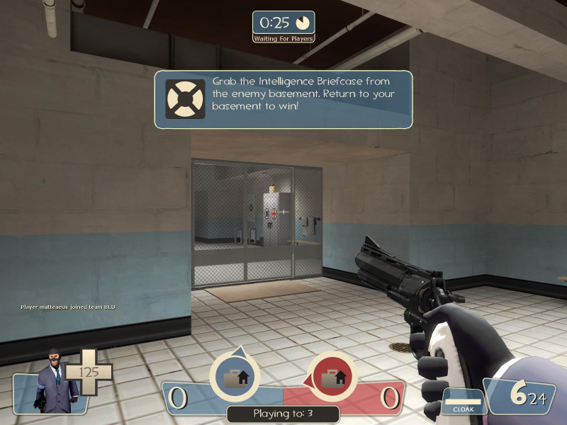
on the top you have the match timer (and alive/dead players + characters after it starts)
bottom left you have an image of you + health
bottom middle there's the progress of the game
bottom right power + ammo.
again, is this bad? would it be better if all of this was in the same corner?

now, you have the health on the character spine, the ammo on the gun and the stasis on his back to the right.
is this bad? would it be better if the info was all on the corner?

top left you have helth + directional buttons.
bottom right minimap, temperature, sound and time of day with weather
would it be better with everything on the same corner?
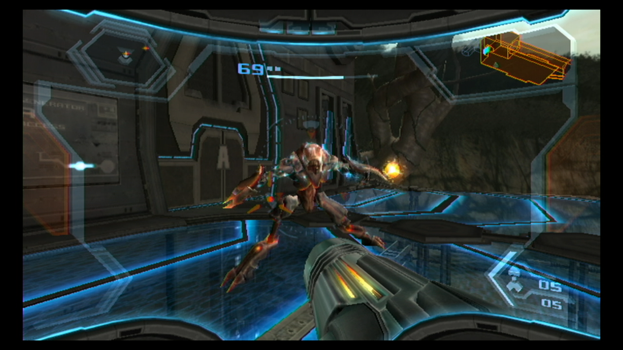
information on most corners again...
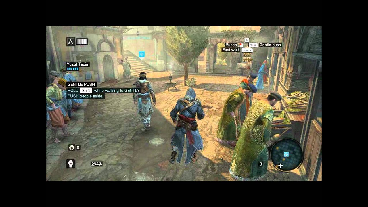
stuff quite literally all around the screen...
do I need to go on?
I'm going on anyway
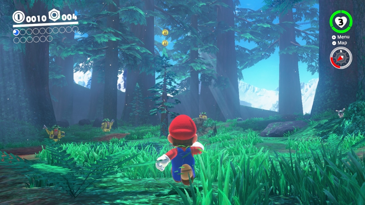
oh look... information on more than on corner of the screen...
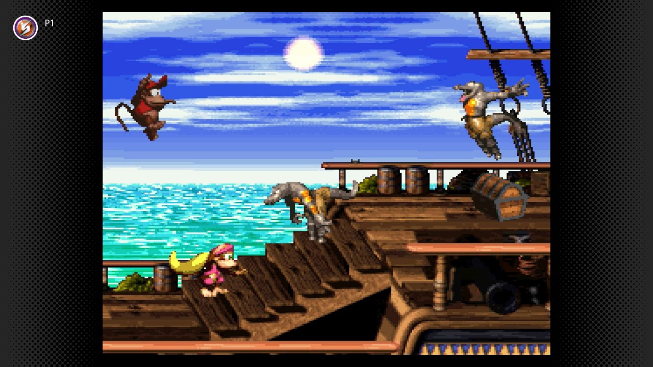
oh look...no information at all until you collect something...

information on the top and the bottom of the screen... on a game that demands fast reaction time to the information on screen... oh wow...
it's almost like most games put the information on more than one place on the screen, and looking at them is not hard...
but instead of showing how spreading the information on the screen is literally the normal thing to do... let's focus on why a optimal hud, is subjective.
back to the dead space screen. if the health and ammo was a number on the corner, it would probably be easier to read, so you can say "that's optimal", like I showed before, having information spread out is not an issue...but let's pretend you have a point here...
you can argue that hacing the hud work in the way it does makes you look around more, increasing a bit the horror part of the game, since your focus shifts to different parts of the screen.
so while one is easier to read, the other is more in tune with the horror feel of the game.
so go ahead. which is the optimal hud? to show it's objective, you gotta be able to demonstrate it's better than the other option in every way
-
@PGJSF said:
https://forum.deadbydaylight.com/en/discussion/comment/1933889#Comment_1933889
No successful game in our times has made an update this big and with such a bad impact and reaction, and survived. The games that won’t die are the ones who keep their core.
halo anniversary edition would like to know your location
-
@Mr_Slick546 said:
It doesn't make any sense, the devs said it has to be vertical instead of horizontal so that you can see all the names. GREAT! why has it been moved to the top left though?
An optimal HUD has all the information you need in one place (bottom of the screen) this change makes no sense.
optimal huds are subjective. there isn't a 1 fit for everything.
-
@Aven_Fallen said:
https://forum.deadbydaylight.com/en/discussion/comment/1933859#Comment_1933859
Its different tho.
Most of the time, discussions come up with Balance Decisions. And this is just logical, the side which gets nerfed wants not to be weaker while the other side is fine with it and vice-versa.
However, when you have something which is not a Balance Decision and there is that much negative feedback, Devs should hear the alarm bells.
it really isn't.
@tippy2k2 put it best
Everything has always been the worst thing that has ever happened and everyone is quitting the game in protest every week. The DBD Forum in a nutshell (hell, I've been guilty myself of an angry post or 10 about wanting to quit forever after a bunch of awful games).
nothing that is happening here is unnusual
-
@PGJSF said:
I disagree. Devs need to see the rage, or they’ll never understand how big they messed up.
this rage happens with literally every single update. it's common place now