
MeltingPenguins
MeltingPenguins
About
- Username
- MeltingPenguins
- Joined
- Visits
- 5,923
- Last Active
Comments
-
I hope that they'll make the hook/mend bar bigger. The layout is fine like this (aside from item/ability being huge, which is weird). It'd be nice if at some point one could pick if the names and portraits appear vertically or horizontally.
-
That's a general and known issue since the update. The hitboxes are either lacking severely behind the playermodel or appear weirdly big/small.
-
@UncleStabby said:
https://forum.deadbydaylight.com/en/discussion/comment/1938562#Comment_1938562
The only problem I have with the layout is how out of the way the remaining objective counter is. Other than that its not so bad to me.
Can I ask what size your monitor is? This isn't meant dismissively, it's where the main issues stem from. The bigger one's monitor, the less effective the new UI is because you have to flick your eyes across the screen for information that before was in one place. And while, yes, you flick your eyes over the screen while playing, you do it in a different way, so to speak
-
A good PTB would look like this:
1 week ptb. one week pause. another week ptb with the updated version. repeat if necessary.
-
@UncleStabby said:
These UI changes are not that bad at all. Being able to keep track of how many times someone's been hooked is so beneficial on both sides, plus as a killer, it really helps to put an actual character to someones name. You guys were complaining alot about this during PTB so I'm just gonna assume that they changed the new UI between then and now, because its really not that bad.
Can confirm that clown rework sucks though. Its too confusing for my tiny brain.
New Survivor animations are gr8 too btw. More believable.
problem is:
You can NOT track how often someone's been hooked on killerside. you only get a total of hooks there. When you have more than one person play the same character the portraits are pointless.
And by all means:
These things are NOT the problem. They are a rotten cherry on top. The issue people have with the new UI is the layout. It's a mess without any rhyme or reason.
-
@Slendy4321 said:
https://forum.deadbydaylight.com/en/discussion/226098/proof-that-the-devs-are-actual-people
Just found this little gem on Twitter
https://us.v-cdn.net/6030815/uploads/J2YD42FA4E6I/img-20210210-170015.jpg
She's literally trying to play the guilt trip game
Y'know, so many people are saying 'the layout is the problem'. Are they really telling us they cannot change the LAYOUT of the UI? Really?
-
You want some fanfic to read?
-
It's NOT linked. Thank heaven's it's not linked.
-
@Mistikus said:
https://forum.deadbydaylight.com/en/discussion/comment/1936986#Comment_1936986
no i want them to be intresting to play but also i dont want them to be that boring to face that you want to dc on them whenever you see em
not an answer. You ought to give us a why you think they're boring to face.
For example:
I think Bubba is obnoxious to face because his mechanics rewards camping and slugging. He can just stand nearby (outside of kindred or with insidious in a lot of cases) and rush in chainsaw swinging when someone goes for the unhook, the mechanic enabling him to mow down two survivors, even with one having BT. (all seen, all experienced). All while people in all seriousness recommend forgetting the person on the hook and 'just do gens', which rarely pans because of how the mechanics (his perks included) work right now.
Or Freddy. He's obnoxious to face because he has no disadvantageous counterplay. He has your standard counterplay, alright, but even that gets disadvantageous with the dreampallets. I've seen people say 'just wake up' like it is a safe-all. Waking up against Freddy will either give away your position and set back your progress (failing a skillcheck, which won't even work if he brings the right addons), allowing him to teleport to you, require someone who already is awake to wake you up (which will take longer and longer each time) keeping you stationary, or has you traverse the map for the alarmclock. While his snares and pallets aren't endless when you are asleep, they have no counter like Trapper's of Hag's stuff. In short, as of now Freddy's mechanic deprieve him of balanced counter. He's not unbestable, but very tiring to face because of the distribution of advantages/disadvantages that are quite skewed to one side or the other.
Third example, Spirit: She theoretically has counterplay (sneaking, hiding, don't go through stuff that moves) but in practice her mechanics don't force her player to play in a way that would really allow for it. So what we often get is phasecamping and an unpredictableness that makes it exhausting to face her, as there's a too little window of time all to often to know which form of counter you ought to apply now. As in: when she's phasing, you can't really tell if she's about to pop up or pass by, as the audiocues are non-existent/too subtle. Means it takes too long to get the information needed to decide whether to run or hide a lot of times.
There's three examples of killers I find boring and why (because by experience my chances against them are significantly low due to how a lot of people use their mechanics), can you give the same for Deathslinger or Legion without it boiling down to 'I cannot run them for 5 gens'
-
@Mistikus said:
deathslinger and legion should get reworked to make them fun to play as and fun to go against
'fun' you mean you wanna remove what makes them interesting so they can be engaged in that dreadfully boring and repetitive looping-juking routine some elitists declared the 'only fun way of playing' ? Naw.
-
@SilentHillOnDvD said:
He's fun for me as a survivor and killer because ik how he works. People make post saying how some killers are boring but never show gameplay on how good of a survivor they are. Ofc it's boring when you're not good at the game.
and usually 'boring' in those cases translate to
'this killer has a mechanic that counter the 'engage them in a chase and loop and juke them until the gens are done'
They don't want to change tactics, always citing how chases are 'the most/only fun part' of the game. Mind you, these are the same people that will run away from Myers or ghostface in an unbroken LOS and then complain about T3, or say Freddy is perfectly balanced because you can engage him in a chase...
-
On the general note, I don't understand why some people still try to genrush against pig. Like, sure, the game will take longer, but for crying out loud, just 99 a gen and wait till no one has a trap on to pop it.
-
Could someone post the meme from spongebob? The 'we did it patrick! we saved the city!" one? Cause that very much sums things up
-
To summarize what I think people want:
UI:
- Change the layout to the old layout. The new mechanics and small animations are fine, it's the layout that is the problem. The vital information was neatly in one area, and that is what so many want back.
- Change the 3D portraits to the stylized adept ones
- Give us the 'how often has this survivor been hooked' feature on killer side as well.
- Make the hook-progress/mend-time bar bigger.
- Change the Doc's insanity animation back to the smoother static of the old UI.
- (Basically bring back the stylized things, they looked neat!)
- Please remove the hook counter in killer side until it has a purpose ingame. Some speculated it's meant to help with getting adept on killer, but as right now Adept still requires much more than just X hooks it's currently superfluous
Animations:
- The new load-in animations are lifeless. While some say it fits with the idea of 'the entity sucking people's souls out' it's maybe a little too soulless and stiff.
- It'd be totally fine if the load-in animations would fit with the character's personalities. E.g. David is probably more like to stand proud than dwight (unless dwight finally snapped, but that's a different chapter)
- The animation for injured running looks more like they are hurrying to get the bus or similar, not as if they are running for their life while trying to keep their vital organs inside their body.
- The nodding looks like... You know when you have like a microphone arm thing or a showerhead that has set positions and you crack it from one position to the other? The nodding now looks like that. (and it's too fast)
I think that summarizes things? Did I miss something?
-
@ClassicSun said:
I know they said they can’t, but honestly if they changed it once they can change it again. And good lord do I hope they do
I DO believe what queen meant was the entire old system behind the UI.
Changing the new system's LAYOUT to that of the old UI or one close to it shouldn't be a problem. And THAT is what people are asking for. We don't mind new features or small animations for the status icons, but we mind the layout (and the parts that clash with the design like the 3d portraits instead of e.g. the adept ones)
-
The reason why people want to know these things about fictional characters whether they are relevant or not is because people want to feel seen.
People want to be acknowledged to be more in a setting than a someTHING to provide 'an important lesson'
Check out e.g. Council of Geeks on youtube, they got some marvelous essays on why people want to know what's up with a character whether or not it's relevant to their story.
-
Does anyone know what that is even for?
People have speculated that it's there to help with adept, but... adept is still a complicated mess to achieve on killer, as it's still so much more than the hookcount.
Why is it there?
-
I don't see a reason to play right now.
Sure, there's some cute stuff I'd like to have on the rift, but with this match of a patch I won't be able to get there anyway. so...
anyone up for Among Us?
-
The entire reward system is broken as all hell.
I'm getting the feeling the devs are putting the groundwork for possible changes into the live code, instead of having that in its own internal version and only put it into the code WHEN IT IS DONE.
For crying out loud, they also somehow messed up the store because they somehow changed a letter in a bit of code that has no business with anything. how do you mess that up?
How do you manage to change bits of code that is nowhere near anything you might replace/rewrite? HOW?
-
We don't need a dbd2, we need them to clean up their code for good and get their priorities in order.
Right now it all feels like they are doing everything to mock the community
-
Some people said the soulless rigidness of the new idle animations works well if you consider the entity is slowly eating away their soul/emotions...
personally...
I'd rather have the old starting idle, and the new upright one as a brief 'eeek' moment when the TR starts. maybe
-
@Madjura said:
https://forum.deadbydaylight.com/en/discussion/comment/1933303#Comment_1933303
make the items/abilities smaller and we're fine.
You can make everything smaller in the settings, there is a scale slider for that (Steam version, no idea if that's also a thing on console).
The best option really would be add an option to customize the placement of the elements somewhere, then everyone can build their own HUD. Maybe add an option to remove certain elements if someone doesn't want or need them.
https://forum.deadbydaylight.com/en/discussion/comment/1933238#Comment_1933238
A TV screen is much bigger than a PC screen (90% of the time it is, some people have huge screens for their PC games). Before it was all clustered together for information. Now it's all over the place
It seems like a lot of people who dislike it have big screens / TVs. Have you tried changing the scale in the Settings menu to see if you can find a value that improves it for you?
I meant 'make them smaller in relation' (and i'm on 100% on the scaling and a lot of elements are hard to read for me.)
-
I start to wonder if the devs think that when we say
'the new HUD is a bloody mess because it's all over the place'
we mean
'we don't like any of the new features it supposedly provides'
Dear Devs:
We don't mind the new features. It's the all-over-the-placeness and the clashing designs.
Give us the old HUD layout, give us adept portraits, make the hook time larger, make the items/abilities smaller and we're fine.
-
@OniWantsYourMacaroni said:
At least 4 pople are enjoying the update i guess 😧
eh, I think two are the devs on fake accounts...
-
The entire HUD redesign smells so of 'let's make it esports ready'.
Which raises the question: Why force it on the actual players? Players need vital info:
Who is injured/hooked, what's their hook state.
All these things they seem to want to add etc sounds so much 'oh yeah, this is for a spectator to keep track of points'... Just... put that into a spectator mode in customs. Tournament matches gonna be played in customs anyway.
I haven't checked what the spectator UI looks like, but for crying out loud...
This is really, throwing things at the wall and either not waiting what sticks or using what broke.
-
@TheClownIsKing said:
Serious question.
Because as someone that plays killer a lot the new UI isn’t causing me any issues.
Why?
As a killer my eyes already were darting around the entire screen all the time anyway looking for movement, scratch marks, and crow activity, especially out of a chase.
Like... to me this is something every killer should already be doing. So what’s also moving your eyes around to new HUD placements?
So I have to ask, seriously, are those experiencing problems players that never play killer?
Playing both and it's a mess on both sides.
The thing is now that your eyes flick more. As killer and survivor the main attention is on the central row of a 3x3 grid, occasionally flicking to either corner with the old HUD. with the new one you flick your eyes around to pretty much all sections of the grid (3 places for three different bit of info that were condensed in one sector before)
-
Stop.
People have been giving constructive, informative feedback about what about this patch needs tweaking/fixing or ought to be done from scratch during PTB. Plenty of it.
They said what is good, they said what's bad. They wrote long explanation as to why the new HUD is not well done, why the new animations need polish, where bugs are.
And then the devs went and fixed... nothing, by the looks of it. Maybe a handful of minor bugs. But the big issues? The HUD and the animations?
There they went and claimed 'they want to hear console players' opinions about the new HUD first'. And now that many, many console players raise the same complains as there've been on the ptb, the devs apparently shrug and say 'there's no going back now'.
So, we have the right to be angry for good.
-
Made my own mockup yesterday
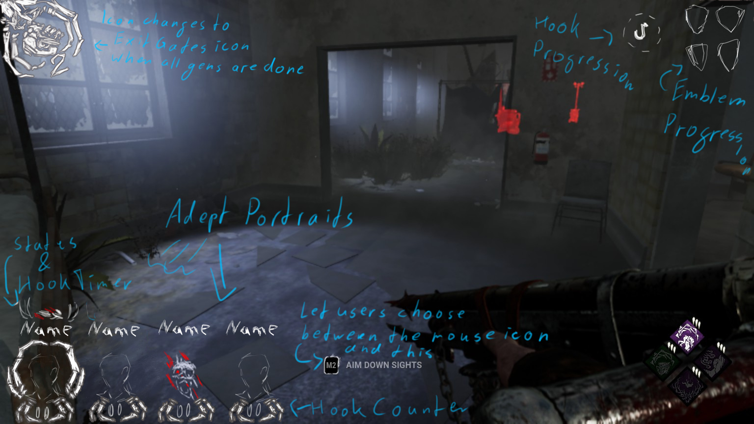
(gonna rework it later)
Basically what this does is:
- Changes the design but not function to the old-ish layout.
- Survivor info is again condensed in one area.
- The status info could either be above the portraits (as shown) or overlayed unto them, with the portraits (using the adept pics as seen above) becoming semi-transparent.
- I'm not certain the killer's hookcounter would be necessary, as it only counts how many hooks you made in total. As that feels only relevant towards emblems and challenges, this goes into the emblem progression.
- The esc menu would have a more detailed emblem progression, as the esc menu allows for mouseover info (careful not to accidentally dc)
- The Items/Ability would go with the perks
- There could also be a totem tracker for survivors where the 'instructions' are on the current in-game HUD
-
People have pointed out the onslaught of issues with the UI on the PTB already, and nothing has changed for the better. Instead the devs went and said 'we want to hear what console players think'. And they hate it too for the exact reasons people named for the ptb.
People have offered dozens upon dozens of suggestions on how to fix the UI, have asked for what the devs are going for here and were met with silence.
The community has rarely been so unified about something as it is about that this UI is not a good thing and is ought to change back to something useful and less straining.
In short, what people hate about the new UI:
- It does not provide vital information as effectively as the old layout and the new layout is migraine, etc inducing to some
- It puts focus on all the wrong things (the hook timer is tiny even on biggest scale, making it hard to judge how much time yuo got left to unhook someone before they hit struggle etc)
- The portraits and new images clash with the stylized bits.
- Unnecessary things like the hook wheel on killer side that feel superfluous
-
@LapisInfernalis said:
https://forum.deadbydaylight.com/en/discussion/comment/1929507#Comment_1929507
I love this one.
This is my idea although some placements are not optimal either:
https://us.v-cdn.net/6030815/uploads/QP9JQH05P2KP/hud-ideas.jpg
f.e. I would switch my placement of Power/Item with the scores. No-one needs to see their points all the time.
Key:
green=looking there very often
yellow=looking there to check perks' cooldowns f.e. DS
orange=needs a glance sometimes
red=why do I need to know that again?
I think EGC is some semi-vital info cause it can help with judging if you got the time to try to go for a safe/heal or if it's too late
-
You can ALWAYS revert back to an old UI design. If they say they can't they are counting on people not having the slightest clue how programming and graphicdesign work
-
@pixelfixed said:
less is always more in design.
i feel like the major problem with behavior is that no one at that company is actually competent at playing their game. this is a game much like chess; it literally takes thousands of hours of play to reach any sort of skill level. they need to have a mandatory 10 hours a week play time for all employees working on the project. after a year the updates might become better/useful.
The New UI feels drastically as if it is solely there for someone watching to judge the game. As in it's intended for esports. And then they apparently went and made the audience UI in custom matches even different.
Like... why?
-
@pixelfixed said:
@MeltingPenguins your markup is just about what they're going to have to do. they're going to (or lose half the base) put it back, raise up the players and put the useless "hook counter" under it.
as everyone already knows, if they're insistent on images they'll have to use the adept pics. it's the only choice. how those colored pics actually made it into the game is so colossally stupid i'm at a loss for words.
your "states & hook timer" would have to share the same screen as the images somehow, like before. it would eat up too much screen real estate on top.
your "emblem progress" is a very interesting idea! as it's not required information, one could look at it at one's leisure. big thumbs up.
Now I'm wondering... I have these claws/tendrils there around the hookcounter. Would it make sense or be too clustered if THEY would double as hookcounter with the statuses between them. Like they'd go from semi-transparent to white and then snap inwards when a survivor dies.
Or have the 'hook counter' underneath the images as two tallymarks and have the portraits desaturate and go slightly transparent and overlay them with the statusicon?
-
I posted this in another thread (as you can see, I currently can't make new threads (I did nothing too bad, just been swearing a lot)), and I'd like to take the opportuniyt to ask your opinion as a graphic designer if this would be better:
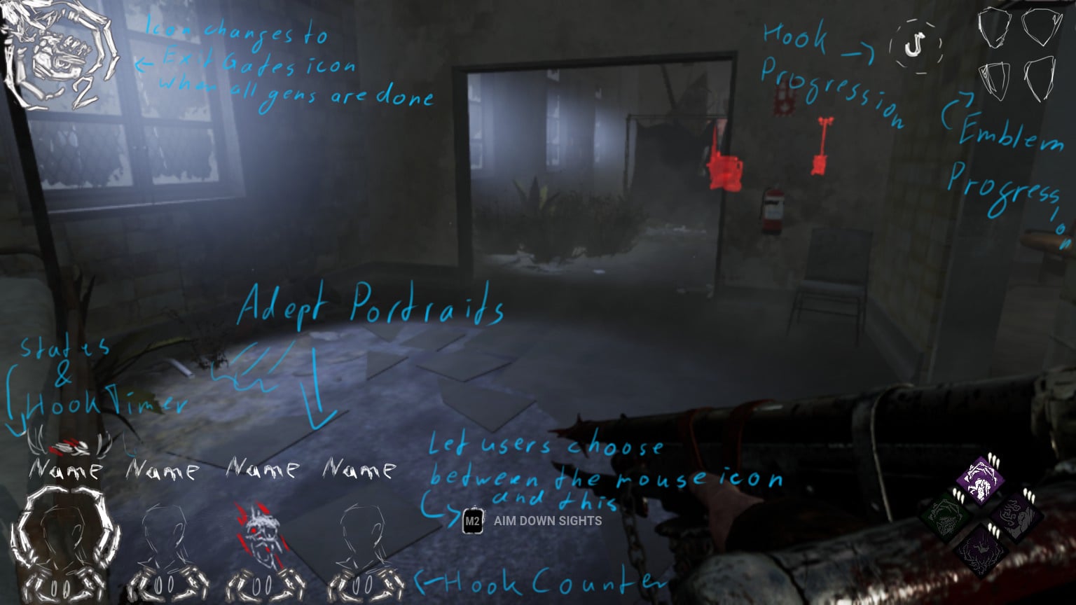
The items/ability would either go with the perks or where I put the circular hook progression right now.
As the circular hook progression is on the new HUD it seems to just be there to tell you if you got enough hooks for an iri emblem, which here would be covered with the emblem progression.
-
@Palum said:
yes pls. It looks like an Mobile HUD
funnily enough the UI of mobild dbd looks better than this
-
@NickChinchill said:
https://forum.deadbydaylight.com/en/discussion/comment/1929543#Comment_1929543
I'd say that emblem progress is something most people don't need to see during the match unless they're trying for certain achievements - otherwise you should be focusing on just doing what's required in a match rather than watching your score. While having a Hook Counter is valuable info on both sides of the coin, it does change how players approach a situation and how they might act. I'd personally pu item/ability info with Perks on your HUD idea, since then it's grouped together; your perks/abilities/item on the right, the survivors and their condition on the left. And then maybe put Hook Progression for Killers by the Gen Counter/Objective since that's their objective.
The with scratching the hook progression (the circular one) was that as it is in the New HUD it feels as if it's there TO tell killers they got enough hooks for an IRI emblem, as it (the circular one) only tracks how many hooks you got in total.
Putting items/abilities with the perks sounds good.
-
@NickChinchill said:
https://forum.deadbydaylight.com/en/discussion/comment/1929507#Comment_1929507
Really digging this HUD design sketch tbh! Nicely done
Thanks. You think it'd make sense to put the item/ability where I got 'hook progression' on that? I mean, how many hooks you got as killer would be covered in the emblem progression. (which i dare say is the better way to get the information needed to go for adept. There's a proper hook counter per survivor at the portraits anyway)
-
@Exerath1992 said:
I like it, you guys are just too lazy to train your brain to look where you need for the information you're looking for
Wrong.
If you have to flick your eyes all over the screen to get vital information, drawing your attention away from the mainfocus of action, it's simply badly designed.
'training the brain' is one thing, but a cluttered mess as the new HUD has nothing to do with this.
Like, I took a few min to design this:
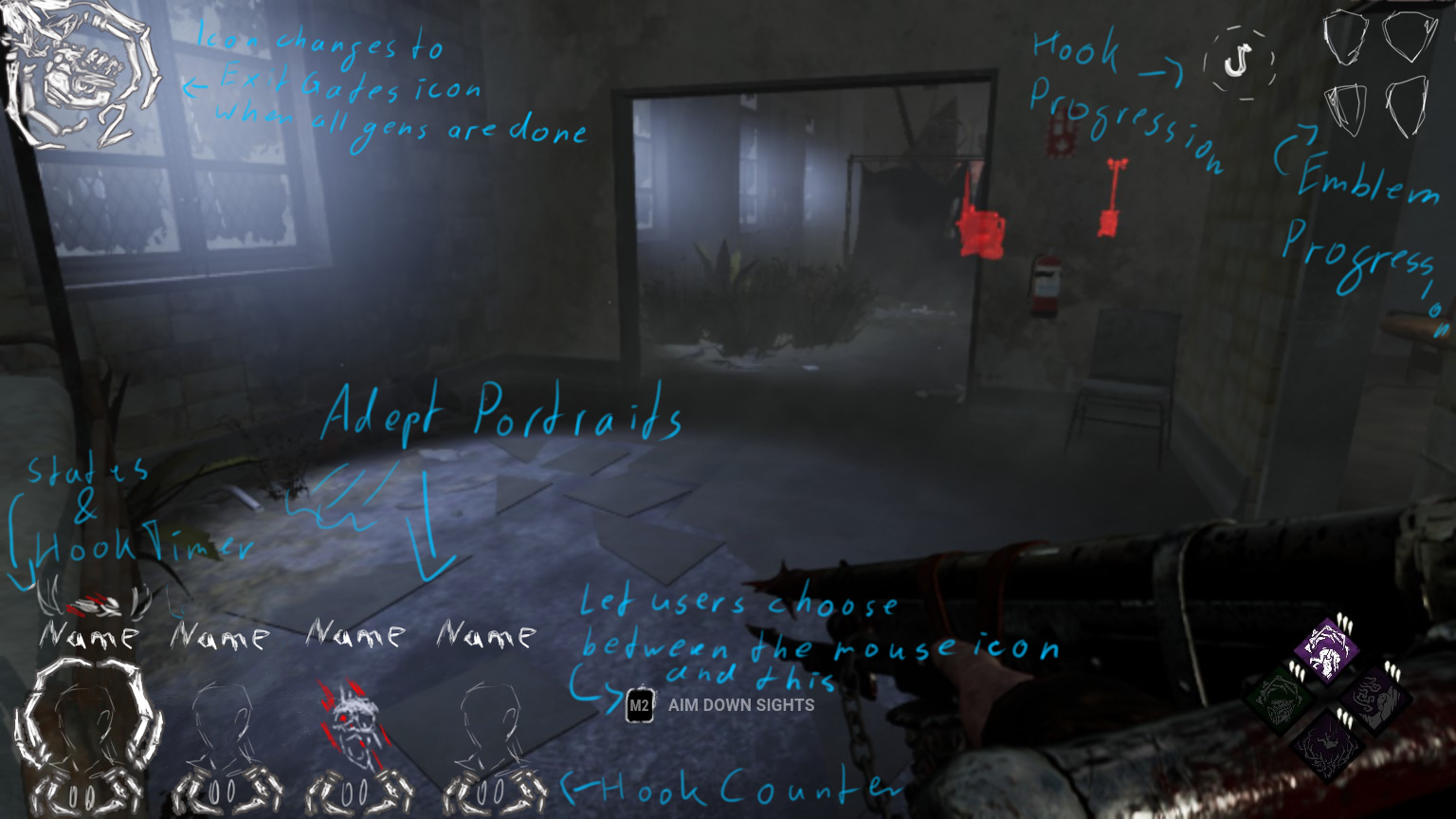
it's not perfect and incomplete yet (items/ability missing for example) but I dare say that this would be a better idea than what we got.
-
The new UI is a mess. Tried my hands on a better design if anyone wants to see (can't make a new thread atm)
-
Even on 100% the UI is so TINY. The hook progress on survivorside is nearly invisible because it's so small, making it neigh impossible to time rescues, and the hook progression killer side is... how am I supposed to read that even? What is it for? Why?
The characterportraits are useless and the names are barely readable (again, tiny), directly proving the patchnote about 'making it easier to read across all platforms' false.
Not to mention that it just does not feel right for the game.
-
@supersonic853 said:
Thanks i hate it. I have to look everywhere just like i had to on the ptb on my pc.
Is the text readable at least on console and can you see the hookprogression as survivor) ? Cause Hell knows it ain't on pc. It's so... tiny no matter what you do.
-
@apathyinc said:
Maybe the new HUD will help address the console frame drops.
Not entirely certain, but the new HUD calls for more operations I think. this might negatively impact frames. It's been a while since I been coding with graphics
-
@lowiq said:
https://forum.deadbydaylight.com/en/discussion/comment/1926583#Comment_1926583
I disagree. Announcing something creates the expectation that it will be completed. Providing half-assed announcements about things that may or may not be completed is not managing expectations appropriately.
As I stated earlier, I believe the devs are just as deserving of blame. However, the issue isn't that they aren't working with the community, it's that they take too long to make changes and don't always provide rationale behind their changes. This creates the perception that they don't care enough about the game.
I'd argue the 'it takes too long' and 'they should tell us some things ahead of time' can work together when they'd announce something the moment it is more or less something concrete. Pragmatically speaking they ARE doing that with the map updates, and it might help a lot if they'd give us more sneakpeeks of things they have nearly done.
And I'd still say that with features such as the colourblind mode they should have said 'we are def working on it, but it'll take time' before, instead of coming across as pretty dismissive towards it.
-
@lowiq said:
Have you read some of the things people write about the developers of this game?
The community is just as much to blame as the developers as to why we can't have nice things.
On the other hand, the devs often come across as
'people are pointing out things that make the game genuinely frustrating to play, driving people away, let's make fun of that'
or
'people are almost begging for certain (basic) features/fixes and are getting frustrated that we appear to not even acknowledge that. let's not tell them we are working on it and instead let them get (rightfully) angry cause we come across as aloof'
The colourblind mode is a good example. It's something that should be shared to the community, even if nothing really comes of it. The idea to withhold information like that because 'people would get angry/disappointed if it then doesn't happen' (this is what it seems like) boggles the mind when not saying anything gets people just as angry/disappointed.
-
@kynac said:
I think im going with "The King" 's theory. He said that the survivors killed people and were horrible and the killers suffered so they get their revenge.
Kind of like a reverse in roles kind of thing to feed off pain and suffering
I'd say the better theory is the alternate timelines one. (I mean, c'mon, the trailer literally spells it out) The survivors we know weren't horrible people (no saints either, but you catch my drift) and neither were most killers (see the threads about how many killers got tricked into serving the entity). The entity picks them because they have the biggest potential when pitted against each other.
The killer!yui and her other selves might be some... training ground? Like the entity checking if these alternate versions of what it's got already are worth it?
So this might be a hint to a roleswap chapter? maybe?
-
@ASpazNamedSteve said:
Definitely Doc and Clown. They live to make others suffer.
Wasn't Oni super brutal and petty too? Can't quite remember.
Which killer sees the survivors as who they are and who doesn't. And who has other motives?
Sees someone else for all we know:
Wraith (for all we know)
Nurse (possibly)
Huntress (potentially)
Oni (likely sees them as the farmers and lords that insulted him)
Deathslinger (sees them as Bayshore, the warden and others who wronged him)
Twins (potentially. Might go into the second category as well)
Kills to survive/protect someone:
Trapper (arguably)
Hillbilly
Hag (for all we know)
Bubba
Plague
Blight (The Entity supplies him with serum in exchange, iirc)
Kills for killing's sake and sees the survivors as what they are:
Michael
Doctor
Freddy
Pig
Clown
Legion
Ghostface
Other:
Spirit
Demo
-
Doctor and Clown.
They both see the survivors for what they are, unlike Deathslinger who sees the survivors as the people who massively wronged him.
Bubba has the whole 'trying to protect his family' bit going, hasn't he?
-
In-universe your explanation's likely correct, out-of-universe these are likely early designs for Meg, jake or dwight, and claudette
-
Question: How exactly is it meant to 'prevent accidental tunneling'?
-
With Freddy I'd argue that the way he's now he's not OP, but his counterplay is imbalanced in terms of advantages and disadvantages to one side or the other.