Why the new hud is worse then the current one shown with an example.

before i start yes i just took screenshots and used MS paint and it's poorly done but really this is all I need to get the point across.
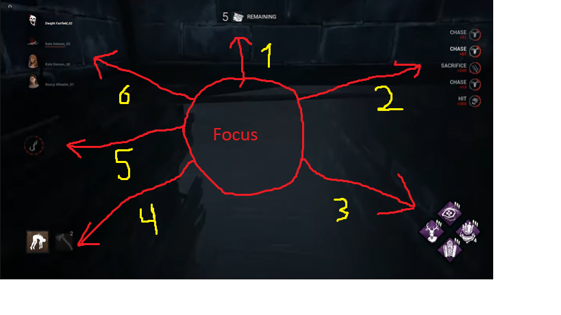
As you can see there are a lot of things on the hud you need to look at, you can ignore # 3, 2, and 5 but the gen icon, survivor states, and your power are really far from each other. this makes it so if you want to check everything or your easily distracted by your hud you have to go all over your screen to check everything. now lets look at the current hud (again just a screenshot from YT)
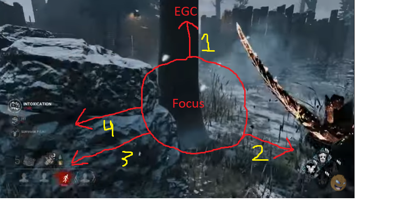
As you can see there are way less things you need to look at in fact most of the time you only need to look at #3 which has the survivor states, gens, and power all nicely compact into one corner. you rarely have to look at the EGC timer, points, or your perks but the point is all the main things you need to look at are all together. If they really wanted too they could even put in the hook count right next to the power icon to make it even more compact.
My point is the new hud is simply too spread out and is not user friendly, they can fix this in a few ways.
- They provide better locations of these icons, they could even give us multiple options for their placement or even let us put them where we want.
- They let us switch back to using the current hud and as suggested simply put the hook count next to the power or somewhere else. Many of us like the compact placement of the icons it looks good and provides all the info we need to know throughout most of the game.
- they can give us a mix of both the old and new hud's. something like simply replacing the old icons with the new ones, this could also be paired with the 1st suggestion as an option of how you would want the hud to look.
Edit: A lot of people also don't like the new survivor portraits and after seeing them a few times i agree, the current ones are fit the feel of the game better and are also more practical since you just have to glance at them to get info while with the new ones you have to check if they are flashing red which both looks bad and feels lazy. There is also an issue that causes for color blind people since they might not be able to tell at all if the icons are even flashing red. Also as a lot of people said it feels like those portraits belong in a mobile game, they just... don't look right.
Comments
Whenever I look at the updated UI. I feel like I'm playing a mobile version within the mobile version of DBD with either a Keyborad+Mouse or a Game Pad.
Also, you guys should make the pictures for every survivor (hud-wise) black and white (like unbreakable), it just doesn't fit the aestethic with all of these colors
I actually saw a post on reddit that did something just like this! All they did was keep the old UI and replaced the default portraits with the Survivor's adept designs. I thought it looked much better than the new UI.
Edit: Here's the link
Haven't read all comments, but I also dislike the new layout. Of course there is a big chance of just habit (human nature) disliking change, but also just generally you shouldn't be changing interfaces that don't have any issues. I don't see how the new layout should be better than the old.
For example why did the bloodpoint score events move? The only reason is, the killer hook counter pushes it away. This now requires the player to adjust for no reason. Is there any reason why the hook counter needs to be there?
Does anyone know about the status effects? The BP scores list goes down quite a bit, looks like it is overlapping with old status effects. Did they move too?
Why is the generator now in a separate spot? Why not having all objectives at the same location?
I also disagree with the explanation "only game progress for killer is regressing gens, which is frustrating". The killer progress is when the survivor icons turn into skulls. Give the killer the hook counter as well and you have more killer progress added.
And all the good changes (hook counter, personal hook counter, survivor portraits) don't need a HUD rearrangement. And overall, I don't like the long text blocks like "prevent survivors from escaping". This looks like a tutorial. I really think the icon of a hatch or the word EXIT is everything you need
The info is spread all over the screen and causes clutter, instead of the clearly defined areas we have now. We will have to look around all the screen to gather info that is accessible in one glance in the current layout. The injured icons are harder to see. The score events have been moved for no reason.
Overall, the same additional info could've been introduced by slapping it on the current HUD, that nobody was complaining about, because it has a functional layout.
It horrible the neq layout. I dont wanna be looking at top left of my screento see survivors. I want bottom left as its much easier to see.
They should have juat added talliwa to the current screen look.
Idk who came upwith this layout but in my honest personal opinion it looms terrible.
Definitely not a big fan of the new UI either. At first I thought it's just the "getting used to change" part that's making me unconfortable, because let's face it: We humans don't like change. When the EGC first launched, I wasn't the biggest fan of it either but now I think it's a great addition to the game.
So I focussed more on being objective with the new UI and yeah: There are good changes. Seeing the hook counts and what player is playing which Survivor is definitely a great addition that can help Killer as well as Survivor players. And as somebody who visual feedback, the Killer's hook circle is a great idea to keep the Killer motivated and show his progress instead of just the generators that are ticking down like a time bomb.
However, the more I looked into the new UI, the more flaws I've noticed. As OP has already stated and demonstrated, the UI elements are all over the place. Searching for multiple kinds of information like Survivor health status, active perks and generators left, in order to decide on a move now takes a look in three different directions all across the screen. The new UI isn't very compact and the placement feels almost random.
And then are the new Survivor images. Personally, as I said before, I think they are a neat improvement, however, they don't exactly feel like they belong there from a design perspective. Everything on the UI are (possibly vectorized) 2D icons. The Killer's power is an icon, the Survivor's items are an icon, the perks are icons, the gens are icons. But the Survivors are represented by rendered images. And then, weirdly enough, once they disconnect or die or are downed... those images are being replaced by 2D icons again. Do you see how that's kinda weird? As other players have already suggested, using the Survivor icons that are already in use for the adept achievements would make a better addition and would feel much more cohesive in the new, or even the old UI.
Personally I'd say, just add the new elements into the old UI. But of course, that's might result into more problems and having the work of the UI designers run into nothing might feel kind of disappointing. I'm not against the idea of a new UI at all. Because the current UI CAN be improved... but this UI simply isn't the right change.
I'll repost my quote from another thread
-
The new UI reminds me a lot of when dota2 redid their new ui - I genuinely hated it when I saw it but they revised it about 5 - 6 times until they got it right.
I do genuinely hate the looks of this one. Everything looks big like it belongs on a mobile moba game and it's spread apart everywhere. I want to be able to just glance at something to get an idea of where it goes and not have to constantly scan my screen for info. Not saying the new UI is terrible but like it looks so unfinished. The survivor icons would be cool if they actually showed the cosmetics the survivors were wearing at least headgear if it's going to use face portraits. Aside from that everything looks too clean and pristine and lacking thematically. The current portraits while basically just a silhouette are more defined than just taking a snapshot of the current survivors and placing them in a generic orb.
-
The only thing new about the hud I like is the new placement and appearance of the score events. That's about it.
That is pretty much exactly what I had in mind when I wrote that! It's great to have a solid visual alternative floating around, thanks!
I really hope that between the backlash and the genuinely constructive criticism the team can incorporate the good stuff and ditch the bad.
As someone who plays this game and only sees out of one eye, having the information all over the place makes it much harder on me to see what's going on. Please try to make this game more accessible
Don't let this thread die everyone when the PTB comes out tomorrow and make sure to tell the devs and mods that, no, it's not better when you play it, convince them to not make it go live, at least do it for colorblind people who wont be able to play it anymore if it goes live.
I just made some mockups too for a post about streaming and why that affects us a bunch too. Not only is it really hard to use, but it breaks all streaming layouts! There's no simple way to fit elements in there easily.
It feels like the biggest complaint is how the UI is all over the screen. I'm hoping that more streamers that bhvr uses for free marketing will be very vocal on how it hurts them so that they hold off pushing out this new HUD and make adjustments.
I hate to have to focus everywhere. What was bad about the old one? Did people complain about it?
I gotta say, seeing them side-by-side, I agree, it's too spread out.
Minimum Solution: Allow us to choose which UI style we want - the old, or the new.
Ideal Solution: Allow us to independently set the style, the position and the size of each element, including disabling individual elements or the entire HUD for those real hardmode players that like to be completely immersed. I know I say that as if it's some easy flip of a switch but realistically, allowing the users to make it exactly the way they want is the only way to satisfy the whole community. It's worth investing your dev time to make 1 solution that is acceptable by all rather than a forced take-it-or-leave-it approach that clearly will be divisive.
No they just want to change it because they are changing the overall look of the game like with their map reworks.
The thing is not EVERYTHING needs to be changed, they also said they want to add new things to your hud but what i fail to understand is why can't they just add it to the old hud. Ironically there is actually more room to add stuff on it then the new hud.
I think the criticism is blown a bit out of proportion but still to a degree true. First, we should give the new hud a chance (i am rank1 survivor and killer with 1000 hrs, so i am kind of invested in this game too).
I personally have no problem with the information split up. to a degree: that interactions that give bp are now at the top right is irrelevant, the new hookcounter is nice, but not a point you will look often. Perks stay at the same place, but survivors and gens completed are now split up. I think these should be in close proximity on the screen, i look at them both as survivor and killer a lot, because they show the pressure either side currently faces and how the game goes.
So my suggestion would be to move the gens completed from top middle closer to the top left. Other than that i would argue that it is fine.
the problem is there isn't a good reason for all the important info to not be located together, while your right it won't have much impact on games if any at all it is just REALLY inconvenient and ugly for everything to be split up like it is now.
After thinking about it for a while, i have to agree with the sentiment in this thread. In the new UI- everthing seems to be split up all over the screen and i have to agree that this is too much. I am not against change and i would not have a problem if some things get split up, but everything and all over the screen? It seems like they completly changed their design philosophy almost.
RE3:R hud
so your suggestion to stop people complaining about the HUD being all over the place... is put even more stuff on a side of the screen that's already filled with info ?
that sounds bad
I'm personally not a fan of the new design either. I don't think there was anything wrong with the old layout. Why fix what wasn't broken? I'm not a fan of having to look in every corner of the screen to know as much as I did by glancing in one corner before.
I feel like some of the new information is a little unnecessary too. I didn't need a hook counter for total hooks states, I'm not going to stop trying to hook people if I know someone is still alive. If it was, say, a strike next to each player name, representing how many time's they've been hooked, that would make more sense. But right now, it doesn't serve too much purpose, other than to clutter the screen.
When the gates are open, the "stop survivors escaping" isn't really needed either. The whole purpose of the killer is to stop them from escaping, by hooking them.
There's also a few people saying players are just complaining about the new layout, as if it's unjustified. I can't agree with that. If you like the new look, that's great. But I'm not really seeing much benefits to the new version, over the old. There are some "nice to haves", like seeing which character is being played by who. But it can't have been needed, if it wasn't a problem without.
The new layout might be fine now, but it's still inferior to the old. A few things being better, doesn't really make the whole thing better.
Please mods can we get this pinned? It took serious sifting to find this gem of a summation of what everyone is complaining about? It's amazing that all of this feedback was given months ago.
It's not about getting used to it, this isn't like a new killer or something where it takes time to learn them to their max potential. The new UI's just abysmal, it completely ignores the rules of UI design (which have been created because they're true)
UX/UI Designer and Animator,
You do not understand the user experience.
Please leave the company You are not suitable for this position Because you are terrible at designing.
Thank you.
Wow this has aged horribly. It was so funny to see the chosen few shill for the HUD during and directly after the ptb. It was like the vast vast majority of players were all morons who couldn’t differentiate between good change and bad change. nice job. The game is in a wonderful state atm because it’s filled with sycophants who work there and think exactly like your comments.
keep thinking your player base are all idiots who can’t have an original opinion.
trolllollolol
An opinion over this UI is A: "It looks good" and B: "It looks bad"
just because a vast amount of players choose B which you disagree with doesn't mean we are idiots. Also opinions over this will usually take this form in one way or another which is "is it good?"
In features yes this is an improvement but that is where it ends as this UI just looks bad. It doesn't matter if you disagree with this or not that's your opinion but opinion A is far outnumbered by opinion B.
Keep going with that. Meanwhile in steam alone the game lost 10,000 players in the last 24 hours.
Nope. Not even 5000. In Europe it is the middle of the day and there are 41000 player currently. Thats pretty the same number as before.
i just played 3 matches as a killer, first time with new HUD... its sooooo annoying, like, really, i cant focus on whats in front of me if i want to keep track of the gen and survivor status. The killer literally needs to look like crazy all over the sceen the whole time. Not gonna lie, i dislike it alot. With thousands of hours spend in this game... i stopped enjoying it. Just my opinion thou, but maybe, just maybe... give the ppl a choice? Changing to the old HUD if they want to?