4.5.2 HUD Update Feedback

So, I'm a fan of the updated HUD, but I still have a couple of issues with it.
My main issue with it is that if a survivor has no item, there's dead space under the objectives and it doesn't look great... It's not terrible on a smaller HUD scale, but still, it just doesn't sit right... I rarely bring items to trials and it's disappointing to think my HUD will look like this most matches:

My next big thing is the portraits - I'd still love the portraits to be the adept achievement icons rather than full colour portraits. I'm still hopeful that this will be implemented, someone tweeted the devs about this after the first WIP screenshot of HUD update and both the author's tweet and BHVR's reply got around 1500 likes each, so it seems a lot of people are on board with this idea - maybe it just couldn't be implemented in time for the hotfix? The full colour portraits just make it look like there's too many styles in the HUD, and the adept icons would keep it a lot cleaner.
The names being vertical instead of horizontal still doesn't look as good, but seems as though the devs want it to stay like that... It feels like it's in my field of view and is quite obstructive, more of an issue when playing killer.
It would be helpful to still see survivor portraits even when their status has changed, for example if one survivor is hooked and one is downed, you don't know who's who because the portraits have gone. Not a major issue as you can listen out for the screams, but would be a 'nice to have' kind of thing, if possible.
When the generators are completed, the escape icon looks odd being in the middle of a box, and overlapping it at that. See below. Also, the old 'Find the exit' text in the HUD prior to 4.5.0 was fine, and it wouldn't hurt to put that back in next to the escape icon. But, it's fine without it, too.
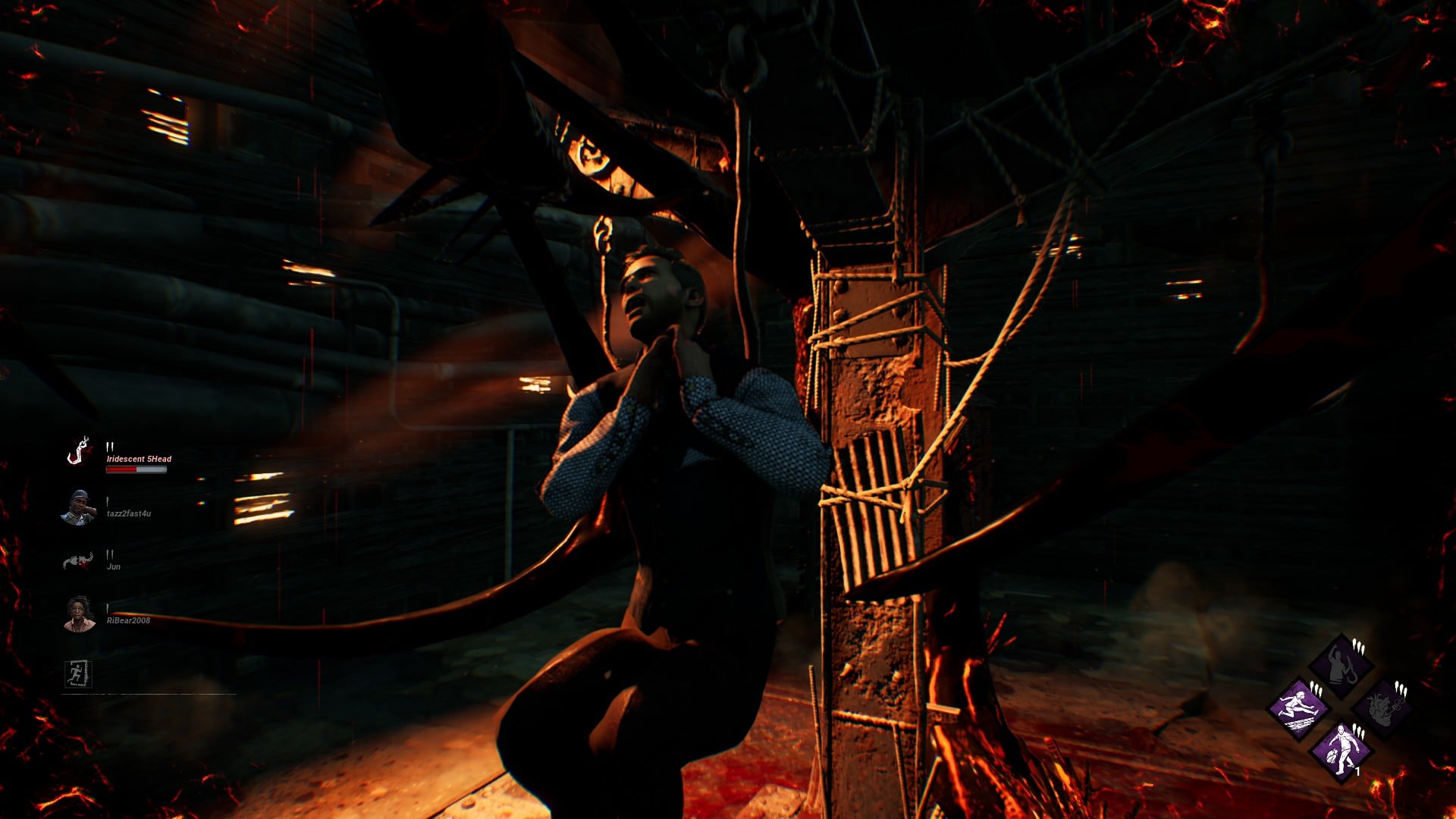
On the plus side, the number next to the gen icon looks great being more visible, and the new bleedout bars look great! Skill-check scaling was a great implementation, too.
Overall, this HUD was definitely a step in the right direction, but it definitely could use further tweaks, most of which I've summarised above. Just my personal opinion. :)
Comments
It was semi fine change. But yeah, I still don't get why there isn't adept achievement icons (which isn't issue here now, but...)
...why icons aren't positioned horizontally? You'd do that, you can re-position event scores back to where they used to be?
Other than that, it looks decent.
and BHVR, I haven't been playing your game in for what? 1 month? I was seriously protesting, not just talking crap.
I can give this a chance, but my negative feedback on Steam STAYS.
they're still in the middle of the screen... how do they not see the problem here?
I never bring an item unless I’m doing a challenge (extremely rare) so that’s ######### disappointing looking.
One of my biggest problems as a solo player was the removal of the survivor’s red health bar flashing when they were being healed up by a teammate or picked up by the killer, did they add that back in?
honestly they're both pretty awful. Im not sure which is worse yet, I haven't played with them in the center, but I can't imagine this will be significantly better. Id have to assume it would be a bit better, but it might make looping VERY uncomfortable. Honestly I still see no reason to move it from the bottom of the screen. The bright aspect of it is also very jarring. I always turn over my phone when I play, bright colors are a bit distracting in this environment. I've literally just set them to the smallest GUI scale and have been trying to ignore them. Its awful, and has been causing a lot of issues with managing certain killer abilities, but its more comfortable than trying to manage this
not sure if anyone else noticed but when 4.5.0 was released you can see your name normally in-game even if you had special characters (japan chars, etc.) in your name. This has been broken since 4.5.1 I assume.
Good job BHVR.
Giving killers the same hook UI as Survivors is still on my wish list of future changes
Honestly the new HUD for killer is fine, but for survivor I wouldn't mind if they lowered it just a little bit.
80 points became 20 points, and now 60 points.
Still, thanks to their sloppy response and ignoring the voices of PTB users, the rating is even lower.
Character icons should have been horizontal at bottom left and all other stuff on top
I haven't seen it, no. When I was being carried by the killer, that previously would have made my health bar flash, but it didn't now.
Guess I still won’t be playing then. How disappointing :/
can i be honest? i prefer the 4.5.0 hud. i like it better when the infos all over the place
I mean, there was a time in the game when that didn't exist and people got along just fine, but if that's how you feel then fair enough :)
Im aware. It was a small addition to help the gap between swf and solo and to not have it is just stupid and only makes me want to keep playing in sweat squads if they’re gonna do that.
Not sure if you've seen but this issue has been fixed in the 4.6.0 PTB! So it'll be updated on live servers in the next update :)
I don’t understand why they insist on keeping them vertical. They take up a lot of screen space. It would also help with that big empty space you see when you don’t have items. And I agree that the portraits need to be changed.
McLean (dev) said in one of his streams recently that this HUD was stuff they could do to immediately address feedback, so further changes will be coming. Hopefully one of them is to put the portraits back to horizontal!
I hope so.