Plenty of unnecessary UI changes this patch. Please revert!
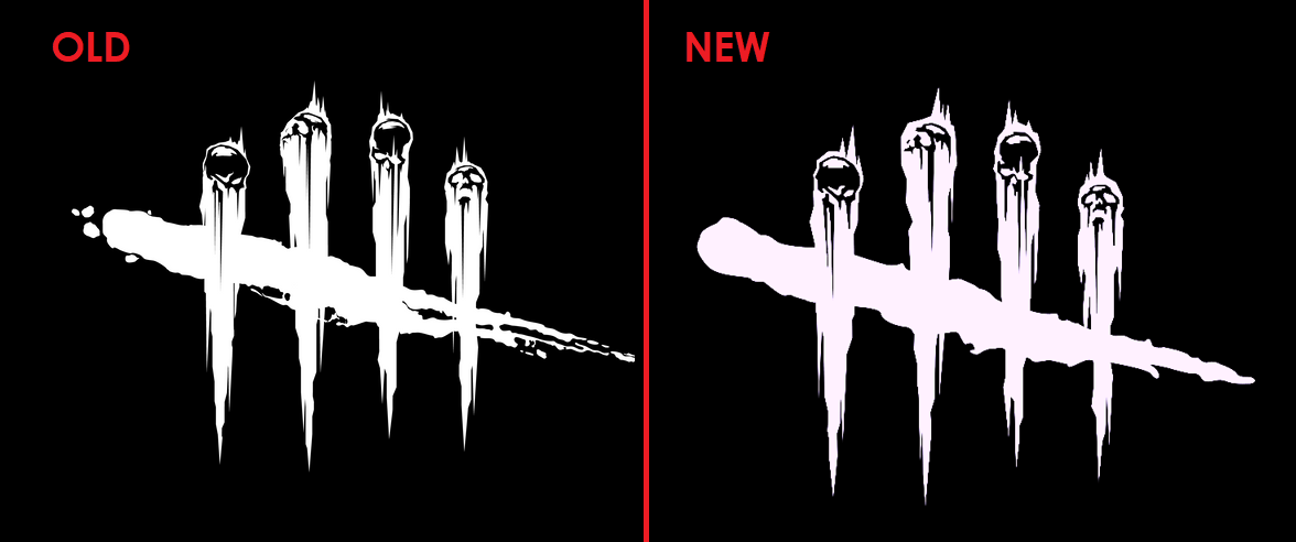

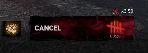
This patch is filled with a ton of unnecessary UI changes. I don't understand why the team keeps making drastic UI changes that aren't in the PTB. The font changes and placement on the survivors in the lobby, the big ugly red background on the ready button that doesn't make a unique noise anymore, and it doesn't even show an estimated queue time anymore (which also happened on the PTB, so at minimum this should've been fixed). This photo was posted on the subreddit earlier today, and the loading screen logo is just so ugly and too cartoony; the original one was perfect.
Comments
The only one that I thought was a positive was the hook states when in game, otherwise I think they all look bad
Sadly they do it anyways.
I still miss my Next and Previous buttons to cycle through your chars.
A lot of menu changes are worse than before. Just change things to change things :-(
finding anything to nitpick at.
They were in the ptb …
revert these ui changes, how can any dev look at them and go yeah this is an improvement.
Agreed, they should be reverted. It looks just bad. The UI Team Lead seems to have worked on a bunch of F2P mobile games (with lots of micro transactions), but seems to not understand that the visuals for those dont really fit DBD.
EDIT:
But as with every change to the UI which is disliked, BHVR will give us the silent treatment. "We are listening"… nope.
it frustrates me because having the estimated queue time was an amazing feature. they added it as a feature during the plague patch waaaay back and then removed it for some reason. then they add it back and remove it again 😭. i just don't understand. i question why they would take away features that have net benefits, and unless this is a bug, why would it be intended. plus the new ready "timer" sometimes bugs for me and is stuck at 0:00 even though i'm still queueing.
edit: upon reading thru other posts, a developer confirmed eqt will return as well as the ready up sound
The previous Ready button was perfect. All the chances they've made to it are worse compared to what it used to be. Play and Cancel sounds are gone, the button is huge, bulky and very intrusive, estimated queue times are gone.
The logo change is weird, why do it after so many years, especially now that the 10th anniversary has been celebrated…
It feels like someone in the UI department was bored and begged for work to do, ANY work, and the HQ finally yielded.
Changes should be made IF and WHEN they are necessary. This really ain't it.
Between all of this, the recently changed cosmetic and character selection UI, and the charms selection and search bar overlapping, my best feedback for BHVR would be to fire the person in charge of making these decisions over the games menu UI and hire someone actually competent at their job.
I remember the character/player names in the lobby being made smaller before because they were considered too large and received a lot of criticism. Why have they been made larger again?
In lobbies with characters that have long names, the current size makes the UI really difficult to read. It’s especially, really, really bad with multibyte character languages such as Japanese. The font is also very thin, which makes it even harder to read.
There is a UI Scale slider, but the options are grouped into such broad ranges that it doesn’t really solve the problem. I’m perfectly fine with the current size of the other UI elements, such as the menu screen, but in order to make the text readable, I’m forced to shrink other parts of the UI as well.
Behavior, if you want to keep the menu text at its current size, I think the UI Scale slider needs to offer much more granular control — perhaps something as fine-tuned as the Aura color settings.
And the new Ready button is really, really awful as well.
It’s huge, yet the only information it provides is a pointless stopwatch and a checkmark that blends into the background and is difficult to see. What is the point of the stopwatch? I want to know the estimated time until I find a match. I don’t need a visual representation of how much time I have already wasted waiting.
Please just bring back the old Ready button. It was much clearer and more useful.
Also the additional/changed blood squirting animations are not necessary and don't look too great, sorry.