
Fraudette
Fraudette
About
- Username
- Fraudette
- Joined
- Visits
- 587
- Last Active
Comments
-
@Dragonshensi said:
I would even want a Bikini Plague and Wedding Dress Huntress.
Wedding dress huntress? I am quaking please I'd love this
-
@milwaukee354 said:
https://forum.deadbydaylight.com/en/discussion/comment/1951270#Comment_1951270
Ok sorry kind of new, but is that fair heartbeat killers get to be stealthy
I would say yes, because it requires an action that slows down your gameplay and pressure- which is to literally stop moving and reposition yourself. There are plenty of ways a killer could lose their heartbeat and run a stealthy build- I'd suggest running some youtube searches on killer stealth builds and checking them out, for context. Hope this helps!
-
@trokx said:
https://forum.deadbydaylight.com/en/discussion/comment/1951350#Comment_1951350
Ok thanks for explaining and doing so in a CIVIL manner lmfao can all killers move without facing a direction bc I don’t play as a killer whatsoever
Yep. It's called moonwalking. Sometimes they do it to hide the red stain, other times its for mind games, sometimes it's just for memes.
I'm just regurgitating info already posted at this point, but as others have said, you should play killer! It'll help get you into the mindset of your enemy, so you can be more prepared for them when you face them. It really does help a ton, even if you find you aren't as good at it.
-
@trokx said:
https://forum.deadbydaylight.com/en/discussion/comment/1951299#Comment_1951299
Scream can block spine chill, literally saw him
behind me and spine chill was not activated. Unless my game is glitching which it’s not bc friends can attest to this, what hacks are you suing for this not to be blocked?!
Huh. I've never had this happen to me before. Spine chill saved me from being caught off guard by them quite a few times, back when I ran it.
-
As a survivor main... what? Like I'm genuinely confused haha
-
... was he using insidious?
-
Schrödinger's hitbox
-
Broken emblem is my guess. Seems to be a reoccurring issue with high-rank survivors where the Unbroken emblem is either static or doesn't reward you at all, and it's resulted in quite a few silly depips.
Because of this, it might be difficult to rank up - even when you're doing your best. Some people have said that they've managed to stay in red/purple, but it's way more difficult at the moment. You got this! :) No idea when or if it'll be fixed, but doing our best is all we can do for now. Many others on here have expressed similar grievances, so let's just hope the devs get on it asap.
-
Yerv, for sure. His commentary/gameplay is absolutely hilarious, and the way he interacts with fans is priceless. Monto is definitely up there as well!
-
Massive shoutout to the Ash who stuck with me on a game (I believe it was Rancid abattoir, but I can't recall for sure) and was the reason I lived. I had been really hauling ass, getting unhooks and doing gens, and at some point me and the Ash stayed together to crank out the gens, heal each other and get stuff done. We we're sort of stuck, seeing as the other two had died just a bit earlier and we we're so close to the exit. At some point I was running behind him to the exit and was downed because of the slowdown gas. There was a hook right at the gate that the killer put me on, too, so bonus yikes. The clown opened the exit to start the end-game collapse, and the Ash could have escaped, but instead he stayed behind, hid in the abattoir and waited until the clown was just out of reach before getting me off. It was risky, especially because it was a camping clown, but he timed it just right and we both got out alive. Hope he had a good night, that was a really fun game. :) Sadly he was a crossplayer, so I couldn't thank him in endgame chat.
Also shoutout to the Clown too. Opening the gate ended up working in our favor, and he clearly wasn't camping maliciously (I doubt that makes sense, but hopefully you get what I mean).
-
I came back two days ago from a year-long break. If only I had known...
-
@Kenthria said:
https://forum.deadbydaylight.com/en/discussion/comment/1947245#Comment_1947245
Your comments are still elitist. You say your fix works for you then ignore that i say that doesnt work for me. You tell people with disabilities to work around the problem like that is possible if keybindings do nothing would you tell someone who cant walk to crawl up the stairs?
No wonder we have so mamy scummy developers because shills will do anything to defend them. dbd devs do not need you to defend them.
... I don't recall defending the devs. If anything, I mentioned the fact they didn't care in a negative light. I also never said my fix "works". It was merely a suggestion to help you, since I saw no one was really offering any alternatives, and those were the things that came to mind first.
It sounds like you just want to complain, even when offered genuine and well-intentioned advice so that you could keep playing despite not being accommodated, so I'll leave you be then. Sorry that I couldn't help you more.
-
@Kenthria said:
The people complaining and the devs should explain to people like Puppers why they cant keep playing the game they love with disabilities that worsen over time. That a few people with ignorant and selfish viewpoints cried victim over the idea of changing a minor and commonly annoying mechanic because it doesnt cater to them.
I hope i play with you guys so you can experience players dieing unfairly on the hook leaving you unable to win as a survivor.
Or maybe youre killer mains looking for easier games.
I apologize if my previous comment came off as elitist. I certainly wasn't intending it too. However, wishing to make your disability everyone elses problem out of spite, simply because they disagree, is a slap in the face to others who also struggle with disabilities and actively work harder to ensure they can assist the team.
BHVR, as a company, most likely doesn't care enough to make any changes to gameplay for something such as this. Because in the grand scheme of things, the feature and the people who struggle to it are a smaller minority, far less so than, lets say, colorblind players. And that sucks. It sucks to feel unseen because of a disability, and it sucks to feel like you're victim to an unfair system when it feels as if its working against you. But the chances of them actually addressing this point sometime in the near future are so minute that you're better of working with what you have, thinking outside of the box and attempting to solve the solution on your own, rather than waiting for them to introduce accommodations. You're stronger because of it, and it won't fix the problem, but you'll have found a way around it and you can pass that wisdom onto someone else who may be struggling. And in a game like DBD, where everything is broken, I don't think BHVR are even batting an eye to the struggle mechanic at the moment. They're too busy trying to please the majority, and its been a feature that has received little complaint beyond "this is stupid" for so long that its never really been in the spotlight. I've heard they're working on it, but I have yet to see any actual progress on a change myself.
It feels like accepting defeat, but not everything is going to come easy. Sometimes, its your responsibility to work around your disability, and a large group cannot always bend to ensure you're accommodated when it comes to luxuries rather than necessities. Not everything is going to cater to us, as much as we'd like it to. You have to work harder than others, and that might seem unfair, but again, you'll be stronger coming out of it, and you'll have gained plenty of respect. :)
My suggestion for keybinds still stands. If pressing spacebar isn't working out for you, you might find that a different key or action entirely may assist in you keeping your focus for that 60 seconds. Alternatively, equip perks that encourage you to pay attention to your teammates during the hook phase, such as kindred, so that zoning out is more challenging since you'd still be engaging with the group-albeit indirectly.
If it were up to me, I'd remove the quick-time events entirely and replace them with something else, but until then, we've just got to make do. I hope I don't come off as insensitive, because again, I understand where you're coming from - but these are just my suggestions on how to tackle the issue until we may see it brought into light.
-
EDIT;; I actually came back to this after they announced they'd actually be changing the mechanic from a spam key to PH-style skill checks! I honestly didn't even think they'd care or make the attempt to alter the mechanic, but I'm super happy that they did. I still don't agree with calling the old mechanic "ableist" rather than inconvenient, but this is a great step forward in changing an outdated mechanic for the better, and hopefully it'll help you as well! :)
Consider swapping out some key
-
This game is, unfortunately, incredibly toxic. I main survivor because I enjoy the feeling of accomplished teamwork and I like to meme around and just have fun with the emotes, but I've also played killer, and I can say with certainty I've gotten my fair share of comments on that side of the coin.
Honestly? I know how hard it is to not say anything back, but just be kind, and if not that, be impassive. Don't take them seriously, because they don't deserve your respect. But if they're leaving nasty comments, somehow, saying something as simple as a "ggwp" and nothing else is more scathing than anything else you could have said, because they're looking for a reaction and you're essentially saying "Your words and time are meaningless to me. Have a good day."
I've never understood why some survivors feel the need to belittle the killer after they've already gotten their win. But I also don't believe in "growing a thicker skin", because tolerating the behavior is just the same as promoting it. Being kind sounds like a cliché and broken record, but I promise you, it'll improve the end-game chat. I've experienced it first hand. I was once playing killer and was also very, very new, and as soon as the chat opened a survivor had already sent a message about how terrible I was and if I was mad. Instead of being hurt, I just laughed, mentioned how I was new, and asked a question about noise notification prompts. They immediately changed tone. Now, instead of toxic behavior, they were giving me tips, answering my questions and giving me encouragement.
Just know that the more you engage with toxic players and mirror their behavior, the more they'll rub off on you, and the more you'll find you become one of them yourself.
-
As a woman, who gives a ######### if the boobs jiggle. I don't think the Entity is kind enough to give everyone a sports bra.
-
I don't mind them, personally. I prefer the old ones over the new ones, but it's easier for me to look past the animations when there are far more atrocious things in the update.
However, I do think they should bring back the limp, since I feel that would convey the injured state more and help make them not look so constipated.
-
I didn't have high hopes, but I'm incredibly stoked about the fact that there was any change at all! Even if I still have my gripes, the new HUD is far better than the first one, and I'm much more inclined to play on it. I do hope there are a few more tweaks that are added, but overall? Huge step forward imo.
-
It was suggested I move this over here, so excuse the massive size!
______________________________________________________________________________
I took a long break from DBD, only to come back and see the change to the UI. To say I was surprised at the change to what was generally considered an organized UI layout would be an understatement. Of course, at the time I saw it, it was still exclusive to the PTB.
Welp. It's here now.
So, let's take a look at it and break it down; why it fails to convey information in a consumable manner, how it ruins gameplay and how it is deterring to new and old players alike. I'm currently taking a Visual Design analysis course in college that focuses on how certain aspects of a UI, site layout, or applications are chosen and used, and I'd like to take a crack at this one. Just a heads up that this is going to be a looongggg post, so you might want to grab a drink or two.
________________________________________
OVERVIEW
With as much talk as there is about this layout, I'm sure we've all seen it before. But, if you happen to have not, here it is:
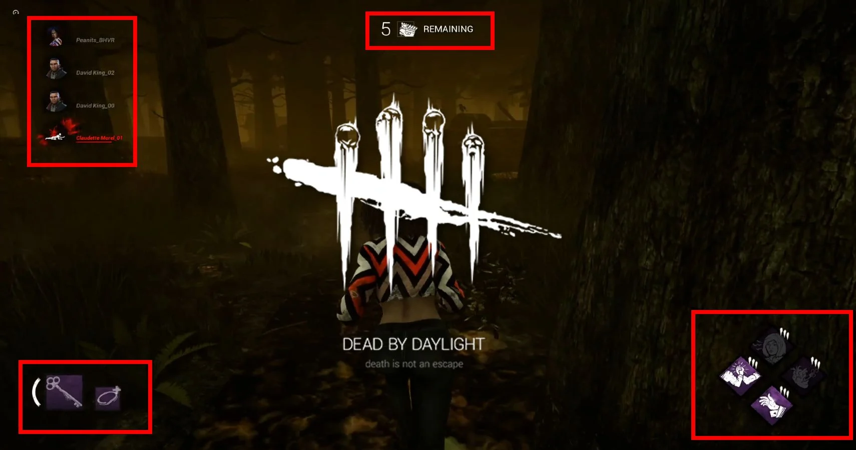
What you're looking at is the new layout for gameplay, and what many would consider a visual disaster. As you can see, information is spread out and spaced throughout the screen, requiring you to divert your attention to various different corners of the screen and get a glimpse of the information, all the while sacrificing your ability to focus on the center of the screen- aka, where all of the vital game action is taking place.
But WHY is it a UI failure? And would it be considered as such in a game other than DbD?
If this was an RPG, then this UI would be far less atrocious. RPGs typically feature a layout quite similar to this one, as many often spread their information across the screen to better organize their multiple currencies, settings, options, and inventories.
The problem is that Dead by Daylight is not an RPG. It's a horror game, one where quick reaction time and important visual cues take up the majority of the gameplay and dictate how that particular session will run. What this UI does is scatter this information in a format that harms the players, as it takes away from the momentum and the precious seconds you have to make a decision. We shouldn't have to look in 4 different places to take in information that was previously available to us in 2, ESPECIALLY in a game where we're probably being chased and should be focusing our attention on the center of the screen to avoid being caught.
When it comes to designing a layout for a game, one needs to consider what the players will be doing during their gameplay session, and how to make information accessible and easily consumed. You WILL be running from the enemy in DbD, and you will be on a time crunch. Unless you're a Blendette waiting for the hatch, you don't have the luxury of taking your sweet, sweet time and glancing around every inch of your screen to just be informed about gameplay matters. You think quickly. You take in information. You make a decision. You commit. To be able to make those decisions, you need information that is just as quickly accessible; and the prior UI fulfilled this role by having everything neatly packed into two corners that do not obstruct the remainder of the screen and can easily be glanced at, even if the killer was right behind you. With one look, you knew everything- how many gens were done, the status of your fellow players, and your item charges.
It is this lack of awareness when it came to designing the UI that makes it a failure in the context of Dead by Daylight and its gameplay. This UI does everything in its power to be inconvenient to a player who is booking it and trying to look behind them to ensure their survival. Nearly every corner of the screen is obstructed in some way, detracting from important visual information and making it all the more difficult to think on the spot and make informed decisions.
_____________________________________
VISUAL STIMULI
When playing a game, it needs to be taken into consideration that there will be a lot of things going on at once, and this can be confusing for the unprepared. To balance this, many developers make their UI smaller or centralized, to ensure that it doesn't add to the confusion.
So what happens when the UI DOES contribute to this confusion, and actively becomes an obstacle to gameplay?
Well, you get visual disorientation or overstimulation.
As a survivor in Dead by Daylight, you need to be quick on your feet and actively avoiding danger. You cannot be doing this efficiently when you're distracted and making sloppy mistakes as a result of being hampered by a UI that is obstructing your vision. This applies to killers as well; one wrong move and you've lost the survivor you were chasing, or you've wasted precious time on a loop because you were distracted by the visual layout.
"But I'm not someone who's easily distracted!"
Perhaps you aren't; but when your heart is pounding and you're thinking of every possible way to escape, considering possible vaults, looking for palettes, etc., it's easy to get tripped up by information irrelevant to your circumstances. And one mistake is all you need to be on the hook.
Another thing I want to touch on is empty space.
When it comes to design, a very important principle that needs to be considered is the principle of "empty space", or a place to rest the eyes. This even applies to decorating a room, as having posters or portraits in every area can be visually distracting and cause headaches. In games, this principle is INCREDIBLY important, because granting the player space where they can expect less visual information and think more clearly allows for more informed decision making or simply escape the various things happening on the screen, should they so choose. Having too much clutter will absolutely give people a headache.
In the new UI, there is one singular space where a player can look too should their eyes need a small break, and that is the top right corner of the screen. Every other area is covered. What makes this worse is that the top right of the screen is often where players will look to peek corners and keep an eye out for the killer, or vice versa. While it's good that it isn't an obstructed place, it is developmentally a poor choice because the one area a player can go to rest their eyes is one of the highest areas of visual traffic in a chase.
________________________________________
"MADE TO WORK AGAINST YOU"
One of the saving graces of getting into this game back when I first started playing was simply how easy it was to get all the information I needed in a match.
Needed to see how many gens were done? A quick glance and I knew immediately, along with also seeing how everyone else was doing. Effortless. Two pieces of incredibly relevant information sat side by side and even benefitted each other. If you happened to not be paying attention to the gens but got the notification a survivor was down, your glance to see who got the hit not only gave you the answer but now you also know how many gens are done and can plan accordingly. The same goes for the opposite as well.
But now, you need to look everywhere and go on a hunt just to find something that would have previously taken you a second.
Need to see who's down and out? Sure, just look at the top left corner of the screen, away from everything important, just to have to look down and scour through the names. And to be completely honest, the icons for the survivors were just fine- easy to take in and conveyed the message well. We honestly didn't need more visual information to take in, and maybe it's just me, but the mystery and fun of seeing who you were playing with was one of the smaller but just as impactful appeals.
The icons are distracting and do nothing but add more to an already cluttered screen. But then you have to look across the entire screen to see your perks. Previously, they were just fine, as they complimented the layout well. Now they're so far removed from everything else it's a hassle to check on them AND everything else.
So what am I getting at here?
Well, imagine you're a new player, and you just got into your first game. You're probably going to have a slower reaction time and might not make the best decisions, and you'll no doubt be taking information in at a slower pace. It's like driving a car for the first time.
But any new player is going to have one hell of a time trying to navigate this UI. With their already poor reaction time and lack of game awareness, the learning curve for them is going to be exponentially harder in a game that already infuriates many.
Just like that, a new player is deterred from the game.
Because who wants to learn a game that seems to be made to work against you?
Older players have decided to take the hit and leave as well, as the UI is nothing but a new and completely unnecessary obstacle to playing a game that already angers and frustrates its player base.
_________________________________
CLAUSTROPHOBIA
We've taken a look at the UI as a whole and how it fails to convey relevant information in a game like DbD, but I want to take a glance at each change in particular and see how they work in conjunction with each other.
Firstly, the perk wheel.
The perk wheel remains where it has always been, in the bottom right corner of the screen. This is a good thing, as this most certainly did not need changing. So if the fact it remains in the same place is good, why do I still consider this another reason why the UI is bad?
While the placement was not originally bad, the failure of this UI design as a whole is amplified by the fact that since everything is now separated, information is no longer as easily accessible. I would consider the perk wheel a victim of these, rather than a perpetrator. As I said before, it is so far removed from everything else that it in and of itself becomes an obstacle, because it is now a hassle to look at simply because everything ELSE is a hassle to look at. However, since the perk wheel is not a bad design choice and remains the same, that is all I will say about it.
Next, let's look at the items.
Why are your item charges so isolated from everything else? Items are certainly important, but the simplicity of the icons and the strange placement of them make that entire corner feel imbalanced and awkward, especially since something more visually relevant could be taking up that space, such as the survivor layout. You shouldn't have to make the trip to the bottom corner of the screen just to look at one thing. The items fit perfectly in the old UI and didn't take up space, but were still easily viewable. Now they're just needlessly taking up more space and contributing to the problem.
The survivor line is horrendous.
I already spoke about the icons, but there is absolutely no reason they should have moved, and be put into a vertical format, no less. Vertical formats slow down the consumption of information in games like this, as they are obstacles to quick viewing due to their requirement to "scan" the information by looking down the row. In the previous horizontal layout, one need not look for long to gt the gist of the survivor status. The white icons were simple and easily blocked out, but conveyed information just fine. And since you were looking left and right anyway since all of the information was on the bottom, it was easy to take it all in. The way the new UI leads your eye around the screen may have been beneficial to an art piece, but to a video game? Absolutely not. The names of the survivors also sticking out and infiltrating the rest of the space is also a poor choice, though it is admittedly better than if they had gone with the vertical design and put the names below the icons. Again, all of which could have been avoided if a better design choice was made.
Lastly, generators.
Why exactly are they so isolated as well? What was the reason for moving the MAIN OBJECTIVE away from literally all other information? I will give it to the devs, the generator count is one of the easier things to look out for in this layout, but the distance between it and everything else is quite unnecessary and destroys all potential synergy in the UI layout.
The result of these strange and odd placements is a UI that surrounds the player in suffocatingly inaccessible information that creates a feeling of claustrophobia. You can't escape the clutter, but you can't use it efficiently either.
_______________________________
PROPOSED CHANGES
I only want for this game to succeed, and while I doubt many will have gone through the trouble of reading this, if a dev happens to stumble upon this thread and read this, I want there to at least be a section of proposed changes, rather than a huge wall of text that is mostly complaints.
If the UI is to stay, at least move the generator section down into the bottom middle of the screen.
Doing this would help fix the strange feeling of distance between the primary objective and any other game information by at least making it easier to take in the perks, the gens, and the item all at once. Granted, it most certainly won't fix the clutter, however, it will at least make it easier to scan the bottom of the screen and will also open up some free space to the player and give them another place to rest their eyes.
Keep everything, but return to the old survivor layout.
Can you tell I feel strongly about this?
If you're so dead set on keeping the generators in the top and the item in the bottom corner, then at least return the survivor layout to a horizontal format. Hell, I don't care if you leave the icons. Just make them more accessible. You could then put the items on the top of the row, similar to the old layout, and boom! Suddenly information is WAY more accessible and the UI is not nearly as daunting.
Return to the original, or add a toggle option.
This UI feels like we're playing a mobile game. All it's missing are some ads and a thumbstick.
Very few people advocated for this change, and a wide majority are against this UI design. It certainly won't hurt if the design simply reverted to the original, or better yet- why not have a toggle option, where one could choose which one they preferred?
Both sides can be satisfied in that regard. Players who enjoy the original UI can toggle the "Legacy UI", and those who enjoy the newer layout can toggle the "Default UI". Money and time won't have been lost on designing a new UI, and it will no longer force older players away who do not wish to play with it.
________________________________________
FINAL THOUGHTS
The new UI is certainly interesting, but nothing but detrimental to the game genre it was placed in. It discourages quick thinking, holds information literally above the player's head, and creates a box of inaccessibility from which the player cannot escape from.
I'm in shock at the design choices made and how they're meant to reflect the gameplay of the game, however, I also understand the difficulty of creating a game and a UI for that property. UI design is hard. Visual design is hard, and multiple things must be taken into consideration for a UI to work. I can only hope that moving forward, better decisions are made in regards to player accessibility.
If anyone wishes to contest any of the points I made, suggest their own changes, or simply state how they feel, please go ahead. I'd love to hear how everyone else is dealing with the UI and if any suggestions to this post are to be made. I'm also interested in hearing if anyone is actually a proponent for this change, and what they feel succeeds in this new design.
TDLR; The new design obstructs the game and makes information inaccessible and difficult to consume, resulting in disorientation, player dissatisfaction and vital gameplay mistakes. The UI is an obstacle to gameplay that harms the health of the game and was a completely unnecessary change.
-
Understood! I'll move it over there, then. Thanks for the heads up!
-
Just the aesthetic and premise of it all was incredibly appealing to me, especially since I'm a horror buff and love the concept. I love the characters and the fact they get licensed killers is always appealing, especially to see your favorite show up. Plus the various playstyles you can run and how personalized your builds can be really heightens the play value for me!
-
@calem said:
https://forum.deadbydaylight.com/en/discussion/158372/ummm-pansexual-pride-emotes-huh
So everyone except one person is really gonna overlook what this person just defined pansexuality as..? Please find me a source that says the word pansexual was created to mean that. I can't find anything. Sigmund Freud of all people coined the term, and it basically meant that all choices humans make are primarily driven by sexual desires. And to even say that pansexuals are being discarded by the LGBT+ community is entirely false. The LGBT+ is one of the most inclusive communities in the world because we know what it's like to be different and shunned for it. Obviously there are no place for pedophiles or acts of bestiality, but that is not what pansexual means, as someone has already explained.
I'm glad it was brought up, because I had been reading that and contemplating how to approach such an interpretation- though someone nailed it on the head before me. I've never heard pansexuality defined as the "pedophile" or "zoophile" sexuality. Whenever it was mentioned to me, it was always simply coined as those who are attracted to all sexes and genders, as the other mentioned above.
OP, by defining it with such dangerous terms, you're only perpetuating the misguided stereotype, and I highly advise you research the actual definition of Pansexuality. Literally, it's one google search away.
-
As a lesbian, pride month is probably one of the most frustrating things to deal with. I certainly don't mind the artists and people who actually celebrate it. That being said, it's been monopolized by large corporations and used to garner PR favor among businesses who want more sales, and of course, Pride Month is the perfect time to maximize these sales by capitalizing on the public's desire for inclusivity.
It really isn't a month of celebration unless you're celebrating the cash you'll be netting selling pride merch under the guise of a happy, smiling and inclusive Corp., when in reality these companies could care less about your sexuality and just want your money.
-
Like Orion said: Survivors will cry "Camper" whenever they don't get a free hook. It's especially difficult for killers like Trapper and Demo, who rely on being able to patrol hooks and areas, which might net the label of camper. You gave them plenty of time to get their friend and run, and if they waited too long and you're heading back from the gens, then that's there fault, not yours.
There's nothing wrong with using Discordance either, it's there for a reason, and you might as well get value out of it!
-
I don't mind it, but I noticed it can be pretty finicky. Spamming at the speed of light might kill you if you go too fast for the game to recognize (as has happened to me before, and seems to have happened to you), but going too slow for even a millisecond can also spell certain doom. I think it could be changed out for something else, like how survivors wiggle, but honestly if they plan on changing it I'm just curious to see what they do. You'd think such a simple command would be just fine, but somehow even it is riddled with bugs.
-
I am now regretting my choices to level up Claudette first 🤔 LMAO
-
While I don't think that it could be implemented mechanically due to its size (if they chose to keep it so tall), I think the idea is interesting, and it could really make the game quite different! Sirenhead looks similar to the lights on top of the gens, so perhaps they could do something with that? Alternatively, just a sound-based killer, who uses various audio cues to possibly trick survivors and steer them in the direction the killer wants?
-
I, quite literally, started playing two days ago, and was rather disheartened to find a lack of a casual mode or a practice/ai mode, especially since going into a match immediately after the tutorial and finding myself paired with people who have already played a fair few games had me fumbling a bit. I've learned as much as I can in that short window of time (It helped I had been watching the game for years), but I think it would be cool to see at least a practice mode, where players like me can try and test things out without the pressure of being paired with higher ranks and getting absolutely rolled haha!