Lobby UI still needs a lot of work (list of feedback)
So after the lobby UI redesign that was very poorly received we were promised fixes to it over time. While I recognize that some of the feedback was taken on board it still needs a lot of work. Here is a list of feedback to make the lobby UI a lot more intuitive.
More Outfit & Perk Presets
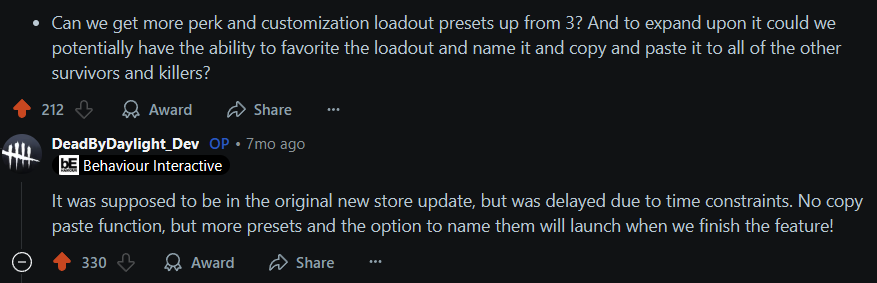
With the thousands of outfits, charms in the game and hundreds of perks, we still can only have 3 custom outfit presets and 3 perk build slots.
7 months ago you said in an AMA that this was supposed to come with the new store update, which was 9 months ago. Why such a long delay on this feature?
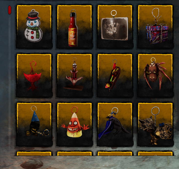
Charms Selection UI
First of all, the bar that blocks the search box…can we talk about it?
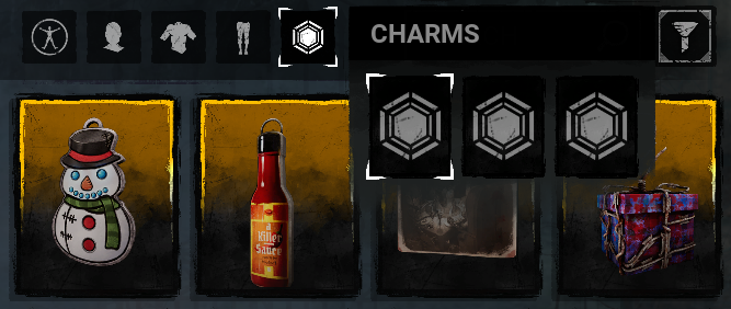
I'm not trying to be rude but this is not good design. Many people complained about this when it was first added to the new store, and then not only was it never changed but it was also copy pasted onto the lobby UI. Can we please move this bar? I understand that if you click on the charm icon it hides it but it shouldn't be there in first place. There is lots of empty space on the lobby page where this bar could go.
Also when you click on a selected charm in this bar it should automatically go to that selected charm in the list. This used to be a thing before the redesign. That way you don't have to waste time scrolling through the hundreds of charms in the list to find it and deselect it or move it to another slot.
Hotkeys
On the topic of wasting time scrolling, hotkeys are very helpful especially for controller players! They make things a lot easier to navigate. The old design had very useful hotkeys that were removed for some reason.
Right now the only ones that were added are to switch between the Characters/Customization/Bio tabs which is kind of useless because it's only switching between 3 tabs. Why not use these hotkeys to switch between the presets instead. When we get more in the future, that will be a lot more useful. These could be with the back bumpers on a controller.
And the front bumpers should be able to switch between the Outfits/Head/Torso/Legs/Charms tabs when in the Customizations tab:
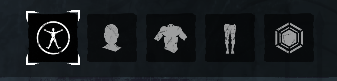
When in the Characters tab the front bumps could also be able to switch between all characters like you used to be able to do on the old design.
Also maybe add hotkeys to skip to the next 12 items in a list. Especially on the charms page that would be extremely useful instead of scrolling for ages trying to find what you need. I know we have a search box now but not everyone knows the names of items.
Other Little Gripes
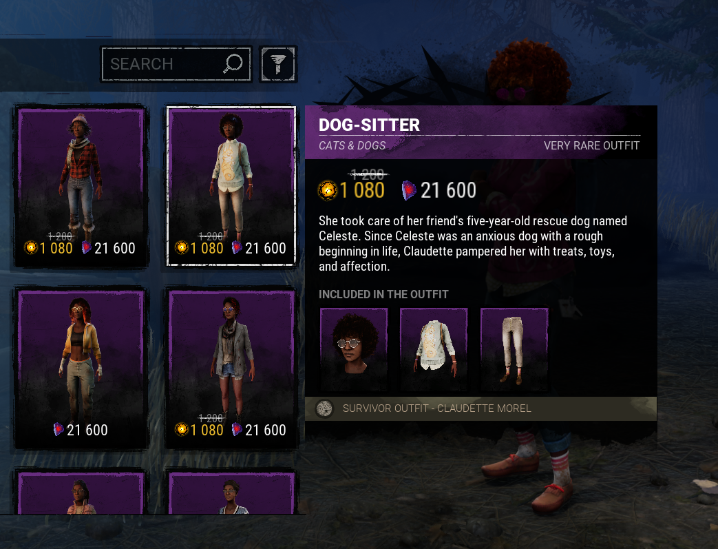
The cosmetic description popup covers your character every time you hover on it. This is annoying when you're clicking on different pieces trying to see which fits better. Why not just make the description popup appear on the left side for the last 2 columns so that it doesn't cover the character?
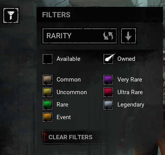
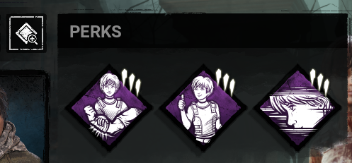
This Filters popup should go away by itself when you click on anything else. Same with the Perks popup. Having to click on the icon again to hide it is not intuitive.
If anyone else has any other feedback and suggestions feel free to add!
Comments
Yeah the UI is still utterly awful compared to what we had before they reworked it. I really hope they will take some of these suggestions into consideration.
Increasing the number of presets from 3 to 5 would do wonders though and imo should be the #1 priority.
I am still mad they removed the Next and Previous buttons to cycle through your chars :-(
I'm hoping that some of these lobby ui suggestions will also be included in the "operation health" Quality Of Life update.