Descriptions and logos dropping in quality?

Cosmetic descriptions as of late have been poorly worded or almost non-descriptions. Look at this stuff.
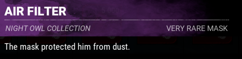
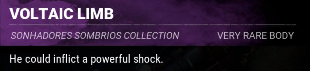
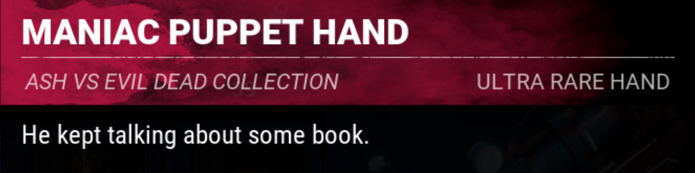
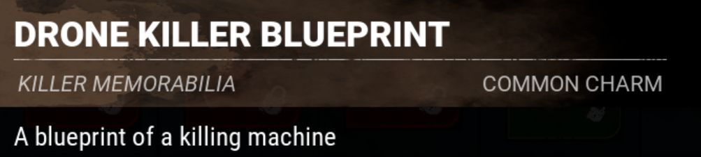
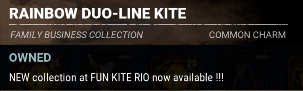
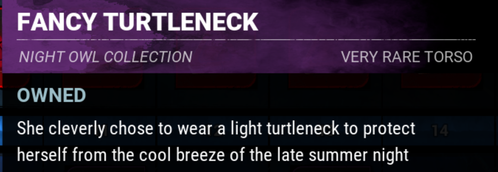
Compare these poorly written descriptions, rife with errors or just low-effort, with ones from earlier cosmetics.
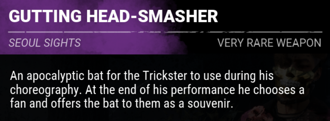
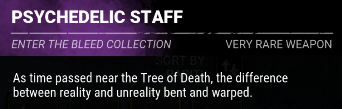
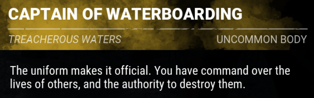
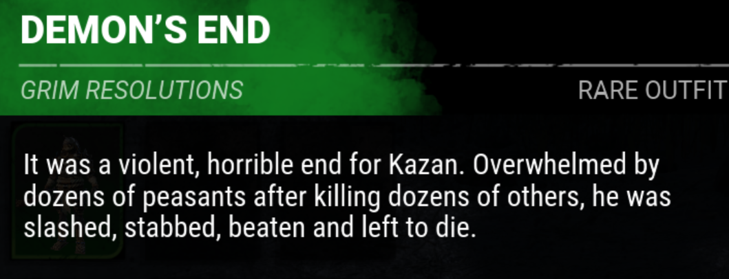
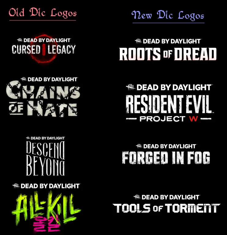
What's with the sudden and drastic contrast? It's also noticeable on the DLC logos, credit to reddit user NinjaGamer1337 for this.
Comments
Yeah I don't bother reading descriptions anymore, at some point they'll just become "this is a t-shirt", which is sad considering they used to contain bits and pieces of lore.
As for the logos, it's probably for consistency sake ? Maybe they're just following the trend of making everything
boringneat and simplistic idk