HUD IDEA!!

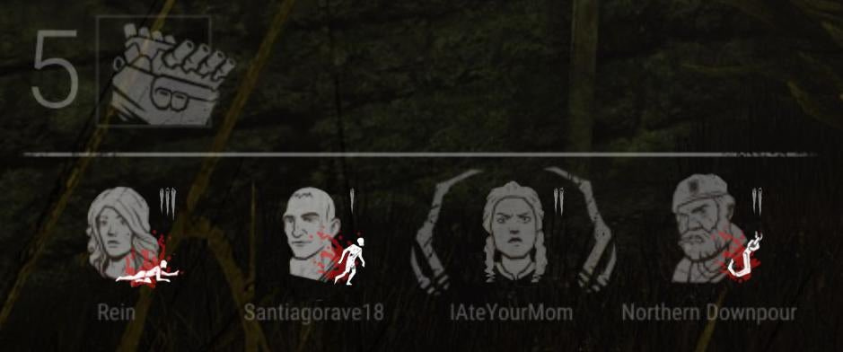
Don't remember where I found it.
Don't remember where I found it.
Read THIS post.
Tldr: This is an archived version of the DBD forum, it has all posts, comments and media. The archived data will be published at the end of October. This site is not in any way affiliated with or endorsed by Behaviour Interactive.
Comments
That is perfect. Really hope the community backlash makes them go back on their decision here. Something as compact as that with the same style we love and they get to embrace their new hook counters as such. Perfect.
"IAteYourMom"
I prefer the hud shown in this idea
That's the HUD we all want
This is what the new HUD should look like, everything is in one part of your screen. The problem with the new HUD is that information is everywhere on your screen and it will take time away from actually focusing on the game . whereas with this its all on the bottom of your screen, so you can get all the information you need from a glance
This HUD idea I honestly love and want. However, it wouldn't work, the devs said everything is more spread out to create room for things they want to include in the future. Yes this HUD idea includes the information which will soon be added but there won't be any room for more additions which I believe is the problem.
I think we will all just have to get used to the new HUD with it being spread out, yes it sucks, I think it won't be too bad though when we get used to it.
Something is off about that David pic tho... Like he looks bald but he started growing some grass on his head.
The art needs work but its a good start. Suggest maybe some sideways stills so that its a bit more unison looking? Don't even want to imagine what Nea and Quinten's would look like...
This is a great idea! This version is easy to understand and look at, along with working well with the game's appearance. The only downside of this could be that people who play the game further away from their monitor/TV may not see the injured/downed/hook states all that well, but something could easily be done to rectify that, like providing a way to make it bigger or just switching the icons to only the survivor's states (like the original HUD).
mate that looks WAY better and keeps to the feel of the game without changing any hud placement.
how can 1 guy come up with this in less than a week but a team needs entity knows how long to come up what we got and it doesn't even look good.
they don't have to be the adept art, honestly they can create new art for each character as long as it has the same bland color/look because this feels right and looks better than a colorful image.
I feel like where they went wrong was just trying to be too different from the feel of the game, they are right that people are resistant to change but going from one art style to a completely new one that doesn't even fit the feel of the game and fails at basic placement of important information is obviously a bad idea. If it doesn't work it doesn't work and i pray they don't say "give it time to grow on you" because i will never like the new hud more than the old hud in fact i would prefer the old hud even if I can't also have the new hook counters.