Deficient_Artist
Deficient_Artist
About
- Username
- Deficient_Artist
- Joined
- Visits
- 56
- Last Active
Comments
-
@Hidon said:
https://forum.deadbydaylight.com/en/discussion/comment/1687167#Comment_1687167
Every map they they've redone is the same ######### colours with one or two texture difference. There's no variety. Every realm had a colour theme to them. MacMillan had blue main buildings, now its as grey/brown as every other map.
Lets ignore badhams pink, yamoakas red and all other upcoming maps
-
lol just fix it stupid, see you cant do that when your community is literal dogshit, cause people like you, complain :)
-
@Kind_Lemon said:
https://forum.deadbydaylight.com/en/discussion/comment/1662441#Comment_1662441
https://forum.deadbydaylight.com/en/discussion/comment/1662442#Comment_1662442
I bought the game because I liked the graphics it had. Your nobody seems to be a little faulty, because I've noted my views on this forum are not an anomaly.
The maps we have rn look godawful. I have no idea why you think the cartoony, blurry mess that is Yamaoka is in any way better than the ugly, bland, strangely shiny failure of a map that is Ormond. I would love the maps to look better, particularly for players using low graphics and resolution, and what DbD did with tints and baked textures when it first released did that. What really bugs me is that they seem to just be chucking their art style right out the window without any restraint or thanks, and that applies to add-on and killer icons along with the design of killers like Blight.
"the maps we have rn look godawful"
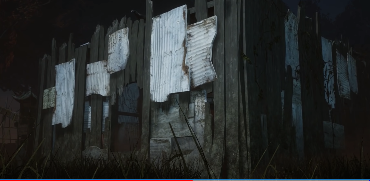
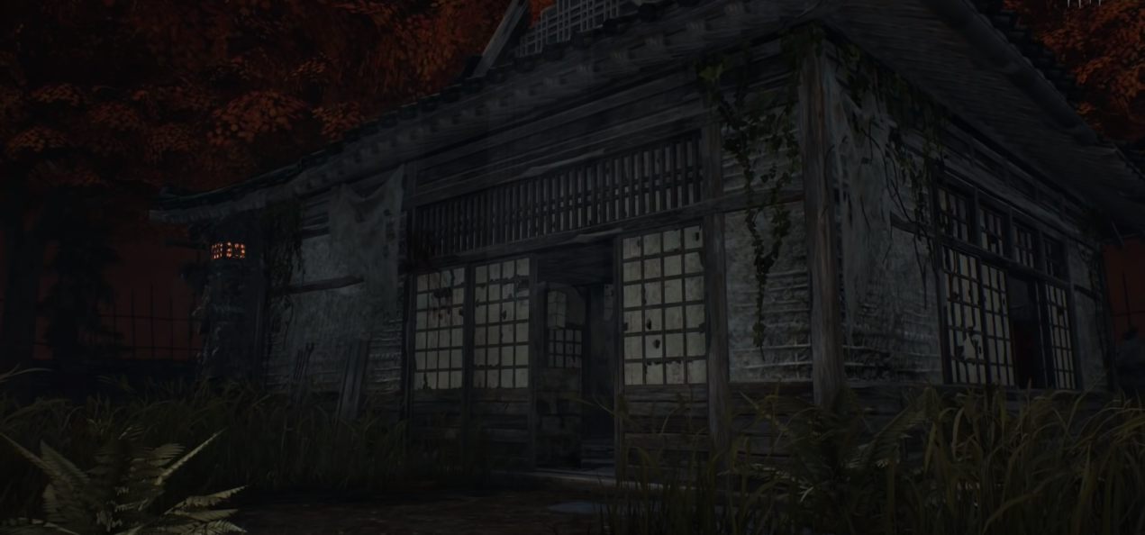
Ok sorry man back to the ######### 2016 build
-
Adios
-
@Kind_Lemon said:
https://forum.deadbydaylight.com/en/discussion/comment/1662437#Comment_1662437
graphics we're getting now are too cartoony. What we had before was less so. I don't want the game to have the same aesthectics as Fortnite.
So, yes, I support the tints. Love the blue when done right. Note how in 2016 DbD, default Dwight could hide against the shack and not be seen by an inattentive killer because the color pallet and material were similar enough. I would like that back.
The game looked awful before though, im sorry but there is nothing that resembles a cartoon now disregarding cosmetics
-
@Ramxenoc445 said:
https://forum.deadbydaylight.com/en/discussion/comment/1662435#Comment_1662435
Wow it's almost like that's guaranteed to happen because killers move faster than survivors and it's game design for survivors to be caught.
"Long as you don't let the sword drag you can still fake it" if you get faked out by this your an idiot
-
Killers arent allowed to kill to make his life easier
-
God forbid the maps look good lmfao
-
Nobody bought this game cause mcmillan was blue or cornfields being yellow or especially autohaven being green, NOBODY did that
-
I hate the tints, makes the game look too cartoony, specially the green
-
if your close enough to him where he can fake it out you deserve the injured state