New Endgame Screen With Player Profiles
I don't know about you guys, but there are a few too many pixels for died/escaped, perks, offerings, and items. You might actually figure out what happened in the match now! I did a mockup of how it could be improved below.
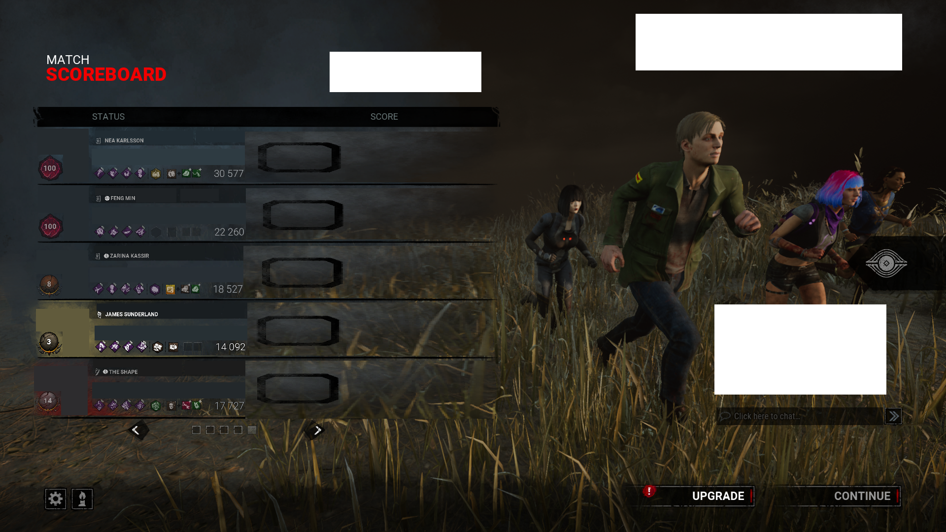
/s end
Ok, but honestly it looks horrible, too cluttered, and important info isn't even properly visible anymore.
Comments
What important info isnt visible? Perks offerings names, all there.
The joke is that the information is shrunken beyond reason for a mechanic that isn't even properly implemented (since no one has any profile stuff yet). Hence why in the picture I shrunk the information even further to bring attention to the absurdity of the bad change. The useful information shouldn't have to suffer (be shrunk) to accommodate space for nothingness.
Yo cool
Another fellow James main 😎
Sadly I am not. I am Zarina/Felix mostly, and had a Cheryl daily (but since I liked the OG Silent Hills 1-3 I bought most of their skin lines).
That’s still pretty cool tho