Customization Icons
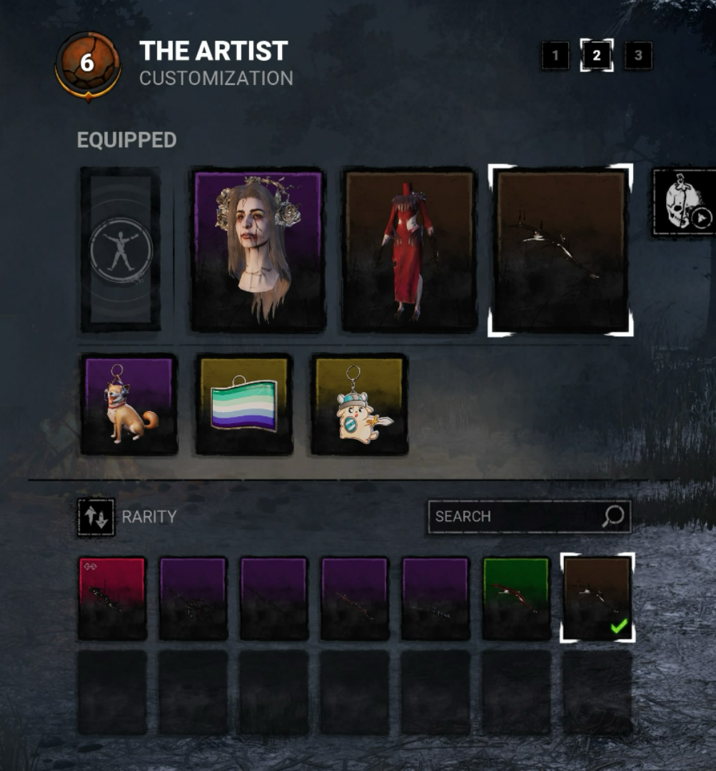
I was putting together a new look for Artist when I noticed that the icons for customization options has changed to be the color of a rarity (Purple for very rare, green for rare, yellow for uncommon, so on so forth) and black. Maybe with that sentence alone you can kind of see where this is going. I think it looks cool but I genuinely can not see the Artist's weapons. It is way too hard on the eyes. It's literally just black on black and as interesting as it looks, it's not good for me to figure out what specific weapon I'm looking for and have to click each individual one to find it. Maybe get rid of the black or have it much lower so we can see what we're looking at in these cases, especially if an entire killer's weapon selection is going to be one color.
Comments