New vs Old UI - Compromise in solving the problem

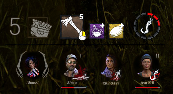

I think the community would like this interface UI - if it would be done according to the principle - if something works well, don't break it.
Adept Portraits Version


Comments
Oh man that's exactly what I thought, the organisation of the old UI with the new UI aspect !
Seriously, who wants UI with information spread all over the screen..? The new UI is terrible in the organisation. The new UI is terrible because you have to look everywhere to get important information, and that conception of the UI is the opposite of any good UI conception, you want to have all important information grouped, which is often grouped in the bottom of the screen. If you look any HUD of any good game, it is organized like it was in the old UI.
Keep the current aspect of the UI, it's perfectly fine and refreshing, but take back the old positioning of UI. Currently, it's just horrible to play like that, it's not a question of habit, it's really the UI's ergonomic which is awful :/
I love this! I, however, want the character portraits to be the Adept ones.
The ideal would be a completely modular interface, and therefore customizable.
For me, there is too much information and colors here in one small rectangle.