Pyramid Head Addon Icons too similar

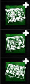
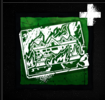
Can we please get different artwork for Pyramid Head's green add-ons? Seriously they all look the same and it's near impossible to differentiate in-game. They all look like Ormond offerings and it bugs me -_-
Tagged:
Mod
Comments
I know that this post is just about distinguishing between icons, but I wanted to comment that I think the artwork on new icons added into the game has severely devolved over the years.
I agree that these are incredibly similar, I've moved your thread to Suggestions & Feedback for attention - also changed the thread title to make it a bit more clear that it's an issue.
Thanks for pointing this out.
I wonder how none of the artists designing these thought to think about accessibility to players.