You moved this locker, and it shouldn't be moved.

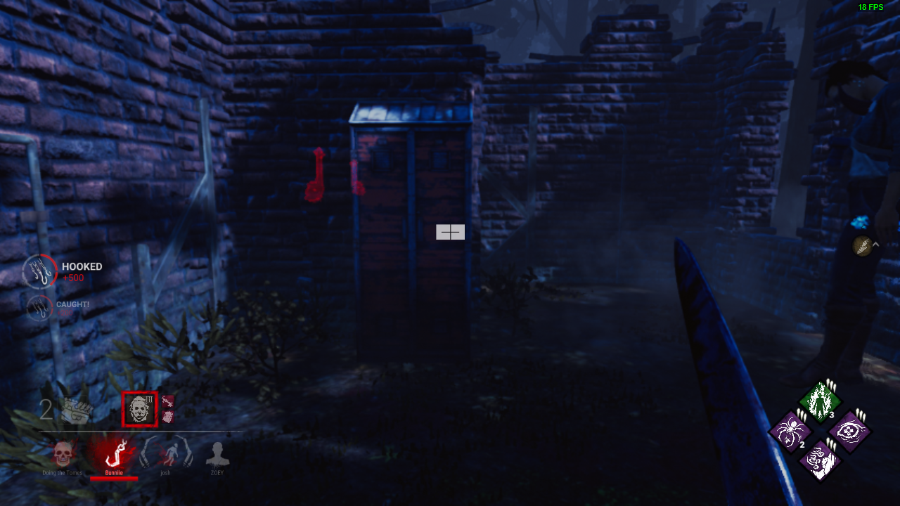
This once-diagonal locker was a key part of the flow of this tile in that it was out of the way, in shade, and was much scarier to hide in. Now it is in the way, and feels out of place when hiding inside. All in all, please put it back in the position that facilitated more horror-esque gameplay and atmosphere.
Sincerely,
a fan
Comments
op locker generatoin
Nice, a new spot for free hits against blendettes.
This is much better placement for head-on, I'm assuming that's a reason why.
Buffing Head On, yaaaaas
😑Hadn't really thought about that, but this makes me more annoyed by the change.
Regardless, my position on the placement of the locker not being beneficial for a horror experience and my position on the placement creating unnecessary clutter in paths of travel still stands. In fact, I'm going to further it: this locker placement reminds me of the kinds of changes done to Lery's in terms of clutter placement, and I really don't like where all the debris is put on that map. It serves little gameplay use other than annoyance and a source of wonky hatchet hitboxes. Hitboxes in general, even.
update and reminder: this locker also is more annoying in terms of hatchet collision when attempting to hit a survivor near there. It's also a sign of a lack of understanding that thinner walls are better for places like these because survivors already have enough mobility in their camera to keep themselves safe. Adding a locker in front of the wall only makes it safer for survivors to stand behind the two and peer around.