I Can't Think Of A Good Title, But It Has To Do With The Stats...

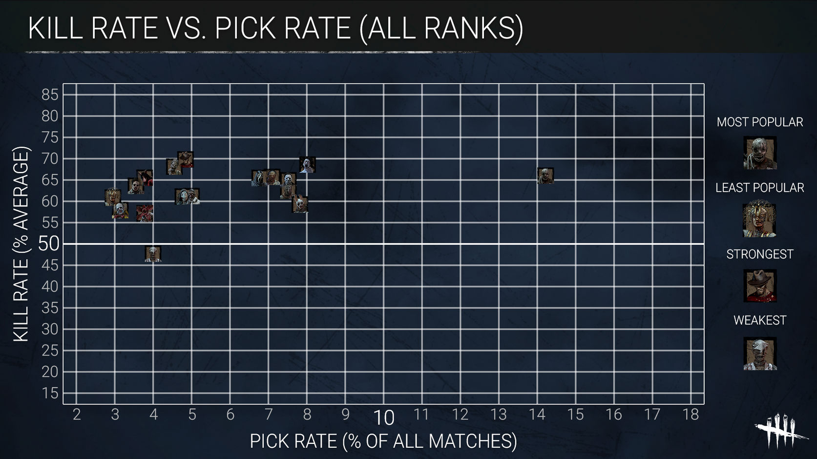
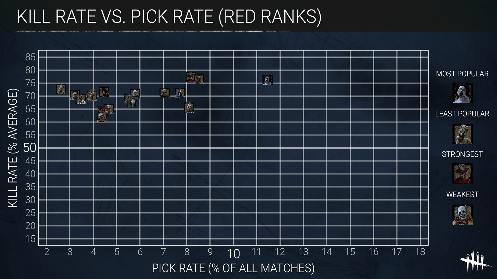
Y'all remember these, right?
Well, this is not about the stats themselves.
Rather, this is me asking: How am i supposed to read this?
More specifically...

How do i read what percentages they have?
Does the top of the Killer icon define how effective they are, the middle, or the bottom?
Does the right of the Killer icon define how popular they are, the middle, or the left?
Is Trapper on all ranks 67.5% effective, 66% or 64%?
Is he 14.5% more chosen, 14.25 or 14%?
I know when i put the numbers like that, it seems like a neglectable difference, but simply knowing where to actually read the percentages helps me give me clear numbers.
Tagged:
Trusted
Comments
In the first one the Trapper has a barely above 65% kill rate average, meaning he kills a little bit more of 65% of survivors who play against him (Check the Y axis) and about the pick rate, as more to the right he is the more he's picked by players to play as him (Check the X axis), in the image he shows a % a little bit above 14%.
It's the same for the second one.
The middle of the picture shows the specific data, it's called "image dots", I agree with you about the confusion, they might should've added the percentage in a small number above the image dots.
@Boss
You read it like this
In a simplified version here, you read the chart by going off of who's the farthest right for the most popular and who's the farthest above the rest for the most Kill Rate.
Here's a more "advanced" explanation below.
how to read who the most popular Killer is (Red Ranks chart)
We'll go off of Red Ranks Spirit to just make things simple. So, the way you'd read is it viewing the bottom portion of where they're set on the chart, the farther to the right means the more that Killer is used.
Spirit is the farthest Killer to the right, so they're the most popular among Red Rank Killers. BUT! Their Kill Rate is slightly lower than Freddys, you can see this by where they're positioned in the charts top graph.
how to read who the "strongest" killer is (Red Ranks Chart)
So, if you're the highest on the graph, you're the "strongest Killer" or you have the most Kill Rate out of any in this sense. Spirit is just shy of being the "strongest" and most popular, which is why Freddy is listed as the strongest, since he has a slightly higher Kill Rate than her in Red Ranks and even in the general graph above.
how to read who the most popular killer is (all ranks chart)
We'll go over the "All Ranks" chart as well to help clear up any confusion, we'll use Trapper as a base for this explanation this time, and than we'll use Freddy again for the other portion of this chart.
So, as explained above, if the Killer is the farthest right on the chart than they're the most popular. Trapper is the farthest right, so he's the most popular or most used Killer among all the Killers when it comes to every rank, not just Red Ranks.
Why is that? Well, he's the first Killer on the roster of Killers when a noob gets the game, so naturally they'd choose him first to understand what it's like to be a Killer for the first time. It makes sense that he's the most chosen by a land slide when it comes to every rank, because since it's covering every rank... it's also covering Grey and Yellow. So, this means that since most noobs start off at Grey and than in Yellow for a bit, they'll pick Trapper a lot!
how to read who the "strongest" Killer is (All ranks chart)
I'll cut to the chase with this one, since Freddys picture is positioned the highest on the chart (NOT THE FARTHEST TO THE RIGHT), this means his Kill Rate is the highest of all the other Killers, which means he's also the "Strongest Killer" for All Ranks as well.
Spirit is slightly below his picture on this chart, meaning she has the 2nd highest Kill Rate. The Killer below her would be Hag, but Spirit is barely above her from how the pictures are positioned, meaning she's in 3rd for the highest Kill Rate and than Trapper is 4th since he's the 4th highest picture on that portion of the graph.
The same applies to the other portion, whoever is the farthest right is the most popular, than you go by who's the 2nd most to the right from where they're positioned on the chart, than so on and so forth.
please read, this portion is important
Your confusion stems from where they're on the list to figure out who's 1st, 2nd, 3rd, 4th, or at least that's what i'm getting from this.
Simply put, read it like this. Trapper is on that base-line of "65" in the far left section of the chart and so is The Pig, but look where his picture is position on that base-line... it's slightly above The Pigs where the number 65 is on that chart.
What this means is, he has a higher Kill Rate than The Pig in All Ranks, not just Red Ranks, All Ranks. He's above Billy and GF SLIGHTLY as well, but not by much, but he's lower than The Hag, Freddy, and The Spirit. So, this means he's in 4th place for the "Strongest Killer" in All Ranks!
another Red Ranks chart example
If I used the Red Ranks chart as another example, you can see that Freddy is slightly above Billies picture, while Billies picture is slightly above Spirits, this means Freddy is 1st on the Kill Rate list for the Red Ranks chart and Billy is 2nd, while Spirit is 3rd.
Spirit however is the farthest Killer to the right on the bottom chart, which means she's the most popular, the most popular doesn't mean she has the highest Kill Rate, it just means she's the most used out of any other Killer, as for who's the 2nd most used, Billy is ahead of Freddy slightly to the right some more, and Freddy just barely makes it above Huntress to sit in 3rd place as the most used in the Red Ranks chart.
Basically, read it like this. If you want to know who the most popular is, than flip the charts with the numbers of the far left being flipped to the bottom, whoever is the highest picture at the top of that flipped chart is the most popular, than flip it back to normal and see who's the highest on the normal chart to determine the highest Kill Rate of any of those Killers.
Hopefully this makes sense.
conclusion (tl;dr)
For a very very simplified version here, just read it like this. Whoever is the highest on the chart has the most Kill Rate, if the picture is slightly above another, than that means its Kill Rate is higher than that other picture... but only slightly.
If the pictures are the farthest to the right, than they're the most popular Killer. Same concept with that, if a picture is slightly more to the right than another, than that Killer is used more than the other Killers picture that's slightly behind it.
Use this to determine your percentages, hopefully I helped or made it more confusion idk.
I think the problem he had was because of the image more than the being able to read the chart, he had the issue as many others to know which part of the image square to see as the actual value for the variable.
Than he'd go off the top of the image, as the image is a bit too big to determine the exact variable he's looking for.
Either the top of the middle of the image should suffice, as a point on a graph is usually indicated by the middle of the point. That would make sense though, as a point is easier to determine the variable it's associated with than a square image.
So, in that sense, he'd go off of the middle of the image to determine said variable or the top of the image.
Yes, I think that's it, I believe the Devs used the "Image Dot" option of the Software they used, so the middle of the square should do it, unless they used Paint or PP to do the Graph, which I don't think so, hehehehe.
No I don't think so either.
Logically on a graph you'd go by dots or "points" on each graph to determine where they are on said graph, which also gives you the number it's associated with, that's how a graph works.
In the case of this graph, this seems to be the same thing, so the middle of the image would be the most logical place to determine what number it's associated with on said graph(s).
Plus, you can still use the images placement to determine who's 1st, 2nd, 3rd, etc.
Then i'll go for the middle. 👍️
That's the best option yeah, if you go off of the top of the image than it would seem wrong in terms of how graphs work with points.
Good luck!