
risingredkite
risingredkite
About
- Username
- risingredkite
- Joined
- Visits
- 114
- Last Active
Comments
-
Not sure if there's any better place to point that out than right here. But this is probably gonna get lost in between all of the HUD, Survivor Locomotion, Map rework and DS, OoO posts right now. You could try and point it out on the Dbd discord again. Maybe that's gonna help. But right here is you best bet, I guess.
-
I don't think it makes much sense to have breakable walls on some maps and not on others. It's a new gameplay element they put into the game and only putting it in some maps would be like having a map without any vaults or a map without any pallets.
And I believe breakable walls can create an interesting gameplay dynamic. Some of the breakable walls on Glendale are well designed in my opinion. Like the double breakable walls with the vault in the middle. It's a... I'd say medium strong vault which power can be decreased by breaking one, or even deminished by breaking both walls. Or the breakable wall by shack which can make Killer's hitting Survivors at shack easier, if they do decide to take their time to break it.
This is what makes breakable walls an interesting gameplay element. The Killer has the DECISION to spend time breaking them and making loops easier for the future. But the Killer can also not break them and deal with slightly harder loops, but saving time in the match. That's what I liked about breakable walls when they first introduced them.
But the problem is... Glendale was MADE with breakable walls in mind. The other, now reworked maps, weren't. And we can see the worst types of breakable walls in the game right now. The breakable walls on The Game map are atrocious. They don't create interesting gameplay decisions or anything. All they do is create dead ends that either the Survivors will run into, or the Killer is forced to break to get to a generator in time. Because if you don't, you're gonna have to deal with walking around entire rooms to get to a generator, exit gate, Survivor or even a hook while carrying one. Which is the worst thing. You can't even reach hooks in time if you don't break them.
Contrary to most people, I do believe breakable walls have their place in Dbd. And I do believe they can be a fun gameplay element. IF THEY'RE DONE RIGHT. And in most maps they aren't. So I hope that we're gonna see some changes to the placement of breakable walls in the future. Maybe even see newer, reworked maps get some adjustments to their placing, and an improved placement with future maps. I seriously believe the walls can be fun, if the devs put more effort into their placement.
-
Found another thing that might create issues with the color of Freddy's and Demogorgon's teleport markers. I've added it up at the main post as an edit. I'm gonna keep the post updated if I find any more things.
-
Yup, another disappointing "event". Literally all we get are daily log-in boni, some new items in the bloodweb, two skins that are locked behind iri shards/auric cells intead of unique gameplay challenges and some promo codes that will be announced on Twitter and Co. like during Christmas.
I don't know about you guys, but this "event" isn't motivating me to play Dbd more than I usually would. If anything it only makes me log-in once a day for the bloodpoints and keep a look out on Twitter for the codes. There are no interesting challenges, nothing special to unlock, no new gameplay elements. I guess you could count the red glyph thingy that is new but that is only one challenge and it's part of the Tome, not the Stampede.
I wouldn't go so far as to call the devs greedy or anything because it's not like the only thing they put out requires money. There are still a few things everybody can take place in. But I very much would call it lazy as we know BHVR can create interesting and fun events. Yet they decide not to.
-
Also, about the Animations:
I don't think they're that bad, but most of them could use some improvements. For example:
Animations like the crawling, recovering, crawling into the hatch, or the transitions from downed to injured, standing into crouching, or walking in one and than the complete opposite direction look good, in my opinion. But then there are other animations which look very artificial and unnatural like standing still or running while injured. They don't look very good to me and in those cases, I prefer the old ones a lot more.
And then there are some issues with the camera movements, especially when getting downed or picked up again. The camera moves down very fast when getting downed to show the Survivor better. I like the idea but the movement itself is too rapid and unnatural. It confuses me more than anything else and the camera arc/ease in and out needs to be adjusted.
-
@Kind_Lemon said:
I've not realized survivors are dying on hooks too often to count, which is unhelpful.
Yeah, the new bars are not only dimmer and less opaque but also longer and thinner. Makes them much harder to read than the old ones.
-
There isn't really a reason why Killers should have the individual Survivor hook counters. I think the team said they only gave it Survivors because A: they wanna make solo survivor easier and B: it might encourage tunneling on the Killer side.
But the thing is, if Survivors don't pay enough attention and need help to see who was hooked how many times, why not the Killer? I my opinion, it's much more common for the Killer to forget which Survivor was hooked how many times because they have so many other things to pay attention to and a much more hectic gameplay.
And also. If Killers wanna tunnel, they tunnel. If they don't, they don't. I don't think a hook counter would change much. And even if they do, Survivors not running after Survivors about to be hooked on death hook anymore is already a Survivor buff. The little bit of tunneling there's gonna be more would just balance that out.
In my opinion, there shouldn't be a hook counter at all. The less information the better. And that on BOTH sides. Makes the game more interesting and actually rewards people for remembering who has been hooked how many times.
-
@gemjas said:
I know all of these points have been mentioned many, many times but it's worth repeating.
https://us.v-cdn.net/6030815/uploads/5P5JBKQMWQIC/jc7d29p7jng61.png
https://us.v-cdn.net/6030815/uploads/YMU4HFKP6FR9/hb38pftpjng61.png
Credit to user In7tinct4 on Reddit.
Please implement of version of this UI instead.
- All information is in a compact, easy to see location. Instead of glancing all around the screen, all relevant information is easily accessible. In addition, the placement is in a location that isn't very important for the player (i.e., it's not in the way). It can be disorienting/distracting to constantly see this information all over the screen.
- The current portraits contrast terribly with the UI design, replacing them with the adept portraits would be easier on the eyes.
- The injured, downed, and hooked states are clear as well as the bleed out/hook timers. The new UI relays this information in a wonky, sometimes hard to see manner.
- The character portraits are still visible no matter the state of the survivor. This complaint is mostly cosmetic, but it just looks ugly to have the downed/hooked/dead icons replace the whole portrait. If the portraits are there to make it easier to know who's who, wouldn't it make sense to always have them there?
As it stands, the new UI prevents me from playing. Yes, it is that bad. It is unpleasant to look at and just makes me uncomfortable. I'm sure other players feel the same way. Until something about this is done, I actually can't play the game. This isn't some protest or me being melodramatic; the new UI actually disorients me and makes playing uncomfortable.
Not sure how to feel about this. It looks more in place than the new UI does, but it has some problems too.
To me, this UI looks a bit too cluttered. There's so much information in one place, it's hard to find what you need. And not necessarily because the placement is random or anything, but rather because there are so many different icons and bars with different level of detail there. The old icons worked because they were simple and easy to read.
I suppose it's better than the new UI because it's not all over the place, but this one is... almost ALL at one place.
ALSO:
Pointed out some more issues with the new UI in this post in case you wanna read it.
-
Yeah, it seems like the bleed out and hook timer bars have a rather low opacity. In addition to that, the bar doesn't have a very prominent backdrop to create contrast. It fades away with the background most of the time. And if you're on the hook yourself, you can't see it either because the blood effect, which of course is also red, makes it even harder to read.
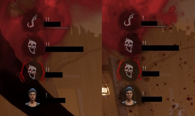
The red bar needs to have a higher oppacity and be brighter so it can be distinguished from the blood. Same with the grey-backdrop which currently almost fades together with the red bar.
-
I'm not sure how to feel about healing deactivating it either, tbh. On one hand, yeah, getting unhooked, running to the next person, unhooking them and then healing them would leave BOTH players with DS which is something Killers have been struggling for a while now.
But on the other hand, it would be highly discouraged to heal your unhooker first because you might have perks that make it faster, a med-kit or something like Solidarity. I might be the only one saying this, but I think Solidarity is a fun perk, even if niche and rather weak. Not being able to run it with DS would kinda suck. But I can also understand that we can't always take every other perk for synergy in consideration when adjusting such a game changing perk like DS.
Also, what about self-heal? I'm assuming self-heals are fine, but it just said healing so maybe it's not. Hope self-healing will be alright too.
-
@LordRegal said:
https://forum.deadbydaylight.com/en/discussion/comment/1889476#Comment_1889476
Taking your comments out of order here:
You are correct that the anomaly suffix is more accurate to my situation - it's just tedious constantly explaining how much of a sliding scale it can be to people who don't know better over and over (especially when a lot of people haven't heard of the "anomaly" part of it in the first place)...I usually say "moderate deuteranopia/protanopia" which gets the point across, I was just excited and didn't mention the "moderate" part of that. I am both L weak and M weak, not completely lacking either.
As to whether this mode is "enough"...for me, it's better than it was and I'm willing to celebrate that. That being said, you are correct - blue auras are for me the best option since my blue cones are intact, they would stand out better than any of the pictures we've seen so far. It's why I mentioned that a "pick your color" option would be the absolute best way to go. That being said, I wanted to also give feedback on what we've seen assuming that it's going to look like that going forward - my experience with giving feedback to BHVR is to not give sweeping statements like "this is not good enough" because they're less likely to listen to what could be taken as negative, non-constructive feedback. Therefore, while I did mention the "optimal" solution in my initial post, I also gave feedback from the standpoint of "what we've seen will be what we get" because that's when they're likely to listen. And honestly the deuteran scratchmarks and the protan gens are far easier to see than the default ones. Is it as good as blue would be? No, but again, I've learned how to phrase my feedback.
Yeah, you are right. This is something to celebrate. A lot of colorblind players are gonna have an easier time now and there might be new players who can finally play the game because before it might have been impossible for them. Player accessability options are always awesome and I wish there will be more implemented for other issues. Like, I remember a person that was saying they couldn't play against Doctors because of epilespy.
I am just afraid that BHVR is gonna call things done after they release the colorblind modes. Because there seems to be a trend of touching things, changing them majorly, and them ignoring them for one or two years before paying attention again. We've seen it with the Wraith and Legion rework. Both helped but Wraith is still a bit too weak and Legion has many, pretty much useless, add-ons. We've seen it with Lerry's Memorial Institute. They wanted to add breakable walls there, but breakable walls weren't ready yet, so now we need to wait for the next Lery's rework. (Not that I'm the biggest fan of breakable walls but... it's an example) We've seen it with perks like DS, which we're changed but still pose a big issue. I am afraid that the same thing is gonna happen with the colorblind options and that if we don't push BHVR towards optimizing it as much as possible right away, we're gonna have to wait a loooooong time before they do it themselves.
Also, thank you for clearing that up. I haven't heard of people with multiple color vision deficiencies before. I guess you can always learn something new. :)
-
EDIT: Oh, also, here's a link for people who havent seen it yet:
https://twitter.com/DeadByBHVR/status/1352326147984470018/photo/1
I was thinking about making a post about this too, but I'm just gonna add a comment here for now.
First of all, I am not colorblind myself, however, I am incredibly happy to see that Dbd is finally implementing a colorblind mode. Colorblindness is something that I have been interested in for a long time and colorblindness accessability is something that I am actually studying for college. That's why I always keep out an eye on how different games tackle this issue in their games.
Anyways, I was wondering... is this colorblind mode actually gonna be enough? Yeah, some people struggle with red on black, therefore they made the scratchmarks and gen auras orange in the deuteranope mode. Some people struggle with red on green, so they made them a little towards magenta. And then there's tritanopes which is a yellow-blue colorblindness so they don't need to change the reds.
But I have a feeling this colorblind concept is only gonna help so much. That's why I would like to hear more opinions from actually colorblind people. Are those good concepts? Would you use them? Or does there need to be more? Because wouldn't making the scratchmarks blue (so, outside of the red-green problem zone) be more helpful for protans and deuterans to actually mimik the contrast we non-colorblind people can see? Being able to customize the color of certain objects like auras and scratchmarks would make everybody happy and account for all the different types and severaties of colorblindness... but maybe those modes are good already. But maybe they're not.
Also, if you don't mind me asking... how do you have both deuteranopia and protanopia? If your eye is lacking L (red) and M (green) cones... wouldn't this make you a monochromat, only leaving behind the S (blue) cones? I think you meant to say you have both protANOMALY and deuterANOMALY, which means you still have M and L cones, but they simply to not function properly. Therefore you are showing symptons of both colorblindness types. Is that so? Not trying to be rude or anything, and I am so sorry if it sound rude like that, but I am just curious. :)