Feedback About Aura & Scratch Mark Color Hue Consistency

I’d like to give some feedback regarding the beta color customization feature for Scratch Marks and Auras.
The colors are currently grouped into roughly similar color categories, which makes sense. I also understand why Aura colors are intentionally less saturated than Scratch Mark colors.
However, the actual hue values are slightly different between the two systems.
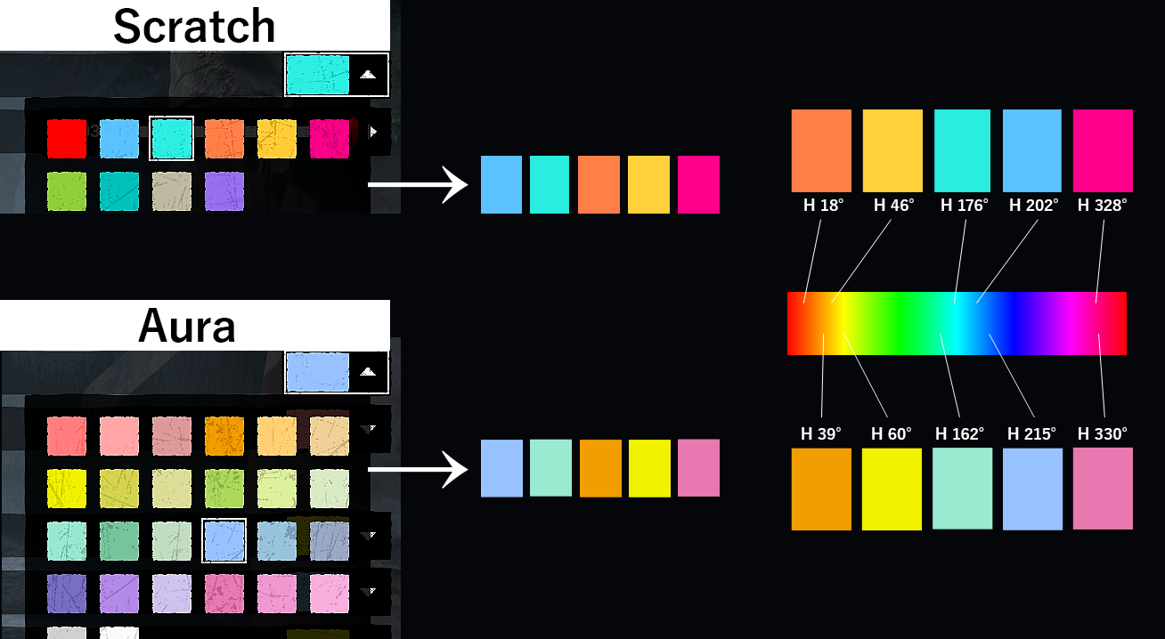
For example, even when selecting what appears to be the “same” color family, the H values in HSB/HSV are not aligned (as shown in the attached image).
Because of this, when trying to use matching color themes between Scratch Marks and Auras, the colors end up looking subtly different rather than unified.
For example, one may lean more yellow, cyan, or magenta compared to its counterpart.
Is there a specific reason why the default hue values differ between Aura and Scratch Mark presets?
If possible, I’d really appreciate it if the hue values could be properly aligned between the two systems, while keeping the current saturation/brightness differences. I think this would make the customization feel much cleaner and more visually consistent.
Additional note: as shown in the attached image, the pink presets already have very similar H values between Aura and Scratch Marks, so they feel visually consistent.
However, the blue, green, and yellow presets differ much more noticeably in hue, which creates a slightly mismatched appearance and feels inconsistent compared to the pink set.
Comments