Let's change the current GRADE icon and placement.

First of all, let me declare that this is not a proposal on how SBMM works, how it is calculated, etc.
And I'm writing this using automatic translation.
Please forgive me if there are any incorrect phrases.
I'd like to thank you all for your support.
With the introduction of SBMM, GRADE were created to replace RANK.
However, even now, there are still people who claim that the difference in GRADE between themselves and their opponents or peers is a glitch in the SBMM.
Unfortunately, there are many posts and opinions like this on social networking sites, forums and communities.
One of the causes, in my opinion, is the visual impact of the results screen.
RANK has been changed to GRADE, and some of the growth conditions have been revised, so the meaning of GRADE has changed a lot.
Despite this, the icons for RANK and GRADE are almost identical.
The placement of these icons in the results screen also remains exactly the same.
This may cause many people to intuitively feel, "It's a glitch that ASH and IRIDESCENT match." etc. Don't you think?
Many of them understand that, "RANK is not the same as GRADE.", and that, "SKILL RATING and GRADE are not necessarily the same thing."
However, they may be misled by visual information and have an instinctive aversion to it.
So I propose this.
Let's change the current GRADE icon and placement.
Right now you need 85 pips to become IRIDESCENT I. And Grades cannot be lost until the reset.
This means that some people have raised their GRADE with very few pips lost, while others have lost or gained a lot of pips and finally raised their GRADE.
The SKILL RATING of both people cannot be the same.
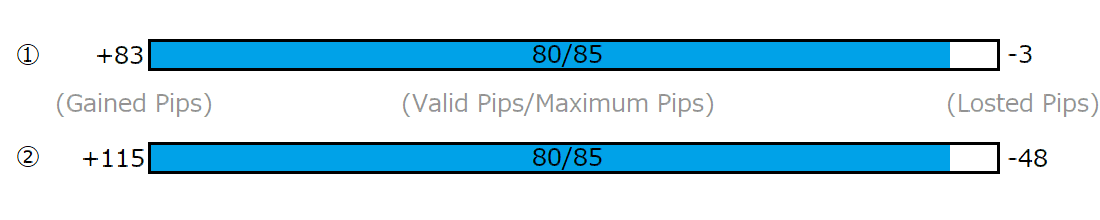
This is just an example I came up with, but 1 and 2 are IRIDESCENT II with 80 pips.
You can see that the person with 1 is a good player, while the person with 2 is not so good, but has worked hard to raise his GRADE.
If the small numbers are hard to read, you can use color coding like this.
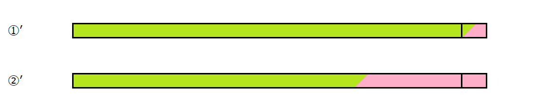
The current GRADE icon should only be displayed on your own screen, and on the results screen, the current GRADE icon should be removed and a new GRADE bar or something similar should be displayed after your name or at the bottom.
Comments
One of the devs in December asked the forums if they should remove opponents’ grades from he endgame score screen because they cause so much confusion. The overwhelming consensus was Yes, but I haven’t heard anything about it since then so I don’t know the status. They may still be planning on removing them but don’t want to do it unless they have something else in place to replace them that isn’t simple the MMR number. Or maybe they have some reason they think having the opponent grade visible is useful to the game that I can’t think of? 🤷♂️ Or it could be something they want to do but feel it’s lower priority in the development queue.
Of course, I'll leave it to someone more talented than me to create a new GRADE display and icon.
Unfortunately, I don't have any design skills.😪
I see, there was such a discussion.
In my personal opinion, I have a desire to have someone look at my GRADE, which is different from my skill, when I make an effort to improve it.
However, I don't like to be criticized for confusing RANK, which used to be an indicator of skill, with the current GRADE.
So, instead of removing GRADE, I thought it would be better to change the way it is displayed so that people can easily understand that it is different from skill and RANK.
They had it hidden during some PTB or during some MMR test. So I don't understand why can't they hide it.
No idea. 🤷♂️ Maybe they just think it looks too empty? Or people were complaining they didn’t know how good the opponents were, even though Grades have nothing to do with matchmaking and are only weakly correlated with skill?
I agree with you very much.
I don't know, but creating an alternative display to GRADE would be a very daunting task?