Plague Max Infection Icon Visibility

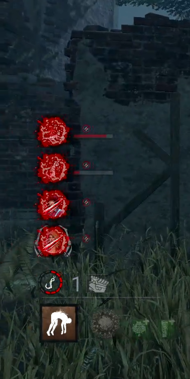
I think the icons (especially for dying/hooked survivors) need to be a lot brighter to stand out against maximum infection, or the background needs to be less bright or not marbled with white. I'm not colourblind, yet sometimes it takes me a couple seconds of staring at the UI to know what the survivors are up to.
Example, this (zoomed in) screenshot - it took me an embarrassing amount of time to find out what the second icon was.
Comments