Can We Get a better Character Selection?
When I mean "character selection", I mean the character select screen for both Survivors and Killers.
The current selection screen is archaic and difficult to navigate. It would be much, much easier to have it so that all character icons are shortened and bunched together into one full screen.
It doesn't really have to be that hard, either, look at other character selection screens from other games to get an example:
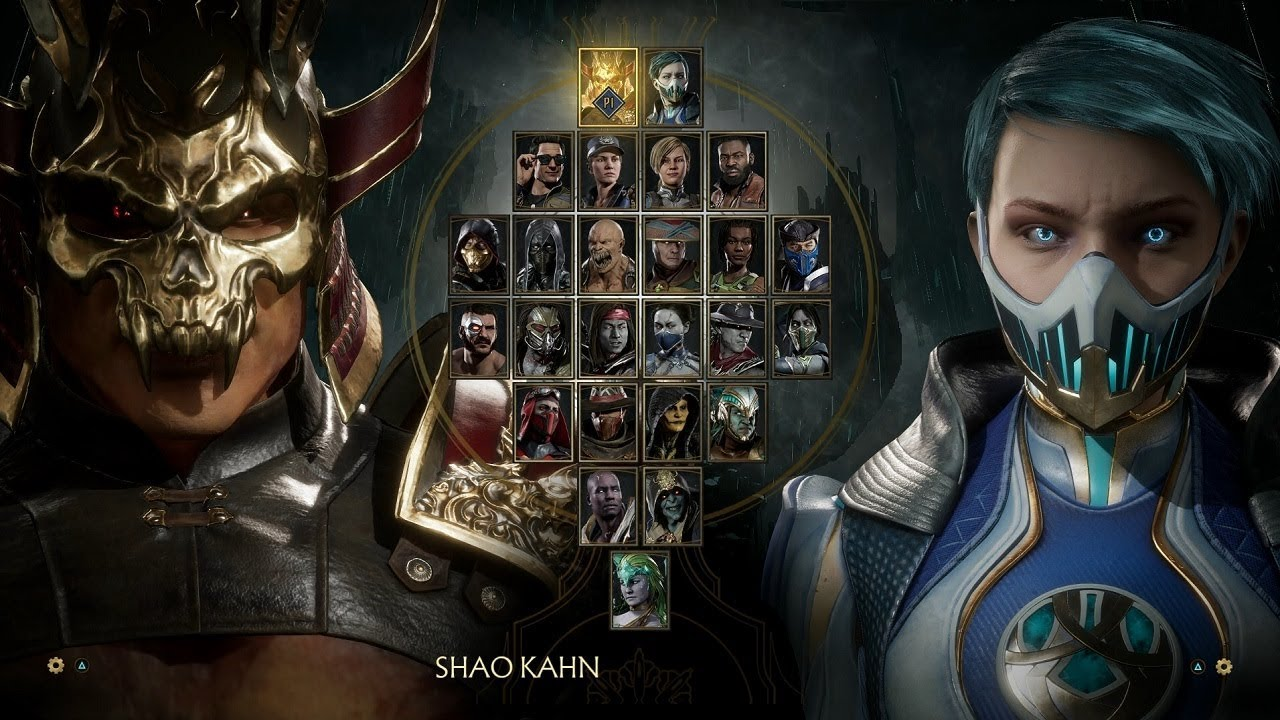
Image: Mortal Kombat 11 base character roster screen (23 characters)
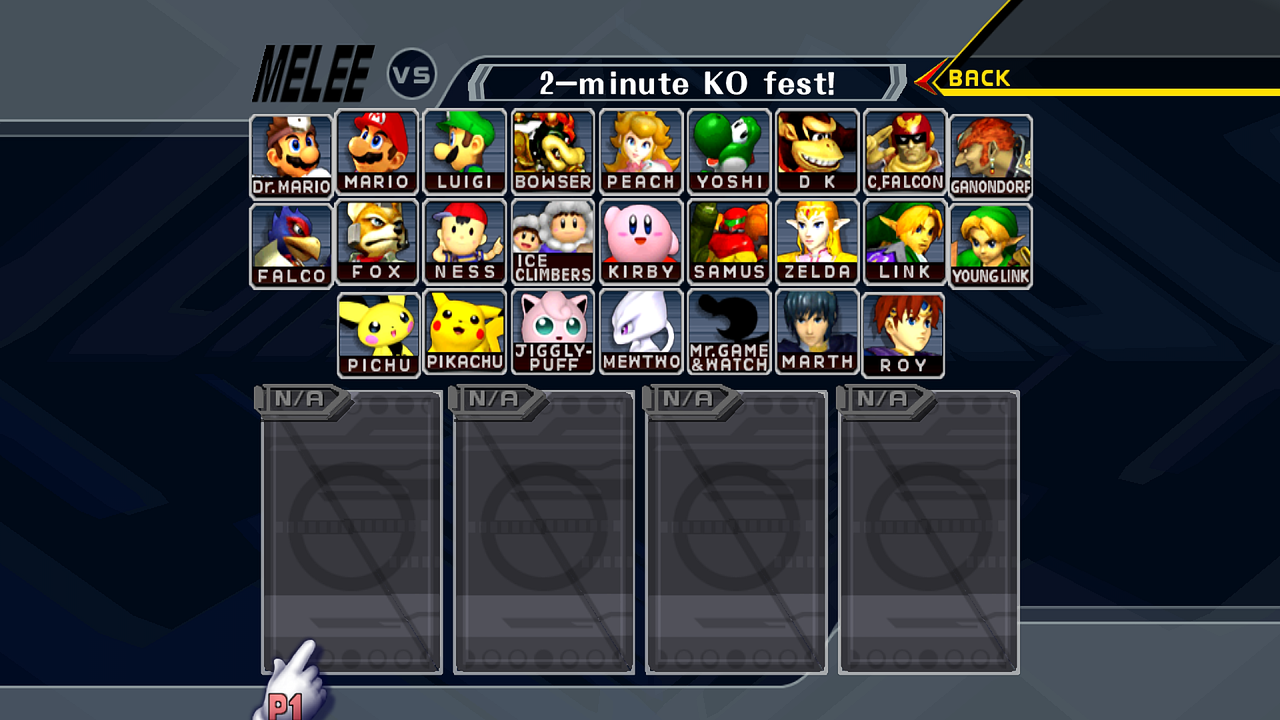
Image: Super Smash Bros. Melee character roster screen (25 characters)
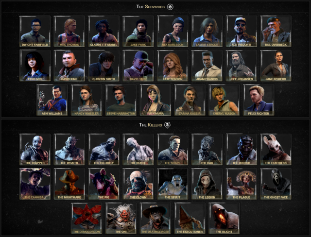
Image: Literally what it COULD look like for both sides. Doesn't include all three last chapters.
Don't you think it's time that we get an ACTUAL character selection screen instead of the ugly one we have now?
Comments