The new UI and what I hope
Dear people of the fog,
I'm sure the new UI, as almost every other stylistic things, will have people who find it good and some who think that it looks crap. I, for myself, am still unsure until I actually played with it on the PTB.
I really like the idea of using survivor portraits instead of the anonymous white figure we have now as well as the hook counter for both killer and survivor. What I don't like so far is, that you have to look all over the place to get the information. Now you just need to look to the left corner ans see basically everything.
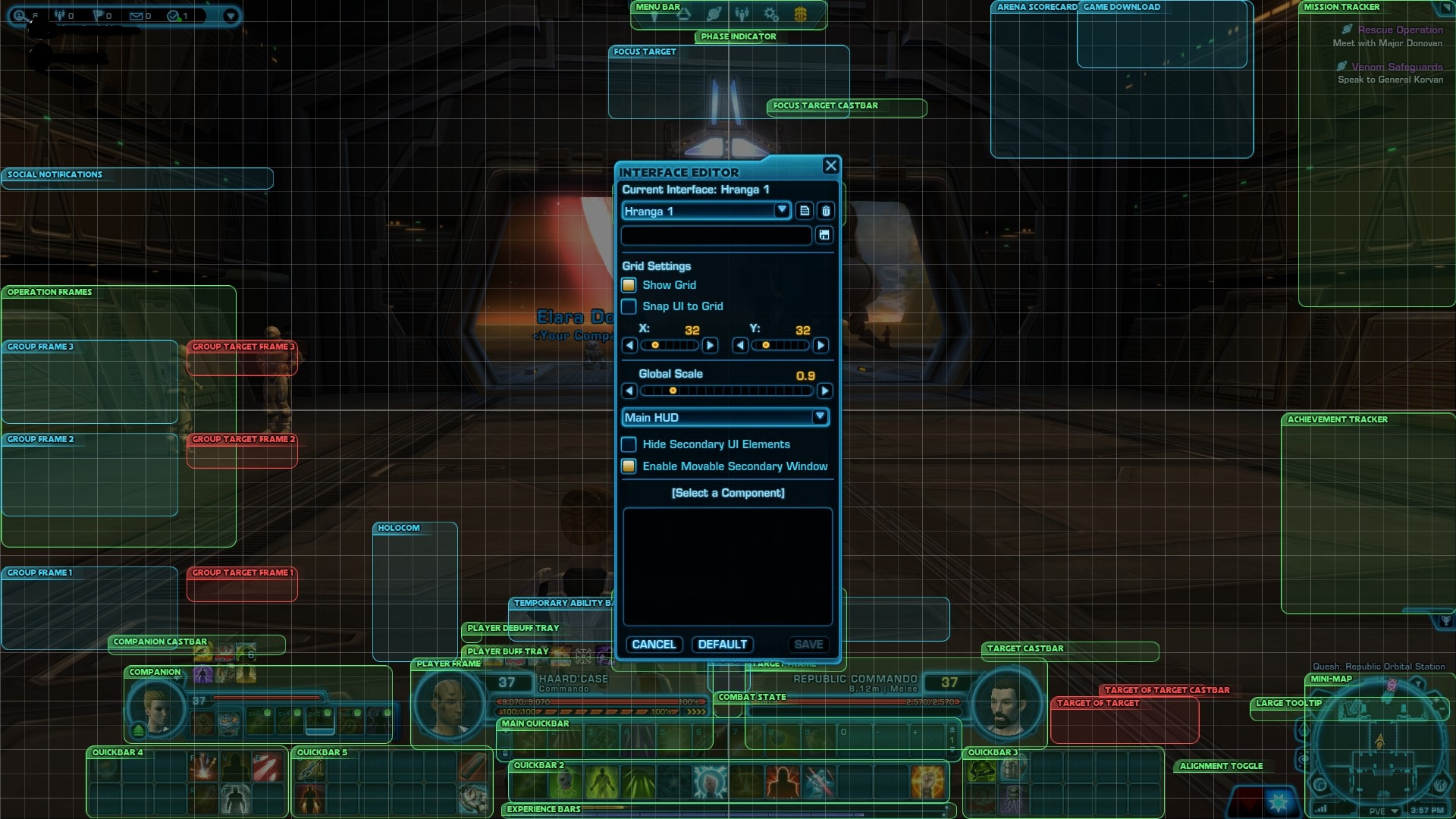
What I hope for is, that we either have the possibility to chose between the old placements (or almost old placements) with the new optics or a possibility to place the different widgets ourselves. what do I mean with this?
UI costumisation like this (from "Star Wars: The Old Republic") in the picture. Everyone could chose their own style.
I also hope that the UI uses the same files for the portraits as the character selection does, or at least uses pngs I can costumise like all my other icons :P
Comments