
flamingaxe12
flamingaxe12
About
- Username
- flamingaxe12
- Joined
- Visits
- 34
- Last Active
Comments
-
Im essentially going to repost some of my feedback from the PTB since im still struggling with the same issues here. There is new bullets though that I added since playing with the live build.
UI/HUD Update
As I mentioned before, the following comments below are not meant to be knocks on the devs or a furious 'instruction' to change. However, I do have legitimate concerns about the UI from both perspectives of the game, and hope these issues show where my anticipation is coming from and what I would hope would be considered if revisions would be made.
1. Survivor Portraits in Bad Location - Having all of the Survivor portraits in the top left of the screen is both cluttering a portion of my screen, and taking attention away from me while playing the game. If there are certain gameplay elements in the distance, like the killer approaching from the top left of my screen, I now can not see that with this new HUD placement. Plus, I have to now look in the top right of my screen to see Survivor Status, which is now drawing my attention away from the action and other important gameplay information like my power/item, and objective status. I know this change was intended to assist with player names, but I dont think its justified enough to pull my attention so far.
2. Almost 40-50% of my Screen Space is Covered – Versus Original HUD Taking up at Max, 30% - I am attaching images below of my observation. The old HUD took up about 30% MAX of the screen space, while this new HUD is eating up bits and portions of my screen from literally EVERY angle. It is, again, covering the screen up with scattered elements, drawing my attention away from the center of the screen, and making it a disorienting experience.THIS is my biggest gripe. I want to FOCUS on the game, not all these scattered HUD elements.
To show this, I am displaying the screen space that is being taken up here, this is a combination of both Survivor/Killer:
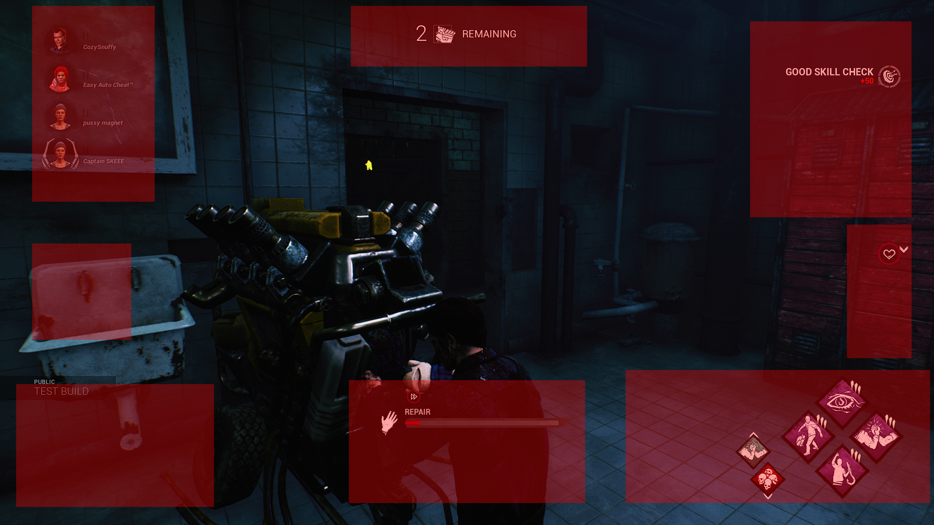
New HUD
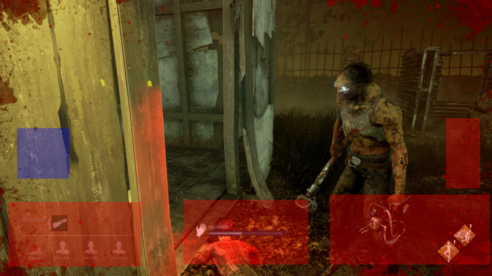
Old HUD
3. Shrinking UI Does Not Make This Better - I saw that we have the ability to shrink the UI to at least 70%, and I tried this as well to give the new UI a try. After 4 matches I had to stop with the scaling, as it was illegible and near impossible for me to actually digest any information, in fact, it made it more difficult as I was squinting to see the low opacity names and seeing what statues were being applied. I am running it at 90% and like this size, but this still does not excuse the scattered information all over the screen.
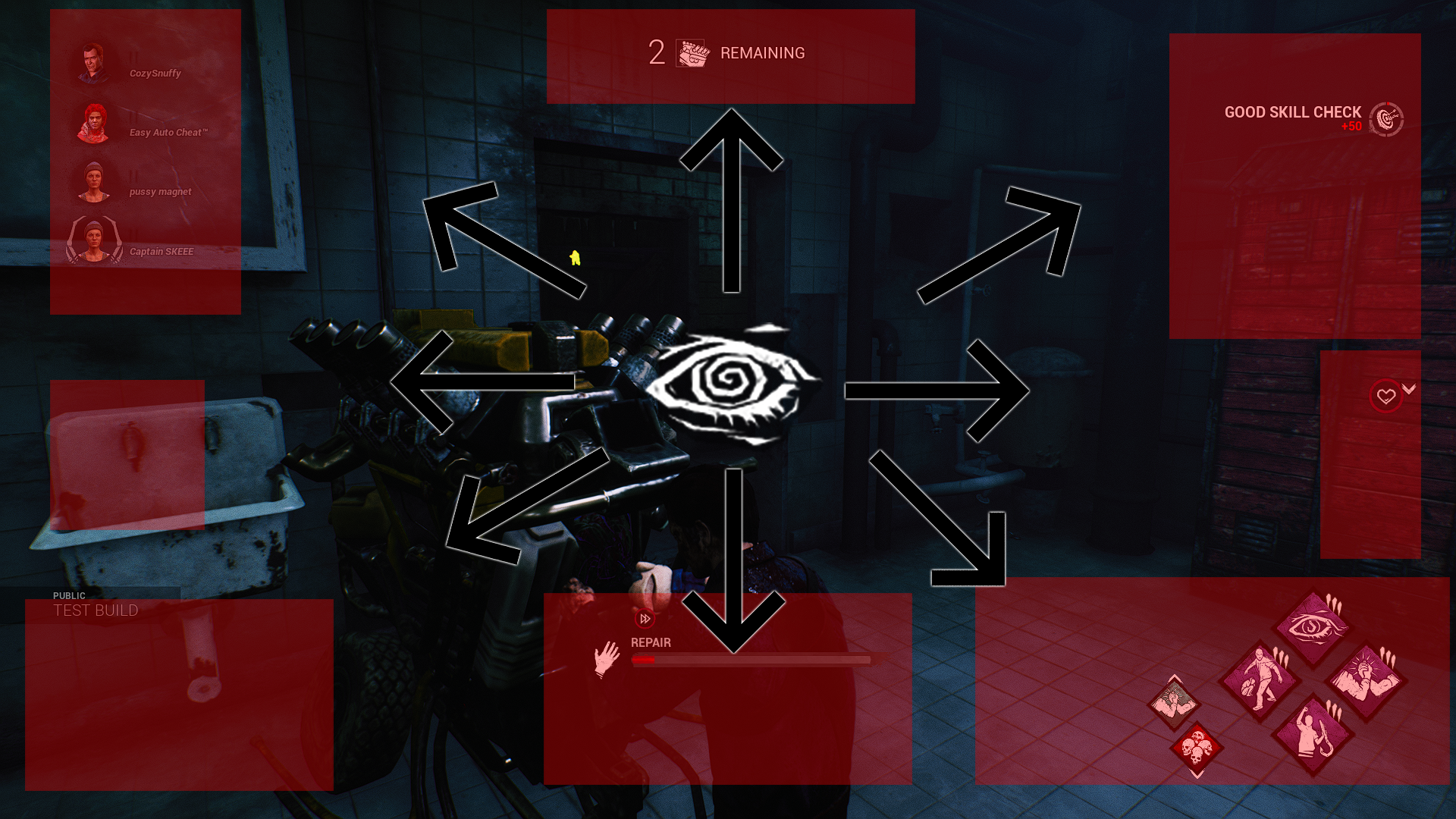
4. (Killer) Cant Focus on Survivor Statuses - Below, I am attaching screenshots of my visual experience when it comes to reading and reacting to the HUD throughout the match. This is the same as a Survivor, but my attention is more intense from the Killer Perspective, and sadly, WAY less of my time was actually spent looking center screen to focus on my game, and spent looking in other portions of the screen to see what was happening to Survivors, my perks, and my power. It is a mess
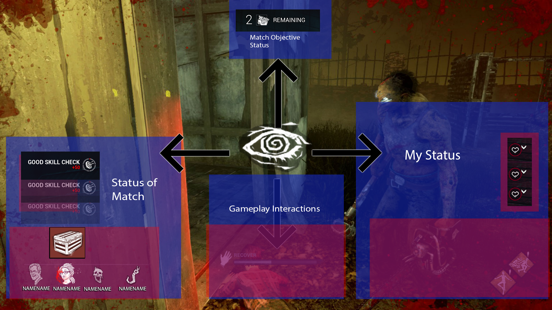
5. Objective Top Center is not Bad - I actually do not mind the new Objective positioning element. It is at the top center of the screen, which helps align my vision with my goal of scanning the environment for gens/survivors. Below, I have attached a mockup of the old HUD, with an example of where my eyes dot to typically in an actual match, with the consideration of this new Objective HUD element.
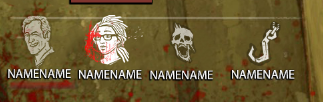
6. Survivor Portrait Animations are Inconsistent UPDATED with 4.5.0 - The whole, Survivor renders for the portraits is extremely unimmersive, and doesn't blend well with the environments or other HUD elements like the Perks or Status Effects in the game. Seeing the portrait renders turn into the older icons doesn't look right and is extremely out of place. What disappoints me is that DbD has these awesome survivor icons in their pockets and if these were used instead, it would immediately remove my gripe about how the HUD reacts to the status of a match. It is almost confusing too, trying to react to these distracting renders and watching them shift to other white colored icons. It is inconsistent and would hope the art direction of the HUD would dial back to the immersive art style previously. It can be more cleaned up for sure. If the render designs stay, it wouldnt be the end of the world, but its current location on the HUD NEEDS to change.
7. Scoring Events are a Distraction in its Location - They are literally isolated in the top right of my screen and disappear faster than I can see them half the time. I never had an issue with its last location, as the status of a match would accompany my points - I hit a survivor, I see the scoring event and the status of the survivor in the bottom left of the screen. Now this example is happening in two places, top left survivor react, and hit event in the top right. Its pulling my attention unwillingly and it became more annoying background elements over time the more matches I invested. Plus, they are SO tiny. Its a distraction in its current placement
8. (Killer) As an Experienced Player, Hook Counter is Useless Unless it Tallies Specific Survivors - I did not HATE the new hook counter Killers get it. I would be lying if I did not get SOME value from this counter. I count hooks in my head per survivor, but this alternative I can see being very helpful for new players to get an idea of the status of their match progress. I personally would like to see that iconography separated per survivor, since that would help me keep track of who I want to apply more pressure to or even target differently throughout the duration of a match. I do admit I can be a 'sweaty' killer main and just apply pressure and win the game no matter the hook count, but sometimes I do end up in more casual lobbies and want to apply the pressure evenly. Again, this is a minor complaint but just wanted to express my feedback.
9. (Survivor) Hook Tallies are Actually Nice - I did not mind this addition either. It doesnt take up too much space on the HUD and it was pretty nifty to see which of my teammates were more in danger than others with this reminder. I can see this being helpful in my matches when I sometimes lose count of my teammates hooks, because it does happen and this is a really nice backup counter. Not loud, not overbearing, and nestled nicely with the Survivor portraits
10 . The new 'Injured' UMG is so distracting - Those giant red scratches on a survivor when they trigger makes sense and catches my attention. However, my issue is that they remain bright red for the entire time someone is injured. It is an eye sore and pulls my attention away way too frequently. As a Killer, this is a pro, but it doesnt feel good having to draw my attention away from the center of the screen. The way the old HUD handled this was a bright ping, and then would fade back out. That way, you could get updated but it wouldnt glare on you for the entire duration, allowing you to get a live update essentially of this effect.
11 . Deep Wounds, Struggle State, and Dying State Bars are SO Small - The idea of the HUD making information more clear seems contradicting with this portion. No matter what my UI scale was, those bars look like little noodles and it was so hard to see what was happening unless I COMPLETELY forced my attention to the top left and nothing else. Its not as visible as it use to be, taking up a good portion of the HUD in the older version and being much bolder in its colors, animation, and width on the HUD.
Animations
1. Love the Injured Locomotions - The new injured animation looks great. Adore how the stiff limping is gone, and now we have something more immersive. Feels good to run with as a survivor, and am enjoying it from the perspective of killer as well. Seems a bit choppy making it seem unpolished, but still really nice and good direction. My favorite part is when I get downed, THAT looks and feels awesome from the matches I played so far and havent had any glaring issues. Its super cool.
2. Idle Animations are Lifeless - All the animations look really nice but the idle seems so dull and has no personality. More prominent breaths in and out, or a little bit more body swaying would be nice.
3. Feels Smoother and More Immersive - Seems more lively and less stiff than the older animations. It is a nice face lift to see on top of all the other visual updates. Female and male bodies seemed smooth, with males being a bit more rigid when running injured
4 . Being hooked is disorienting because of the new camera on Dying State animations - When I get hooked, the camera jerks from the ground and up to the hook. On top of the disorienting experience with HUD, this did not help either.
5 . Love the 'Terror Radius' and 'Ducking' postures - I noticed when in the Terror Radius, the survivor hunches over, as if theyre being hunted and are being cautious. This is such a badass detail and have loved how it blends together with sneaking. With sneaking mentioned, the ducking animation feels really good and for some reason, it feels like I can hide better with smaller objects than the older animations. Feels like I am more in control and the blendspaces feel really good to get up and down from.
6 . Healing someone from Dying state is so cool - The touch of animation on this sequence looks so cool too. It was a pleasent surpurise watching a Survivor struggle to get up, then have myself bend down even further and pick them back up. I really like how that plays and I ran Were Gunna Live Forever just to see it more. Really big props to the attention to detail on this front.
This is my major feedback on the HUD. Gameplay wise for the Clown, there still is a lot of time I want to invest into his adjustments to provide proper feedback, but the HUD updates were the most prominent, in my face, and disorienting experience I have ever had from this game. I think the ideas are there, but there needs to be more structure to the layout with the current elements to not overlap the important aspects of the game or pull my attention away from the core objective, the cat and mouse gameplay. At the end of the day, my senses are being tested to survive and kill in DbD. These cluttered elements are hindering my ability to read and react and I hope this concern would be addressed in whatever version gets revised in the future.
Keep on killing it DbD dev team, theres a lot of great work here and hope to see some plans for changes whenever all the feedback comes together.