BanjoTheFool
BanjoTheFool
About
- Username
- BanjoTheFool
- Joined
- Visits
- 4
- Last Active
Comments
-
@Eareland said:
Everything on the screen is spread out, character icons change was unnecessary, and they look way too "out-of-place", also they're a bit distracting, exhaustion icon outline color is bad, so it's hard to tell when your perk is ready to use again. Also, please, get rid of those small button icons on your item or killer power, because that is some tutorial stuff. Make better and longer tutorial where you teach all that stuff.
Game is from 2016 and it has very few in-game options (compared to game file options). I have an option idea!:
Revert back to old UI
And this has been posted tens of times already:
https://us.v-cdn.net/6030815/uploads/JVP8JLGS9K9X/dookie-5b1-5d-5b1-5d.png
Thank you.
Why would it be hard to know when exhaustion is gone? The icon disappears just incase you didn't know. The adept icons make the characters look *more* out of place, but they could just remake those icons, the way they drew the characters was weird then than now so they could pull something good out. The tutorial thing I agree with, they shouldn't make a heavy "this is EVERYTHING you need to be good at the game" tutorial, that would still be hard for new players, and experienced players wouldn't need of tutorial. I really hate the idea of reverting the new ui, things change and we have to accept that, nothing will stay the same and they're trying to make a better experience, stop trying to stop change, the game wasn't meant to stay the same forever.
-
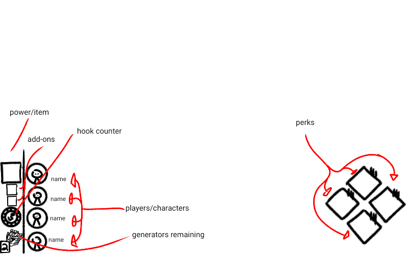
I made a concept of what the ui could look like, I really like the new one but hey if it's getting changed well then, here