
WampaPl
WampaPl
About
- Username
- WampaPl
- Joined
- Visits
- 56
- Last Active
Comments
-
This issue still occurs. When playing as the Alien with Hex: Face the Darkness active survivors sacrificed on the hook continued making scream visual notifications
DeadByDaylight.log -
It is a perfect fit isn't it
-
I wish they had different skeletons. I shouldn't be that hard to since heads are the same size anyway, torso will determine the skeleton so only 1 variant and legs are the only part that require 2 skeletal variants.
-
I really like that the road got a little shortened and contains more cars and stuff to play around. The sea of concrete remains hideous, but at least offer better gameplay. I also quite like that there are hedges on the edges (pun intended). They are meant to delay hits and fulfill that purpose. Lockers spawning there is also a nice quality of life change. There is also the removal of a double tile next to the main building. It was surely problematic, but if feels empty now. I kind of wish that another park would be put there, but it is what it is.
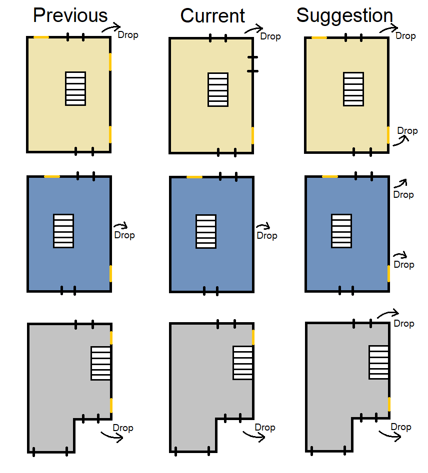
Unfortunately I really do not like what was done to the buildings, all of them. Mayer's house was fine as it was pre PTB and I wish it had remained that way. It was balanced and offered great gameplay for both sides, now it is just plain and uninteresting. And them we have the secondary buildings that are just a joke. Were bad before and are bad now - just in the opposite extremes. I have already suggested my dream way to fix them in one of the previous feedbacks, but i can paste it once more: It would be nice to solidify mindgames where killer counter ground floor windows by going upstairs and assassi-creed them from above. This playstyle was possible in the previous (survivor-sided) iteration but hard to do. More openings to drop from the second floors would make it way more common playstyle as shown in the following image
-
I feel that the ascetics of this map kind of lacks their identity. Glass room is cool but all the other looks too similar. The name says "laboratory" so the rooms should look more like laboratories/offices and not storages and only storages.
Balance wise I really dislike how unintuitive the logic of doors is on this map. On Meat Plant for example it is far better: Sliding doors are closed if there is a unrepaired generator on one of their sides. I wish it would be similar on hawkins. I have also noticed that sometimes generators spawns on the catwalks and I dislike that because they are hard to find
-
Our lil broken midwitch. Its corridors and not too big shape makes it easy to identify and patrol gens while the fact that safety consist mostly of pallets makes it easier to create dead zones. What could be done? I would move the generators further from the staircases and i talk about both the corridor and classroom ones. Finding generators should be somehow easier too yet I do not have any good idea how. Changing the whole map to a "clean" version and make "cursed" areas only near spawned generators would works but it will be so hard to make.
-
Really well done map and balanced map. Atmosphere feels great and only room of improvement would be a change in a mist color to something more like a dust storm. I feel obligate to tell about weird collisions in some places too.
-
Dislike both of its variants. Safe stuff is so much connected to each other
-
This ma have such a atmosphere, it is my new favourite :) The main building is fun to loop and offers many possible paths. Every single room seam to have a purpose maybe except bathroom since its window is a just free hit. Hymm, I am trying to recall where is a chest/killer prop spawn in the main building. Is it in the bathroom? If it is then that room would actually have a purpose.
Balance wise it is fine - or should I say - fine for the unknown and his teleport. We will see for less mobile killers
-
Truly unique map with its lot small room and windows everywhere that require both sides to adopt properly. My general issue with this map is that there is so many random clutter in corridors that makes it har to traverse for killers like hillbilly. Secondary issue will be the size of doorways: i would appreciate to be able to see more into the rooms i am entering
-
Not having a main building is a little boring. Balance wise I like that the shack isn't connected to maze tiles like it is in its Autohaven counterpart, but maybe being only surrounded by corn is overshoot in the other direction. I hope someday it will gat a main building
-
I like corn very much and that map have a lot of it
-
This map gives a slight advantage to survivors due to how the road connects a lot of strong stuff, but it is so much more fair than it used to be
-
Another nice map. Main building feels nice to loop especially after its got changed
-
My very favourite coldwind farm. Nailed distribution of tiles and corn
-
I like this map but there is a little to much overall visibility. Would see a car pile squeezed somewhere there.
Almost forgot. The autohaven tiles have such a low walls making mindgames way harder. I do not like
-
My favourite autoheaven map. Fantastic aesthetic and main building gives many opportunities for unusual plays
-
I like this map. A for Balance
-
I like stretched maps but not this one. The center is way too narrow and the killer have an easy time checking for survivors that try to cross. Main building is kind of lame not feels mainy enough.
-
Quite a dull map. I hope one day it will gain main building idk cargo containers turned habitable / sewage pipe or something.
-
The worse of the two variants and definitely my most hated map, both as a survivor and killer. The main building is strong and separated form everything else and this causes two scenarios: survivors are favored if killer decides to loop there, or killer is favored if he decided to never ever go there. There is nothing in between and it makes one side always miserable. I believe that only a ground rework of the map layout can fix that.
My additional complains is too unpredictable pier and the totems/hatch/killer specific objects can spawn on the very edges. I like that they are big and sloped, do not get me wrong, I is just miserable searching for something there/having a long walk just to pick up an EMP.
-
The better of the two variants. My biggest complains is too unpredictable pier and the totems/hatch/killer specific objects can spawn on the very edges. I like that they are big and sloped, do not get me wrong, I is just miserable searching for something there/having a long walk just to pick up an EMP.
-
One of my favourite main buildings. Round shape is such a fun thing and attached garden is pretty. Unfortunately the rest of the map have not as good aesthetic: some textures are low quality and the amount vegetation is less that expected from such a place. When it comes to balance i can say that this map feels balanced expect these two pockets, that are too deep
-
Probably the most balanced map in that rooster. My only complain is the general look of if. Some textures are low quality, circus have to little colourful elements and the amount vegetation is less that expected from such a place.
-
I am in love with the lighting, the colors and all the interiors of all the houses, visually pleasing so much, but there is a one thing I do not love and it is the giant road. C'mon Murica is car dependant but not that much :) the roadway + on-street parking takes too much space, cut ~1.5m from each side and it will get more realistic.
The main building is great, I can not say anything bad about it. Similar feelings I have towards house of pain(basement one), also really well done. Unfortunately the three tho-story secondary buildings aren't that great. I remember when Haddofield get updated I thought that to counter the right side windows killer is meant to go upstairs and drop from there. Well it sounds like a fun, unique gimmick but in reality isn't usable that well since every one of this houses have only a single hole on the right side. I wish this playstyle to be more solidified.
-
This is the most survivor sided realm and I believe it can not be easy put in pair with the rest.
A lot of the filler palet loops are really safe and the road ones make especially huge impact since they often connects to the building, (unironically Garden of Joy have actually well balanced road tiles). Speaking of buildings: house of pain (basement one) sucks and its name speak for itself, should definitely be upgraded to the Haddonfield version; the two story building is of but I would also prefer to replace it with one of the Haddonfield ones for the sake of consistency; The main building... that is a tricky one to judge I got used to it, but I see many people do not.When it comes map shapes. I expect that there will be only one variant in the future since it is a little odd currently. I visually like I and IV a little more than the other, but it is only a mild preference.
I also feel obligated to mention that despite its terrible balance if has great lighting. Not to dark, not to bright.
-
In both previous pools I said that differentiated sizes and shapes are a good thing, but the bottleneck in this map (and in Azarov's Resting place) is wild in a bad way. Also its a little too dark. Also bamboo are sometimes passable or impassable.
-
Another map with well designed main building and other structures. What i do not like is how the textures are so dark as well as having bamboos sometimes passable and sometimes impassable.
Just like I said in Mount Ormond poll. I disagree with a statement that it is too big. 26 tiles is the right amount of tiles and having some maps more stretched that the other is a perfectly good thing.
Also weren't we promised that an animal will be added on this map aren't we?
-
One of my favourite maps overall. What I like the most is probably that the main building have a variation in layout. My only complain is about the side rock tiles: i feel that survivors have too much visibility there both when it comes to looping and map traversal.
Edit: I see in other comments that some people feel like it is too big and I completely disagree with that. 26 tiles is the right amount of tiles and I wouldn't like any changes to that