
Thylacine
Thylacine
About
- Username
- Thylacine
- Joined
- Visits
- 11
- Last Active
Comments
-
 unknown.png
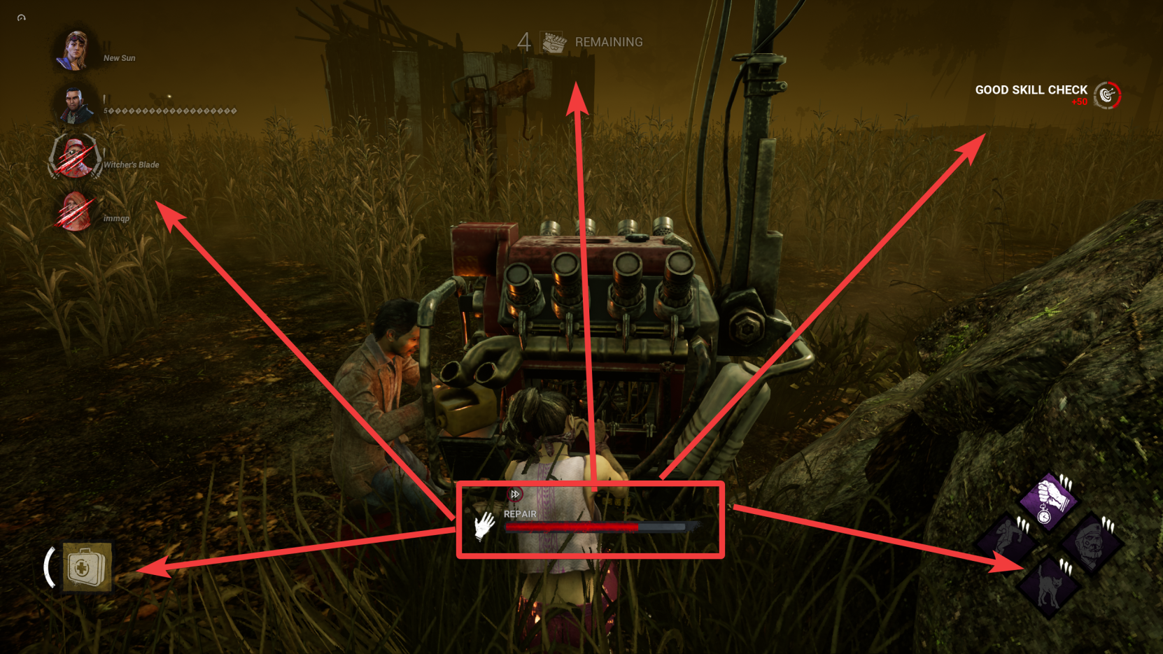
I play on PC and have a large monitor, and the new UI feels jarring to have every separate piece of information I need spread out across the screen. The original UI was great in the placements of its information. The entire bottom left corner now is dedicated to the usage of your item? Blood point pop-ups briefly appear at the top right? It just feels so strange uncomfortable.
It would be great if we had the option to choose between the two UIs, or the ability to modify the placements of specific HUD modules.