Can I get verification from BHVR on the accuracy of this chart's labelling?

I know it was a while back since this chart was released, but while I thought the stats were weird, I didn't notice the y-axis label the first time.
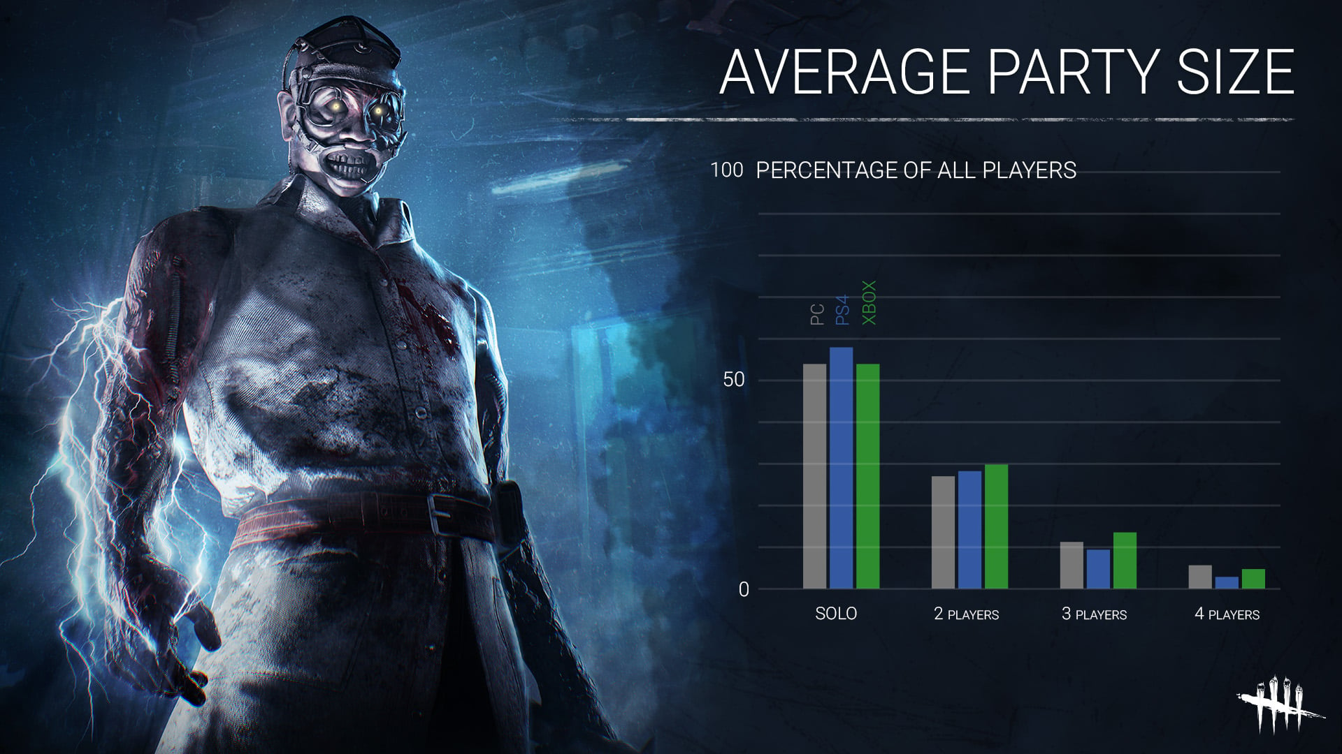
However, somebody posted it in a thread recently, and I realized that the y-axis is actually labelled as Percentage Of All Players. Now, if that's actually accurate, what that means is that if you want a comparison to of solo to swf groups, it would actually be half of the 2 player bar, a third of the 3 player bar, and a quarter of the 4 player bar.
As unlikely as I though the graph was originally, I saw it in the realm of possibility. However, once you take this into consideration, that means there's over 9 times as many 2 man swf groups as 4 man swf groups and a bit under 3 times as many 3 man swf groups as 4 man swf groups.
While I can easily believe that solo players are wildly higher in percentage than swf groups, I find it extremely difficult to believe that 4 man swf groups are that much more rare than 2 or 3 man groups. Nearly everybody I see start a swf group does so with the intention of getting 4 players, not 2 or 3. While I admit there's a number of people who just start with what they have and others who settle for less than 4, it seems counter intuitive that the number of 4 man groups is less than the number of 2 or 3 man groups, And now that I realize by what margin this graph actually indicates, it seems even less likely
So I have to ask how exactly was this graph put together? Is the label "percentage of all players" the right label or should it have been the percentage of group sizes in games?
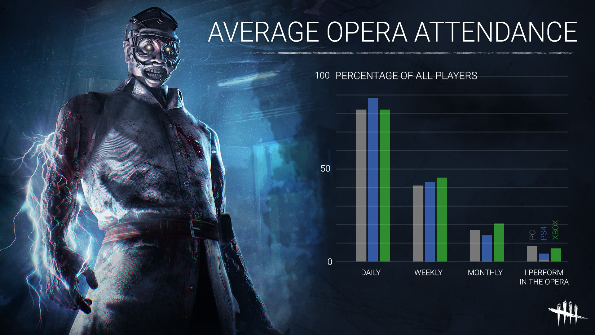
It's further suspect since it was released with this chart which is both wildly inaccurate and mathematically impossible.
Comments