Everything wrong with the new UI in 1 Photo

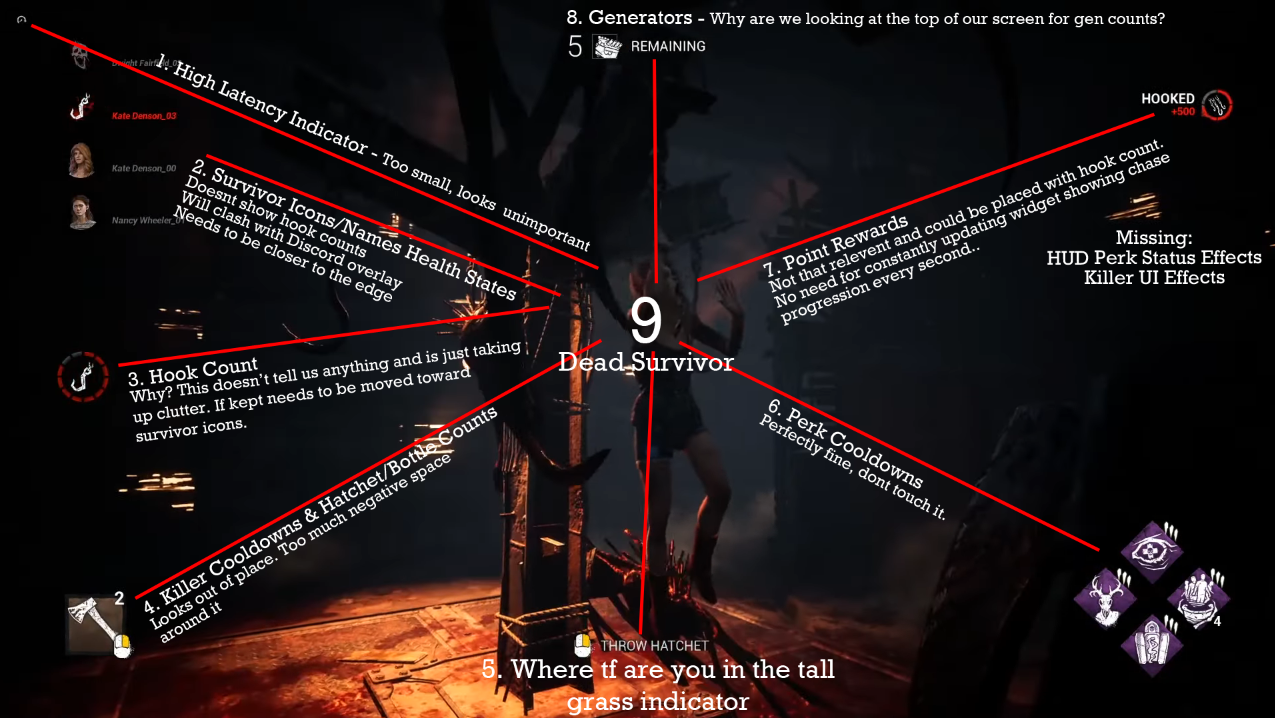
While this isn't the final release, there's way too much wrong with this to go live.
Main issues:
Hook count is irrelevant if you don't know which survivors have been hooked.
Generator count is in a spot that forces your eyes away from the game to check.
Player Icons/Health States are in a position that would overlap with Steam/Discord Overlays
Point Rewards will be blocked off by most content creators face cams
Comments
The power icon and gen count really irk me in particular
Imagine just having this big, ugly, gray square in the corner for no reason on killers such as Wraith who don't use cooldowns/ammo
The main issue for me is the Gen count.. it makes you look away from gameplay and for human eyes, it's naturally easier to look down rather than up. It's at the edge of the screen so it completely takes your mind off the game.